Shopping Bag
Your bag is empty — browse and find something you like?

Your bag is empty — browse and find something you like?
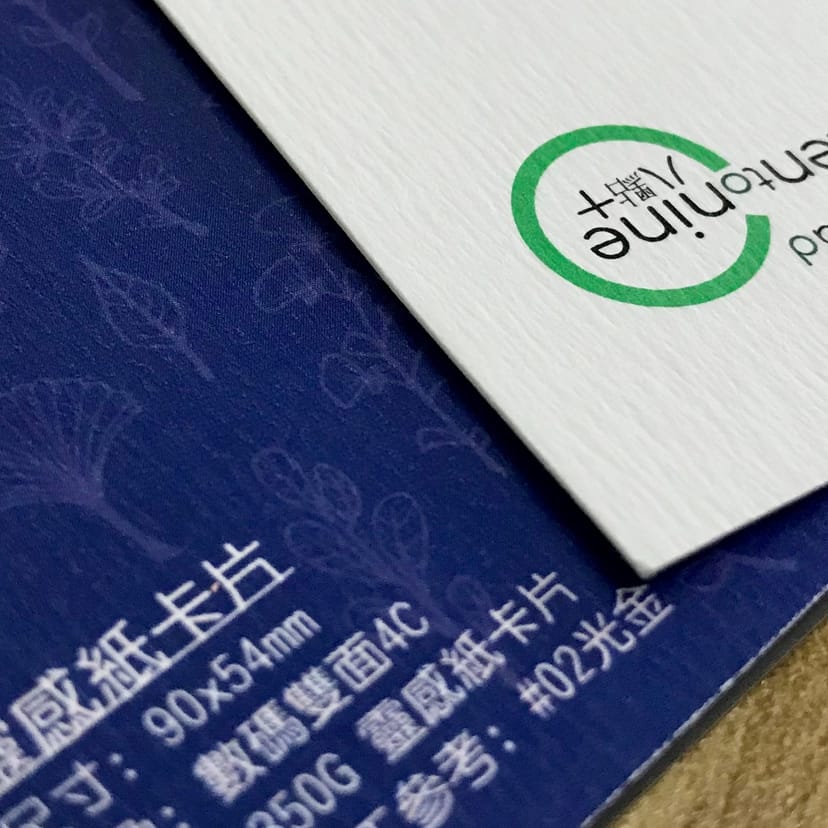
Inspira paper cards feature a varied, raised texture with a woodgrain effect. Their distinctive feel is ideal for business settings and creative professionals. One of our most tactile specialty paper stocks, it is an excellent choice for cards.
Create a name card with a tactile finish without making it look too showy. Inspira paper is an imported art paper with a coated surface that produces more vibrant colours. Its elegant ripple embossing gives the surface a fine, stone-like pattern and a subtle woodgrain feel, making each card distinctive yet substantial in the hand. It is particularly well suited to business settings, creative brands and studio owners; a simple layout is all it needs for a timeless look.
The texture already creates depth; the cleaner the layout, the more the paper stands out.
The stone-like pattern and woodgrain feel add warmth, making this style ideal for studios and independent brand owners.
A little finishing is enough. Concentrate it on the brand focal point for maximum impact and value.
| Item | Details | Recommended Uses |
|---|---|---|
| Finished size Standard name card |
The standard 90 × 54mm finished size is easy to hand out and store. | Personal name cards, company name cards and small brand cards. |
| Paper 300gsm Inspira paper |
This imported art paper has a coated surface for more vibrant colours. Its varied, raised surface pattern also has a woodgrain feel. | Business settings, creative professionals, studios and independent brand owners. |
| Popular quantities Four volume tiers |
100 / 200 / 300 / 500 cards (ideal for trialling a design before reordering as needed). | Individuals / start-ups: 100–300 | Teams: 300–500+ |
| Turnaround After artwork confirmation |
Usually approximately 2 working days (depending on artwork confirmation and any additional finishing). | Flexible enough for upcoming events or client meetings. |
Tip: an embossed paper surface can make extremely fine lines or very small type less clear. Use medium or bold type and keep fine details to a minimum for a cleaner, more reliable result.
The surface never looks flat; even a logo and two lines of text naturally gain dimension.
Compared with a typical rough art paper, colours reproduce more vividly, making it suitable for brand colours and small illustrations.
You can feel the difference as soon as you pick it up, making it particularly suitable for brands and professional services seeking a refined image.
For a memorable tactile detail, apply a localised finish to one focal area. A logo, surname or brand emblem works particularly well.
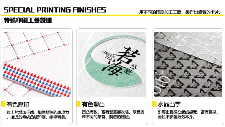
Recommendation: finishing areas look best when they are slightly larger and cleaner; overly intricate details can compromise the result.
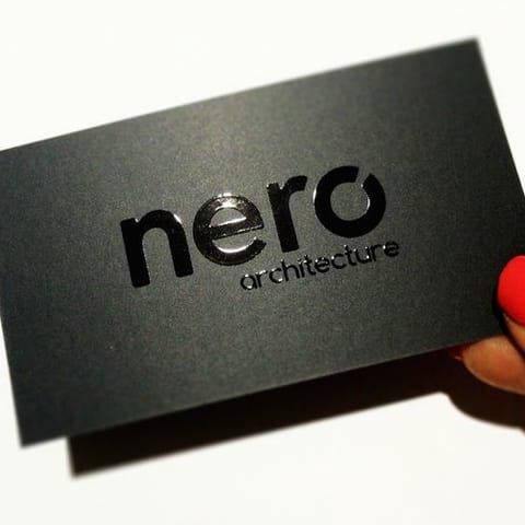
Reflective metallic foil adds a refined finish. Applying it only to a logo or name is usually enough to create a premium effect.
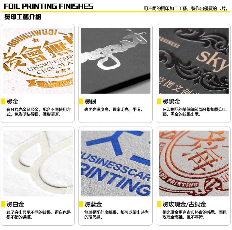
If you would like help choosing a finish, send us your industry and preferred look via WhatsApp. We will recommend the most reliable option.
| Item | Recommendation | Common Errors |
|---|---|---|
| Provide a "separate finishing layer" Spot Layer |
Create a separate "finishing separation" layer using K100% single-colour vector shapes. Use one layer for each finish (Foil / UV / Emboss separately). | Treating the finish as a printed CMYK graphic or merging it into the base artwork can cause registration and plate-output errors. |
| Colour settings 100% black only |
Use 100% Black (K) for the finishing separation. Do not use greyscale, gradients or transparency; shapes must have a solid fill. | Gradients or transparency are not supported for UV or foil stamping; the finished result may appear banded or distorted. |
| Minimum line / type size Avoid very fine details |
Recommended: line width ≥ 0.3mm; small type ≥ 6pt; small holes / gaps ≥ 0.35mm (simpler designs are more reliable). | Very fine lines, very small type and dense detail can result in broken lines, sticking foil or incomplete embossing. |
| Clearance / margins Distance from the trim line |
Keep finishing areas ≥ 2mm from the trim line. Avoid fine finishing details near rounded corners, where details can be lost. | If a finishing area touches an edge or rounded corner, even a slight cutting shift can create a gap or broken edge. |
| Special notes for embossing / debossing Do not make it too dense |
Avoid overly intricate embossing. Leave ≥ 0.5mm between separate elements. For "blind embossing", an unprinted background makes the effect stand out more clearly. | Intricate embossed patterns may look blurred or have untidy edges, while full-coverage embossing can be uneven. |
| Output format Safest: AI / PDF |
Supply AI (with layers retained) or PDF (with the finishing layer still separate). Convert all text to outlines and embed all images. | Supplying only a JPG/PNG, or flattening the finishing and base artwork together, makes registration and checking difficult and increases revision time. |
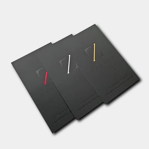
Tip: for the best finishing result, use less, make it slightly larger and keep it clean. A popular premium approach is to apply gold foil to the logo or name and print everything else normally. It is simple but memorable.
(If you prefer not to separate the layers yourself, send us your AI/PDF. We can extract the finishing layer and provide a preview for confirmation.)
Use CMYK
Create your artwork in CMYK colour mode and at the correct dimensions
Ensure image clarity
All images should look sharp at 100%, at a minimum of 300dpi or above
Create outlines
Convert all text to outlines and embed all images or linked objects
Save your file
We accept PDF, AI and PSD source files; for special finishes we accept AI only
From posters and backdrops to booklets, we do it all! Let our professional design team craft eye-catching print work for you.
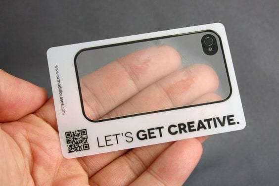
Do transparent PVC cards have to be printed with white ink? Not always — but white text, light-coloured logos, fine print, double-sided content and QR codes usually do. This guide explains what white ink actually does, when to add it (as a spot backing or a full fill), how it differs on clear PVC cards versus stickers, and how to prepare a clean white-ink file before you print.
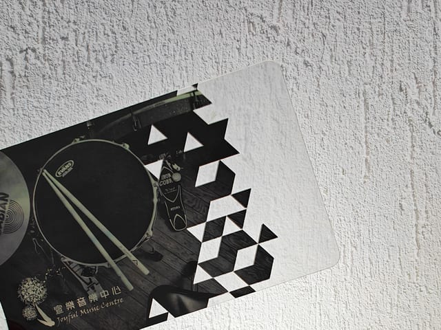
Transparent PVC cards use clear, semi-transparent or frosted stock to show off your design in a way ordinary paper can't. This guide covers how they print — single- vs double-sided, why double-sided needs a white-ink backing, and finishes like foil stamping and embossing — with real card examples rated for recommendation and design difficulty.
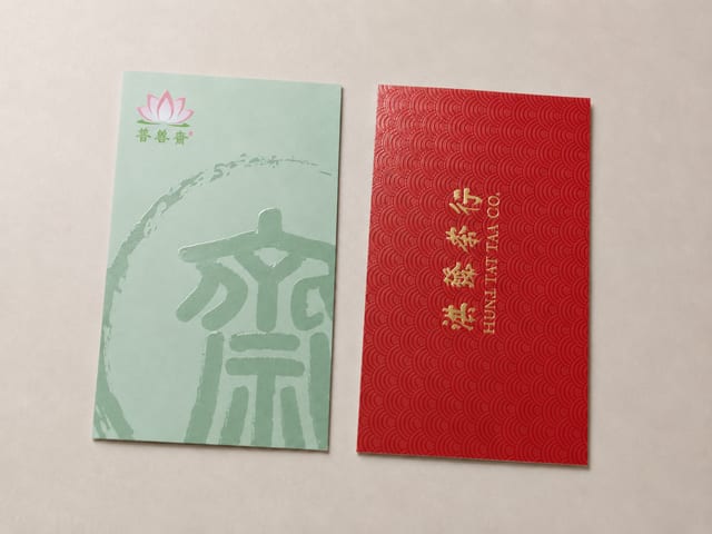
Should specialty paper cards get spot UV? Textured stocks win on grain and hand-feel, while spot UV needs a smoother, laminated surface to read as crisp and glossy. This guide explains why the two rarely pair well, when to choose spot UV matte cards versus specialty paper cards, and what to confirm before you send artwork.

The paper bag has become a fixture of modern life, and a distinctive custom one is a powerful carrier for your brand image. This showcase walks through four styles we print — red leather-grain gift bags with gold foil, spot-colour bags, gold-foil marble designs, and minimalist white card stock — and the finishes behind each.

Clear, translucent, or frosted? Transparent PVC cards each have a distinct look and their own constraints. This guide covers what sets the three finishes apart, why single-sided printing is usually the safe choice, how a white-ink underprint makes double-sided work, and finishes like foil stamping, die-cutting and cut-outs — so you know what's possible before you print.
Paper size shapes both the design and the purpose of a printed piece, so it pays to set your dimensions first. This guide covers A, B and C series sheets, postcards and business cards — with trim and bleed sizes for every format, including the 90 × 54 mm card standard used across Hong Kong and Macau.