Shopping Bag
Your bag is empty — browse and find something you like?

Your bag is empty — browse and find something you like?
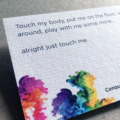
Conqueror paper cards have a striped, tactile texture and distinctive classic character. Printing Banana uses 300gsm stock to give every card a premium hand feel and make an excellent impression.
If you want a card that feels impressive without relying on elaborate decoration, Conqueror laid paper is a reliably smart choice: the paper has a natural raised horizontal laid texture, giving it more visual depth and a more distinctive feel. Pair it with a dark design, generous white space, hot foil stamping or embossing for an instantly more premium, professional result. Ideal for lawyers, consultants, architecture and interior design studios, brand owners, or anyone seeking a composed, vintage and timeless look.
The texture naturally adds depth. With sufficiently bold type and generous white space, the whole card will look timeless.
Conqueror laid paper already has a three-dimensional feel. Applying a finish only to the focal point gives the best value and impact.
You do not need many colours; the paper texture already creates a mid-century feel. It is particularly suitable for handmade businesses, food and drink, and brand owners.
| Item | Details | Recommended Uses |
|---|---|---|
| Finished Size Standard name card |
Finished size 90 × 54mm: the most common size, easy to hand out and a neat fit in a wallet. | Name cards for any industry, small brand cards and event invitations. |
| Paper 300gsm Conqueror laid paper |
The entire sheet has a "flowing horizontal laid pattern" with a raised feel, giving it strong vintage character and a more premium feel in the hand. | Brands and professional services seeking a composed, vintage and timeless style. |
| Paper Colour Options Two warm shades |
Off-white looks cleaner and more professional; cream feels warmer and more vintage. Both pair beautifully with dark lettering and metallic finishes. | Off-white: corporate / consultancy | Cream: food and drink / handmade / vintage brands. |
| Quantity From 100 cards |
Common quantities: 100 / 200 / 300 / 500 / 1,000 cards, making it easy to test the paper colour with a small run before reprinting. | Start-ups / personal brands: 100–300 | Teams: 500+. |
Tip: the laid texture is already part of the design—the simpler the design, the more the paper character stands out; more white space gives a more premium result.
The raised horizontal laid texture adds dimension. Even a single logo and two lines of text will not look "flat" or "thin".
Navy, forest green, brown and burgundy all work beautifully. Good contrast makes the laid texture clearer and more timeless.
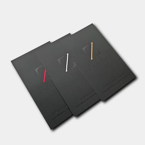
Gold foil / silver foil / debossing all pair well with Conqueror laid paper. For the best value, apply the finish only to a focal point (logo / name / job title).
Want a tactile feature people remember? Choose just one focal area: the logo / surname / brand emblem gives the most reliable and polished result.
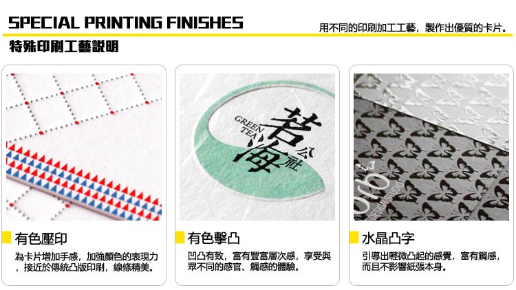
Advice: finishing areas look best when slightly larger and cleaner; overly fine / dense details can affect formation and clarity.
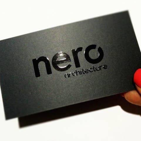
Reflective metallic foil adds a tactile, dimensional quality. Applying it only to the logo / name is usually enough to create a strong presence.
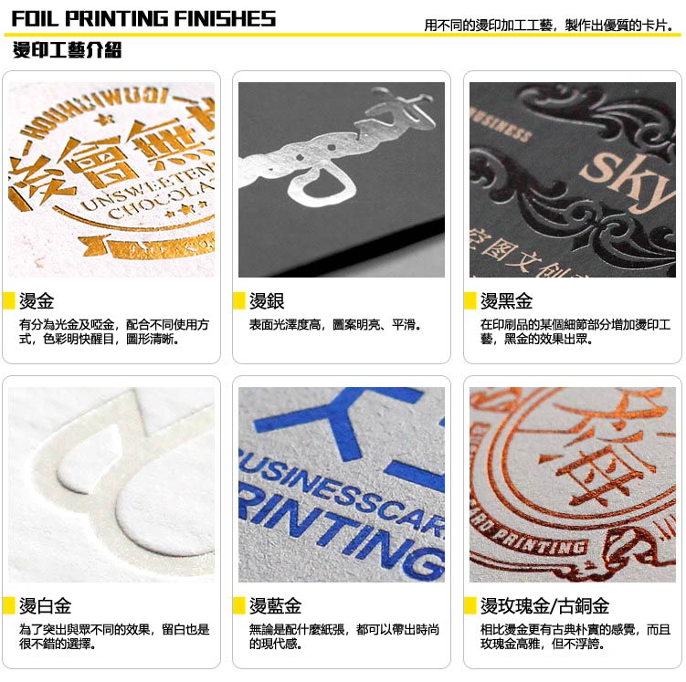
If you are unsure which finish to use, WhatsApp us with your industry and desired feel. We will recommend the most reliable option.
| Item | Recommended Approach | Common Errors |
|---|---|---|
| Provide a "Separate Finishing Layer" Spot Layer |
Create a separate "finishing mask artwork" layer using K100% single-colour vector graphics; use one layer for each finish (separate Foil / UV / Emboss layers). | Treating the finish as a CMYK design to be printed, or merging it into the background artwork, can easily cause registration / film-output errors. |
| Fine Type / Thin-Line Limits Avoid overly fine details |
Recommended: finishing text ≥ 8pt; lines ≥ 0.6pt (0.2mm); spacing between two finishing areas ≥ 0.7mm. | Overly thin lines, small type or complex details can result in broken lines / foil sticking / an unsatisfactory finish. |
| Registration Tolerance Within the normal range |
A registration variance of approximately 2–3mm for spot UV and 0.5–1mm for hot foil is normal. Allowing space in the design gives a more reliable result. | Overlaying foil content exactly on the printed content can make any registration variance look like misalignment. |
| Clearance Keep away from the trim line |
Keep finishing areas away from the trim line / die-cut area to reduce the risk of peeling from cutting pressure. | If a finish runs right to the edge, even a slight cutting variance can cause missing corners or foil loss. |
For the best result: use slightly less, make it slightly larger and keep it slightly cleaner. The most common premium approach is gold foil on the logo / name + normal printing for the remaining content: simple, yet highly memorable.
(If you do not have finished artwork, send us your logo / text details / style reference. We can lay it out within the safe area before printing.)
Use CMYK
Create your artwork in CMYK colour mode and at the correct dimensions
Ensure image clarity
All images should look sharp at 100%, at a minimum of 300dpi or above
Create outlines
Convert all text to outlines and embed all images or linked objects
Save your file
We accept PDF, AI and PSD source files; for special finishes we accept AI only
From posters and backdrops to booklets, we do it all! Let our professional design team craft eye-catching print work for you.
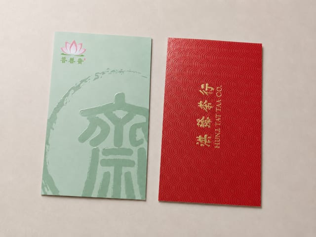
Should specialty paper cards get spot UV? Textured stocks win on grain and hand-feel, while spot UV needs a smoother, laminated surface to read as crisp and glossy. This guide explains why the two rarely pair well, when to choose spot UV matte cards versus specialty paper cards, and what to confirm before you send artwork.

The paper bag has become a fixture of modern life, and a distinctive custom one is a powerful carrier for your brand image. This showcase walks through four styles we print — red leather-grain gift bags with gold foil, spot-colour bags, gold-foil marble designs, and minimalist white card stock — and the finishes behind each.
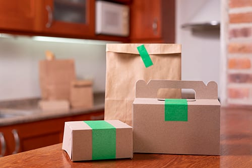
Sustainability policies keep tightening and customers increasingly expect eco-friendly packaging, but greener printing costs more. A Hong Kong printer's guide to choosing paper packaging that balances sustainability, protection and cost, from kraft and FSC-certified stocks to practical ways to cut waste.
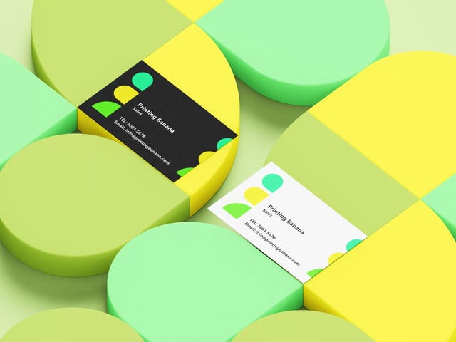
In Hong Kong's business world, the paper you print your cards on says as much as the design. This guide ranks the five most popular business card stocks — thick cotton (9/10), black card (8/10), matte laminated (7.5/10), recycled paper (7/10) and specialty stock (6/10) — and explains the gloss, texture and weight details that separate a good card from a cheap one.
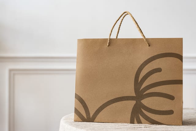
Ever noticed how a well-designed paper bag can make a brand more memorable? Custom paper bag printing is the key. This guide covers what printed bags are used for, the paper, finishing and handle choices, and practical tips for briefing a printer and ordering the right run in Hong Kong.

Planning a card paper box or plain box? Before you ask for a quote, let the product's size, weight, purpose and display needs point you toward a tuck-end, lock-bottom, auto-bottom, sleeve, display or window box — and see exactly what to send our Hong Kong team.