Shopping Bag
Your bag is empty — browse and find something you like?

Your bag is empty — browse and find something you like?
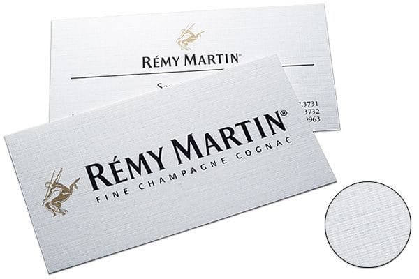
Linen-texture paper is a tactile imported stock with fine, irregular crosshatch embossing for a balanced textured look. It is not a textile fibre; it is abrasion-resistant, bright, colourfast, tough, fold-resistant, distinctively textured and dimensional.
Want name cards with a premium feel without relying on gloss lamination? Linen-texture paper features fine, all-over crosshatch embossing that adds visual depth and a more tactile finish. Pair it with a minimalist layout, dark text and a small amount of hot foil stamping or embossing at a focal point for a polished, timeless business look. Especially suitable for consultants, solicitors, architects and interior designers, brand founders, or companies with a classic or artistic identity.
The linen texture already adds depth, so a cleaner layout looks more premium; concentrating the key details gives them greater presence.
Finishing works best when focused on one spot: you do not need much, but precision matters; it will be remembered at a touch.
The crosshatch texture gives the design a more composed look; pair it with fine-line seals or a seal-style mark for a timeless, tasteful finish.
| Item | Details | Recommended uses |
|---|---|---|
| Finished size Standard name card |
Finished size: 90 × 54mm, the most common format, easy to hand out and store. | Personal name cards, company name cards and brand cards. |
| Paper 300gsm linen-texture paper |
The surface has a fine crosshatch embossing, adding tactile and visual depth. The stock is sturdy and abrasion-resistant, with an overall feel that is refined, artistic and timeless. | Professional services, business settings and brands seeking a classic / artistic image. |
| Quantity Popular quantities |
100 / 200 / 300 / 500 cards (ideal for testing a design first, then reprinting as required). | Individuals / start-ups: 100–300 | teams: 300–500+ |
| Optional finishes A small detail makes a big upgrade |
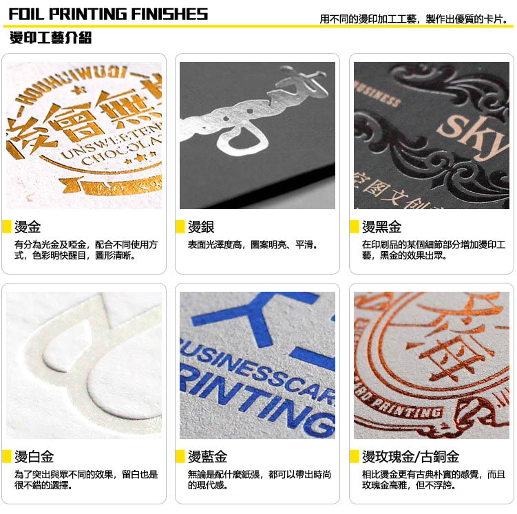
Supports gold / silver foil, debossing / embossing, spot UV, white ink and more. For the best effect, keep the finish focused on the logo / name / heading. | For greater impact and a memorable tactile detail; particularly suitable for VIPs / premium clients. |
Tip: linen-texture paper already has character. The simpler the design and the more generous the white space, the more its texture stands out; too many small details can make the design look cluttered.
Even a logo and two lines of text will not look flat; the linen texture adds depth automatically.
The sturdy, substantial paper suits frequent handing out / everyday use and feels weighty in the hand.
Linen texture + one focal finishing detail makes the card more memorable; use less, but execute it precisely.
To create a memorable tactile detail, use a localised finish at one focal point; a logo, surname or brand seal works particularly well.
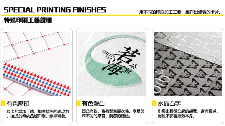
Tip: slightly larger, cleaner finishing areas give the best result; overly fine detail can affect how well the finish forms.
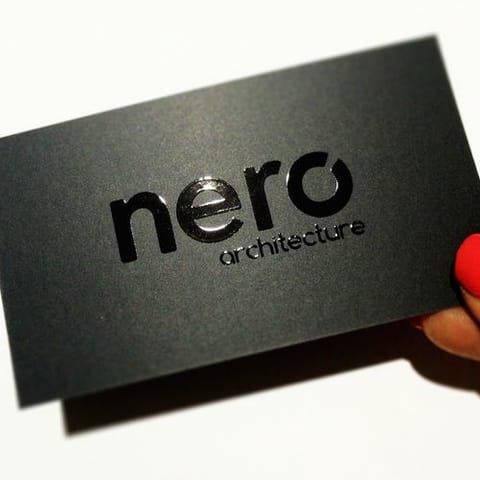
Reflective metallic foil with a refined texture. Applying it only to the logo / name is usually enough for a premium look; there is no need to overuse it.
Want help choosing? Send us your industry and desired look on WhatsApp and we will recommend the most reliable option.
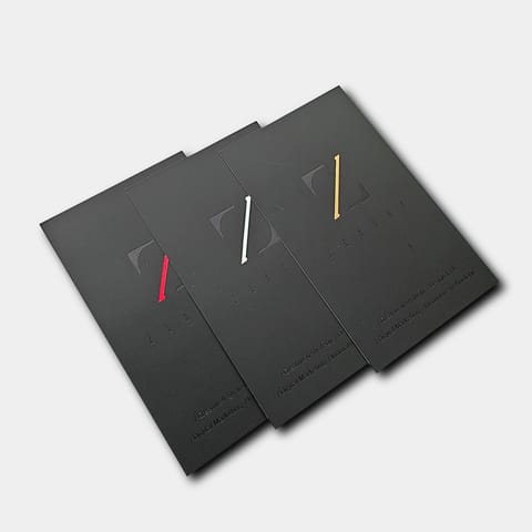
Recommended for the logo / name / heading: it focuses attention and is easy to remember. The linen-texture background gives metallic shine more dimension, so a small amount is highly effective.
The first choice for an understated look: it does not need to reflect light, but the tactile finish makes you more memorable. Especially suitable for a debossed logo or embossed name.
White ink creates minimalist contrast on dark designs; spot UV adds layers of gloss (for example, localised varnish on a logo or pattern), but avoid covering a large area.
Want to add a finish but unsure where? The safest approach is to apply it to one focal point (logo or name), leaving the rest as white space; the linen-texture paper will naturally add tactility.
| Item | Recommended setup | Common mistakes |
|---|---|---|
| Finishing artwork format Dedicated finishing layers |
Provide a layered AI file: place each finish on a separate layer (for example: FOIL_GOLD / SPOTUV / WHITEINK) and label it clearly. | Merging the finish with CMYK on one layer, omitting labels, or supplying only JPG/PNG. |
| Artwork colour 100% K |
Use 100% Black (K=100) in finishing artwork to mark the finishing areas; do not use gradients or transparency. | Using greyscale / gradients in finishing artwork, resulting in unclear finishing edges. |
| Minimum line weight / type size Ensures reproducible detail |
Recommended: lines ≥ 0.25mm; small type ≥ 6pt (smaller details are more likely to distort / cause foil bridging). | Lines or type that are too fine; the finished piece may have broken lines or unattractive foil bridging. |
| Safe distance Avoid trimming errors |
Keep finishing elements at least 2mm from the trim edge; for small type / fine lines, at least 3mm is more reliable. | Finishing elements too close to the edge can be cut into or misaligned by slight trimming variation. |
| Overprint / knockout Relationship between printing and finishing |
If a finish needs to cover the base colour (for example, white ink), please specify this. Also specify any required knockout. As a general rule, avoid too many tiny perforations in finishing areas for a cleaner result. |
Not specifying overprint / knockout requirements, resulting in a finished effect that differs from expectations. |
(If you are unsure how to prepare finishing artwork, send the AI file on WhatsApp and tell us which finish you want. We can check it first to avoid repeated revisions.)
(If you do not have ready artwork, send us your logo / text / style reference and we can lay it out within the safe area before printing.)
Use CMYK
Create your artwork in CMYK colour mode and at the correct dimensions
Ensure image clarity
All images should look sharp at 100%, at a minimum of 300dpi or above
Create outlines
Convert all text to outlines and embed all images or linked objects
Save your file
We accept PDF, AI and PSD source files; for special finishes we accept AI only
From posters and backdrops to booklets, we do it all! Let our professional design team craft eye-catching print work for you.
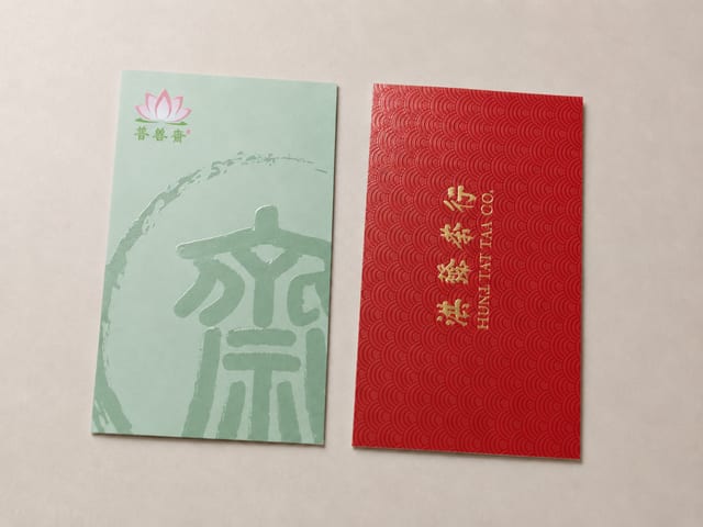
Should specialty paper cards get spot UV? Textured stocks win on grain and hand-feel, while spot UV needs a smoother, laminated surface to read as crisp and glossy. This guide explains why the two rarely pair well, when to choose spot UV matte cards versus specialty paper cards, and what to confirm before you send artwork.

The paper bag has become a fixture of modern life, and a distinctive custom one is a powerful carrier for your brand image. This showcase walks through four styles we print — red leather-grain gift bags with gold foil, spot-colour bags, gold-foil marble designs, and minimalist white card stock — and the finishes behind each.
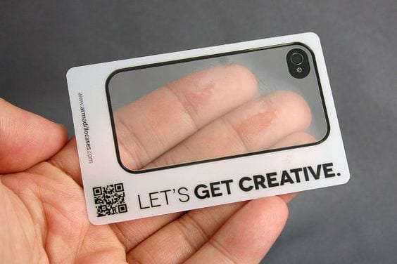
Do transparent PVC cards have to be printed with white ink? Not always — but white text, light-coloured logos, fine print, double-sided content and QR codes usually do. This guide explains what white ink actually does, when to add it (as a spot backing or a full fill), how it differs on clear PVC cards versus stickers, and how to prepare a clean white-ink file before you print.
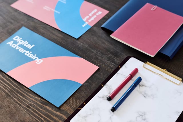
Paper size shapes both the design and the purpose of a printed piece, so it pays to set your dimensions first. This guide covers A, B and C series sheets, postcards and business cards — with trim and bleed sizes for every format, including the 90 × 54 mm card standard used across Hong Kong and Macau.
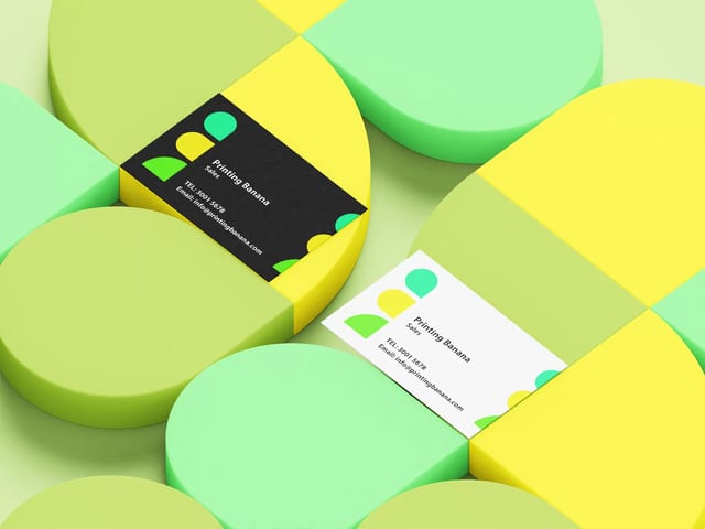
In Hong Kong's business world, the paper you print your cards on says as much as the design. This guide ranks the five most popular business card stocks — thick cotton (9/10), black card (8/10), matte laminated (7.5/10), recycled paper (7/10) and specialty stock (6/10) — and explains the gloss, texture and weight details that separate a good card from a cheap one.

Of all the ways to finish a card, laser cutting is the most striking — a focused beam slices clean through the stock to create details no die-cut can match. This guide covers how the process works, the 8mm and 1mm artwork rules designers need to know, and how duplex and coloured stock make the cut-out really stand out.