Shopping Bag
Your bag is empty — browse and find something you like?

Your bag is empty — browse and find something you like?

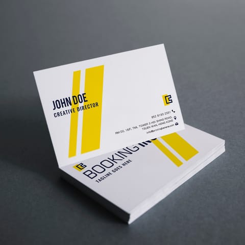
Ice-white paper card is one of the selected specialty stocks from Printing Banana and the most shimmering of them all. Its cool white, diffused pearlescent surface shifts with the viewing angle, making full-colour and metallic designs stand out.
Want a name card that makes an immediate impression? Ice-white pearlescent paper delivers understated yet eye-catching luxury, with fine shimmering flecks across its surface. Turn it in the light and natural layers of light and shade appear. Pair it with dark typography, a metallic-look logo or one focal finish (hot foil stamping or debossing), and the finished card gains depth and becomes a polished calling card for a premium brand.
Dark blue, black or burgundy creates the best contrast against the pearlescent stock. The cleaner the layout, the more the paper stands out.
Use hot foil stamping, debossing or spot UV only on the focal area for a more refined, lasting and cost-effective result.
Avoid cramming in information. Generous white space and minimal text will naturally look premium and professional.
| Item | Details | Recommended use |
|---|---|---|
| Finished size Standard name card |
Trim Area: 90 × 54mm (the most common name card size). | Company name cards, personal brand cards and studio name cards. |
| Bleed / safe area Follow when supplying artwork |
Bleed Area: 96 × 60mm; Safe Area: 84 × 48mm (keep important text and logos within the safe area). | Prevents trimming tolerances from cutting into text or placing it too close to the edge. |
| Paper stock 300gsm ice-white paper |
Thick and sturdy, with fine pearlescent flecks that create natural layers of light and shade from different angles. | Memorable name cards and premium brand identities. |
| Printing CMYK |
Single- or double-sided printing is available. Pearlescent paper softens light colours and adds depth to dark colours (see Design / Finishing Advice first). | Dark typography, metallic-look key visuals and boutique brands. |
| Quantity options Popular |
100 cards
200 cards
300 cards
500 cards
1,000 cards
|
Start-ups / individuals: 100–300 | team distribution: 500+. |
| Compatible finishes Optional upgrades |
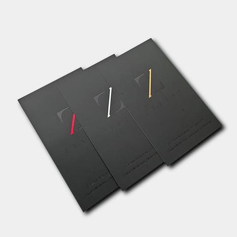
Available as required: gold / silver foil stamping, spot UV, debossing / embossing, raised crystal lettering and white ink (best used only on a focal area). | Premium brands, VIP clients and occasions that call for a strong impression. |
Tip: ice-white paper already has its own shimmer, so the design does not need to be elaborate. Cleaner layouts with more white space look more refined.
The shimmer is fine rather than overpowering. Light creates natural tonal variation, making it ideal for important occasions.
The substantial 300gsm stock resists curling when handed out, while clean typography instantly elevates its professional feel.
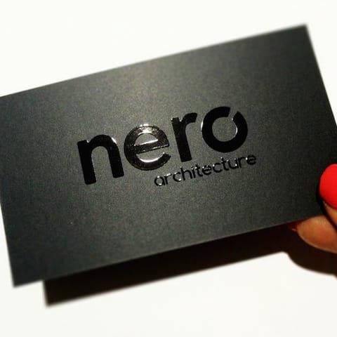
The pearlescent base gives metallic effects greater depth. Apply foil or debossing only to the logo or name for a focused, timeless result.
Want a tactile detail that people remember? Choose just one focal area. A logo, surname or brand mark gives the most reliable, polished result.
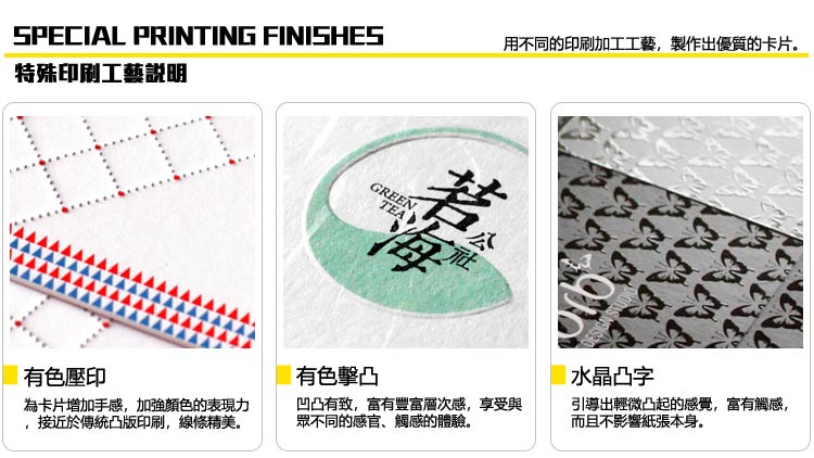
Advice: slightly larger, cleaner finished areas look best. Fine or crowded details can affect clarity and formation.
Reflective metallic foil adds dimensional texture. Applying it only to the logo or name usually creates plenty of impact.
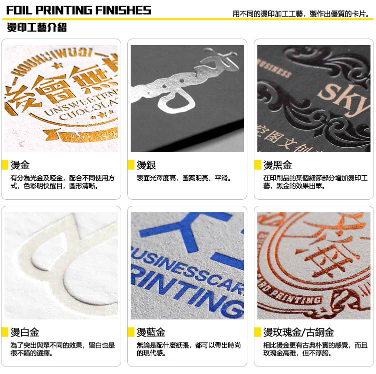
If you are unsure which finish to use, WhatsApp us with your industry and style and we will recommend the most suitable option.
| Item | Recommended method | Common mistakes |
|---|---|---|
| One separate layer for each finish Spot Layer |
Place hot foil stamping / UV / debossing / white ink on separate, clearly named layers (for example: FOIL / UV / EMBOSS / WHITE). | Combining finish areas with the main artwork or leaving layers unnamed can cause misregistered output or the wrong finish. |
| Spot artwork colour Single-colour vector |
Create the spot artwork as a K100% (or spot colour) solid vector; do not use gradients or transparency. | RGB black, greyscale, transparent gradients or image masks can affect output. |
| Minimum line / type size Avoid very fine details |
Recommended: finish text ≥ 8pt; lines ≥ 0.6pt (approximately 0.2mm); spacing between details ≥ 0.7mm. | Very fine lines, small text or crowded details may foil poorly, deboss indistinctly or break up. |
| Registration tolerance Within the normal range |
Spot UV tolerance is approximately 2–3mm; hot foil stamping tolerance is approximately 0.5–1mm. Allowing space in the design produces a more reliable result. | Perfectly overlapping finished and printed areas makes any misregistration most visible. Add slight clearance or make the element bolder. |
| White ink (WHITE) Common on dark backgrounds |
White ink requires a separate layer: WHITE. For overprinting white ink + CMYK, confirm the printing order first (white underprint / white overprint). | Treating white ink as CMYK white or failing to separate the layer prevents the white-ink effect from being produced. |
For the best result = use less, make it slightly larger and keep it clean. The most popular premium approach: hot-foil the logo / name + print the remaining content normally. It is simple yet memorable.
(If you do not have a template, AI / PSD / PDF templates are available on this page. WhatsApp us and we will send you the download link.)
Use CMYK
Create your artwork in CMYK colour mode and at the correct dimensions
Ensure image clarity
All images should look sharp at 100%, at a minimum of 300dpi or above
Create outlines
Convert all text to outlines and embed all images or linked objects
Save your file
We accept PDF, AI and PSD source files; for special finishes we accept AI only
From posters and backdrops to booklets, we do it all! Let our professional design team craft eye-catching print work for you.
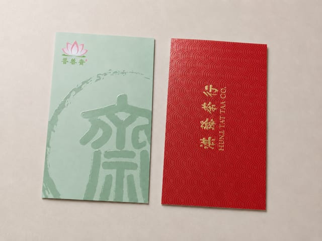
Should specialty paper cards get spot UV? Textured stocks win on grain and hand-feel, while spot UV needs a smoother, laminated surface to read as crisp and glossy. This guide explains why the two rarely pair well, when to choose spot UV matte cards versus specialty paper cards, and what to confirm before you send artwork.

The paper bag has become a fixture of modern life, and a distinctive custom one is a powerful carrier for your brand image. This showcase walks through four styles we print — red leather-grain gift bags with gold foil, spot-colour bags, gold-foil marble designs, and minimalist white card stock — and the finishes behind each.
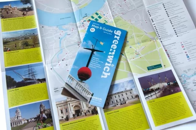
Notice a white line or cracked fibres along the fold of your printed leaflet? It's rarely the printer's mistake — it comes down to the paper's weight, grain direction and printed colour. This guide explains what causes those white edges and shows three practical fixes: choosing a lighter stock, scoring before folding, and laminating for a tougher, cleaner fold.

PVC business cards are made from the same durable plastic as your bank and Octopus cards — waterproof, stain-resistant and hard to damage, yet slim enough at 0.38 mm to slip into any wallet. This quick guide covers how PVC compares to paper stock and walks through the main finishes: standard transparent, white-ink and frosted (coarse and fine grain).
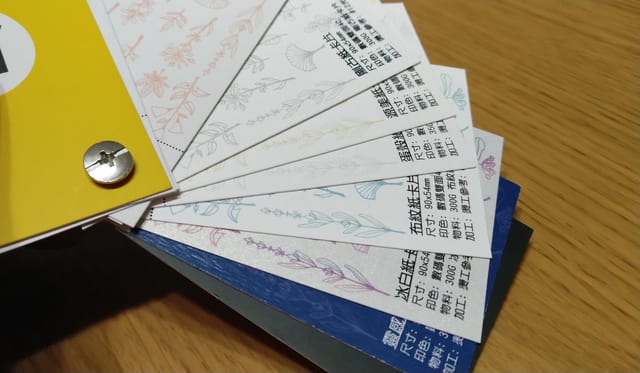
Your business card is often the first impression a new contact takes away, so it pays to print it on something better than plain matte stock. This guide walks through four specialty papers — linen-texture, ice-white pearlescent, Conqueror and Inspiration — with each one's weight, price tiers, the look it gives, and when to keep heavy dark ink off the sheet.
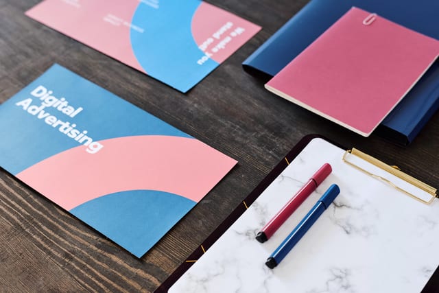
Paper size shapes both the design and the purpose of a printed piece, so it pays to set your dimensions first. This guide covers A, B and C series sheets, postcards and business cards — with trim and bleed sizes for every format, including the 90 × 54 mm card standard used across Hong Kong and Macau.