
Specialty paper cards are usually not the best candidate for spot UV. Textured stocks earn their keep through grain, hand-feel and natural character; spot UV, by contrast, needs a smoother, laminated surface to read as crisp, glossy and high in contrast.
When Hong Kong SMEs, designers and consultant-style brands order business cards, a common wish is: "I want a beautiful stock, and I'd like the logo to have a little shine." That's understandable — but before you send artwork, be clear about one thing: is the star of this card the paper texture, or the glossy spot-UV effect?
If you want the logo, a pattern or key text to look reflective, raised and glossy, you're usually better off with a card designed for UV, such as spot UV matte-laminated business cards. If instead you love the grain and hand-feel of the paper itself, a specialty paper card should keep its paper character — you don't have to force UV onto it.
The short answer: specialty paper and spot UV aren't a natural pairing
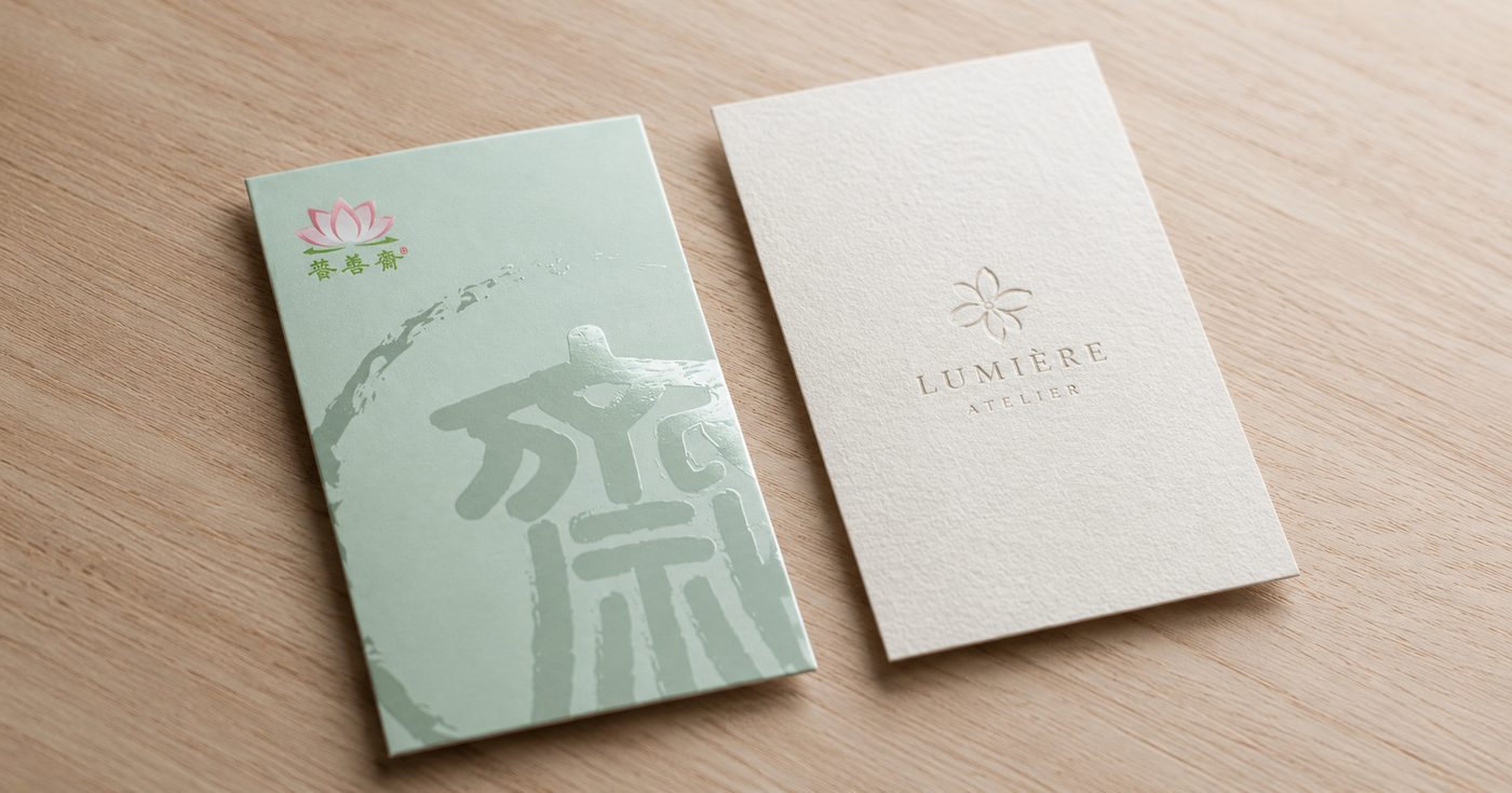
Many customers ask: "I want a nice stock, and I also want to add UV — can I?" It's a reasonable idea, because everyone wants a card that has both a paper feel and a finishing highlight. But not every print process stacks freely on top of another, and specialty paper plus spot UV is a prime example.
The value of specialty paper mostly comes from the surface itself. Ice White paper, for instance, looks clean, stiff and slightly pearlescent; Conqueror laid paper has a horizontally ribbed texture; linen-texture paper has a fabric-like touch. Laminate over these surfaces, or pile on heavy finishing, and you easily blunt the very paper character you paid for.
So the safer call is this: if you want gloss finishing and localised reflection, go the UV matte-laminated card route; if you want paper texture, natural hand-feel and a specialty-stock look, go the specialty paper card route — don't try to cram both effects onto one card.
What is spot UV?
Spot UV can be thought of as a glossy coating applied to specific spots on the card surface — commonly the logo, brand name, pattern lines, geometric texture or key text. Under light, the UV areas sit brighter than everything around them, giving the design depth and tactility.
The point isn't to make the whole card shiny, but to give certain areas contrast. A transparent gloss logo on a black background, a spot pattern on a clean card, a touch of shine on the brand name — all of these read as more refined than a card crammed with effects everywhere.
But spot UV is fairly demanding of the surface. The smoother the surface, the crisper the UV edges and gloss; the rougher and more textured the surface, the more the UV effect is disturbed by the paper grain, and it can end up far less obvious than you imagined.
Why isn't specialty paper suited to spot UV?
The first reason is that specialty-paper surfaces usually aren't perfectly smooth. Stocks like Conqueror laid paper and linen-texture paper have grain built in. Apply UV over an uneven surface and the result may not be flat enough, with edges that aren't as clean as they would be on a matte-laminated card.
The second reason is that if you laminate specialty paper first and then apply UV, the paper's original hand-feel can be covered up. Take linen-texture paper: after lamination its fabric touch weakens, and the stock's own character no longer stands out. That's effectively paying for specialty paper and then hiding its appeal under a laminate — not necessarily good value.
The third reason is that the design easily loses focus. Specialty paper already has texture; add too much gloss, reflection or finishing on top and the composition can become too busy. For a business card, being clear, easy on the eye and true to the brand usually matters more than piling on techniques.
When are spot UV matte cards the right choice?
If your priority is localised reflection, a glossy logo, layered patterns or a more modern brand effect, spot UV matte cards are usually the better fit. According to the product spec, Printing Banana's spot UV matte cards use 300gsm double-side-coated card, measure 90 x 54 mm, and come in quantity options of 200, 300, 500 and 1,000.
These cards typically pair a smoother card surface with a glossy UV effect, creating contrast between the matte look and the glossy highlights. That contrast is exactly what makes UV cards appealing.
They suit situations like:
You want the brand logo to have a little reflective depth.
The card layout is fairly clean and you want a memorable detail from the finishing.
You want a glossy effect on a black, dark or understated background.
You want the card to look more modern, corporate and refined.
When are specialty paper cards the right choice?
If you care more about the paper's own touch, texture, warmth and natural look, the specialty-paper route suits you better than UV. Ice White paper, for example, suits cards that want to be clean, stiff and finely luminous; laid paper has a horizontally ribbed surface that suits more elegant, consultant-style, design-led or brand-heavy cards.
Specialty paper cards don't necessarily need much finishing. Often, white space, typeface, paper colour and layout proportions are already enough to give the card texture. Especially when the surface itself is grained, too much finishing actually steals attention from the paper's own character.
You can judge it like this:
The effect you want | Better-suited option |
|---|---|
Glossy reflection on the logo or a pattern | Spot UV matte cards |
Grain and texture you can feel in the hand | Specialty paper cards |
A card that looks modern, sharp and high-contrast | Spot UV matte cards |
A card that looks natural, soft and paper-forward | Ice White paper cards, Conqueror laid paper cards or linen-texture paper cards |
How should you decide at the design stage?
Before you design a card, ask yourself one question: is the star of this card the "finishing effect" or the "paper texture"? If the star is the finishing, choose a base stock and surface treatment suited to that process first; if the star is the paper texture, let the paper do the work and don't smother it with too much post-processing.
If you want spot UV, watch that the UV areas aren't too small, too thin or too dense. Very fine lines or very small text may be technically possible but won't necessarily read clearly in practice. Logos, shapes, simple lines and clearer patterns usually take UV better than fine text.
If you want specialty paper, think the other way: don't make the typeface too thin, the lines too fine, or the colour too reliant on how it looks on screen. When paper has grain, very fine content can be affected by the surface and lose clarity.
What to confirm before you send artwork
Whether you finally choose spot UV matte cards or specialty paper cards, confirm before submission that the finishing and the stock work together. Don't wait until the design is finished to ask "can I add UV?", because finishing affects the layout, the layers, the line sizes and the file settings.
Before sending artwork, you can check:
Whether you've decided the star is the UV finishing or the specialty-paper texture.
If doing UV, whether the UV areas are clearly marked.
Whether the UV pattern is too small, too thin or too dense.
If using specialty paper, whether the typeface and lines are clear enough.
Whether key text, phone numbers, URLs and QR codes are easy to read.
Whether the file is in CMYK.
Whether the text has been converted to outlines.
Whether images are embedded or correctly linked.
Ideally you decide the stock and finishing direction early in the design. That way the layout, type weight, logo size and white-space proportions can all be planned to match from the start, instead of forcing an effect on at the end.
FAQ
Can specialty paper cards have spot UV?
Generally not recommended. Specialty-paper surfaces usually have grain or a special paper feel, so spot UV may not produce a clear, smooth, strongly reflective effect. If you want a UV effect, spot UV matte cards are the better fit.
Why does UV usually go with matte-laminated cards?
Because matte-laminated cards have a smoother surface, so there's clear contrast between the matte base and the glossy UV. That contrast is the main visual effect of spot UV.
Can I laminate specialty paper and then apply UV?
Technically it can be re-evaluated in some cases, but it isn't always worth it. Lamination weakens specialty paper's own grain and hand-feel, and if you use specialty paper only to cover its texture, you may lose the point of choosing it.
What designs suit Ice White, Conqueror laid and linen-texture paper?
These stocks suit clean designs that value paper feel and brand character. Typefaces, logos and lines need to be clear enough and shouldn't be too fine. The paper already has texture, so the design doesn't need to be too complex.
If I want a card with both texture and a glossy effect, how should I choose?
Decide which effect matters more first. If the glossy logo and reflective depth are the star, choose spot UV matte cards; if the paper's hand-feel and natural grain are the star, choose specialty paper cards and build the texture through layout and white space.
Ask us
Before you start designing a card, it helps to gather your brand feel, the content you want to highlight, whether you need spot UV, and whether you care more about paper texture. If you're not sure whether to use spot UV matte cards or specialty paper cards, send your design direction, logo and the effect you want to Printing Banana (印蕉) and we can help you judge which stock and finishing direction fits best. We deliver across Hong Kong and Macau, and you're welcome to WhatsApp us at +852 3001 5678 (English is fine).


