
With corporate red packets, the thing that usually trips people up isn't whether the design looks pretty enough — it's whether the finished piece looks polished enough. Messy foil edges, text clipped by the trim, notes that won't slide in cleanly, or the biggest note of all — the HK$1,000 — that simply won't fit. Any one of those turns into an awkward surprise once the whole batch is printed.
If you want to place one order and get it right the first time, three things cover it. First, size to the HK$1,000 note as your ceiling and leave a safety margin on the inner dimensions. Second, let one hero finish carry the texture — foil, or embossed foil. Third, when you hand off the file, keep the finish artwork layered, in solid colour, and as vector, so it never looks pasted-on or drifts out of register.
If you're ready to order:
- Go straight to the red packet product page: https://printingbanana.com/red_pocket
- Want it faster and safer? Use the 2026 design collection to drop your logo and greeting onto a ready-made template: https://printingbanana.com/2026/cny
Start with size: for corporate red packets, cap it at the HK$1,000 note so nothing gets left out
Corporate red packets usually have to accommodate a range of note values, so the safest approach is this: cap your design at the largest note — the HK$1,000 — then add a 2–3mm safety margin on every side. Notes slide in more easily, and the margin absorbs trimming and edge-gluing tolerances.
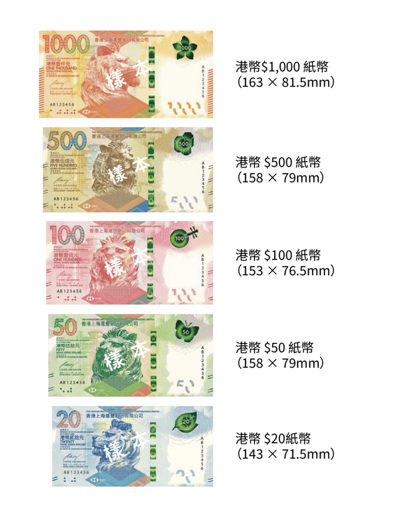
Hong Kong banknote sizes (a handy reference for red packet design)
- HK$1,000: 163 × 81.5 mm (the largest note; use it as your ceiling)
- HK$500: 158 × 79 mm (a common denomination for corporate giving)
- HK$100: 153 × 76.5 mm (high volume; a design with breathing room ages better)
- HK$50: 148 × 74 mm (if you go for a slim style, watch that notes still slide in smoothly)
- HK$20: 143 × 71.5 mm (don't size your packet backwards from this one)
How do you work out the inner dimension (the actual space a note drops into)?
Keep this rule of thumb in mind: the inner dimension should be 2–3mm larger than the note in both width and height before it truly slides in comfortably.
If you want a single size that handles everything — every denomination lying flat as a single note — the most-used corporate spec is a long 90 × 171mm packet, with an inner dimension of roughly 86 × 168mm (it takes a flat HK$1,000 note). For fuller guidance on sizes, die-cuts and note fit, see the complete red packet size guide (2026 edition): https://printingbanana.com/blog/all/4852/
Banknote sizes at a glance
Below is a visual comparison of each denomination. You'll see at a glance how the HK$1,000 compares in proportion to the others — and it makes it far easier to explain internally why you should cap the design at the largest note.
The safest paper-and-finish pairing for corporate red packets: red card stock + a foil logo (go embossed foil for more heft)
Corporate red packets need to feel classy without looking dated, and that rarely comes from an all-over pattern. It comes from clean layout, generous white space, and one focal finish.
The three directions we see most often — and trust most:
- The safe pick (what most companies choose): red card stock + foil.
Best used on: the logo, company name, or a four-character greeting — keep it to a single focal element. - The premium pick (you feel the difference in hand): red card stock + embossed foil.
Best used on: the logo or brand lettering, where the raised effect reads most clearly. - The brand pick (understated but photogenic): red card stock + foil, with optional spot UV as a subtle background pattern.
Best used on: a tone-on-tone base pattern (cloud motifs or geometrics), while the logo stays the focal point.
To narrow down the right route for your company faster, see the quick red packet selection guide: https://printingbanana.com/blog/all/4804/
The heart of file prep: keep finish artwork layered, solid, and vector
The most common finishes on corporate red packets are foil and embossed foil. Getting clean edges and accurate registration comes down to a few simple handoff rules:
- File format: AI or a layered PDF is best (vector plus layers is easiest to work with).
- Colour mode: use CMYK (RGB tends to shift colour when it goes to print).
- Finish areas (foil / emboss / UV): put them on their own layer, in 100% K solid black (or a spot colour), and avoid gradients, transparency, or halftones.
- Line weight: aim for ≥ 0.25mm; don't make reversed-out fine text too thin (too thin and it clogs up and turns illegible).
If you already have artwork but aren't sure the layers are right, the safest move is to pick your paper and finish on the red packet product page first, then submit the AI/PDF for a check: https://printingbanana.com/red_pocket
Five common file mistakes (the ones corporate red packets fall into most)
These five are what most often make a finished packet look less than polished. Avoid them one by one and you'll usually cut around 80% of the back-and-forth on revisions.
Mistake 1: The foil/emboss areas aren't on their own layer, or they're mixed in with the colour artwork.
Result: the finish plate is hard to register and the edges pick up dirt; in bad cases, background patterns get foiled that were never meant to be.
Fix: split FOIL / EMBOSS / UV onto separate layers and output each independently.
Mistake 2: Using gradients or transparency for the foil areas.
Result: the edges blur and the metallic look turns patchy.
Fix: keep finish areas in 100% K or a spot colour, and mostly vector.
Mistake 3: Fine text too thin, reversed-out text too small (especially an English company name or slogan).
Result: the foil clogs into a blob and the text isn't legible.
Fix: keep lines ≥ 0.25mm, bump up the weight on reversed-out text, and reserve the finish for the focal element — print the rest normally for a safer result.
Mistake 4: The logo or greeting sits too close to the edge.
Result: one slightly off trim clips the text and the piece looks off.
Fix: keep important content inside a safe margin — err on the conservative side.
Mistake 5: A die-cut line fighting with the design elements.
Result: the cut area looks messy and the whole thing reads as cluttered.
Fix: put the die-cut line on its own clearly labelled layer; keep cut-outs and windows ≥ 5mm from the edge to be safe.
Die-cut red packets: distinctive, but still play it safe
Some companies like a touch of die-cutting to make the packet more memorable — a cut-out window, a brand silhouette, a Year-of-the-Horse motif. The point isn't "the more complex the better"; it's a clean die-cut line and a safe margin around anything important.
- Keep the outline / die-cut line on its own, clearly labelled layer.
- Don't let the logo, greeting, or any key element crowd the outer cut edge.
For "distinctive yet high-end", the usual recipe is to hold the polish with clean layout and a focal finish first, then add a small amount of die-cutting as a signature detail — the effect ages better that way.
How to plan turnaround properly: for a big corporate run, don't count print time alone
Corporate red packets usually go through proofing, sign-off, and a finish-area check. Budget an extra 2–3 working days as a buffer for internal approvals and revisions. Turnaround is generally counted from the moment your file is confirmed, so the earlier you lock the design, the easier it is to stay ahead of the peak-season queue.
The one-minute file self-check (worth bookmarking)
Run this 60-second check before you hand off and you'll usually slash the number of revision rounds:
AI or layered PDF ✅
CMYK ✅
Bleed added ✅
Finish areas on their own layer (100% K / spot, vector) ✅
Lines ≥ 0.25mm ✅
If die-cut: die-cut line on its own layer, clearly labelled, safe margin in place ✅
Want to order the fast way?
For the safest corporate red packet, go to the red packet product page and choose "red card stock + foil logo": https://printingbanana.com/red_pocket
Don't want to think about the design? Use the 2026 design collection to drop your logo and greeting onto a ready-made template: https://printingbanana.com/2026/cny
Either way, we deliver across Hong Kong and Macau — and if you'd like a human to sanity-check your foil layers before printing, WhatsApp us at +852 3001 5678 (English is fine).


