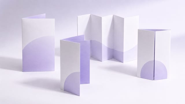
When a client says they want a "tri-fold leaflet", they often just mean they want six panels to work with — whether that should be a letter fold, a Z-fold or a gate fold isn't always clear from the start.
The most practical way to choose a 6-panel fold isn't to memorise fold names first. Start with the content: does it need to be read in order, does it need a sense of reveal, and what goes on each of the six panels? You can pin down the name later — but decide how it should be read first.
In short: for a company profile or service overview, start with the letter fold; for a process, menu or step-by-step, start with the Z-fold; and only reach for the gate fold when you're doing an invitation, a brand reveal or a themed event.
What is a 6-panel leaflet?
A 6-panel leaflet is a single sheet folded along two fold lines to give six layout panels. Printing Banana's two-fold leaflet printing is a 6-panel format, well suited to company profiles, service overviews, course promotions, menus and event information.
But six panels doesn't mean only one way to fold them. The common options are the letter fold, the Z-fold and the gate fold. The letter fold is what most clients casually call a "tri-fold leaflet"; the Z-fold runs in the same direction as a Z-fold accordion. The differences come down to how the piece opens and closes, the order in which the reader sees the content, and whether the inner panels read continuously.
Narrow it down with three questions
| What do you most need this time? | Start with | Why |
|---|---|---|
| Readers grasp what you offer the moment they pick it up | Letter fold (tri-fold leaflet) | The cover, inner panels and back split the job most intuitively |
| Content is read as steps 1-2-3 or by category | Z-fold | The unfolding direction is natural and suits sequential reading |
| You want to spotlight one main visual or event theme on opening | Gate fold | Opening the two flaps reveals a single, focused hero panel |
If you're not sure which fold you need, fold a plain sheet by hand first, photograph the cover, the first opened panel and the fully opened state, and send those over with a content draft. That's far easier to work from than just saying "I want a tri-fold leaflet".
Letter fold: the most common corporate leaflet
The letter fold usually brings both side panels in toward the centre, which suits splitting content into cover, intro, services, details and contact. Its strength is familiarity — everyone understands it on sight, and it's ideal for handing out in volume.
If your content is a company introduction, product information, course details, a service flow or general promotion, the letter fold is usually the safe choice. The cover leads with the theme, the inner panels carry the key points once opened, and the back holds the QR code, phone number, address and an enquiry CTA — a very clear structure.
One thing to watch: the letter fold has one panel that tucks inside, so confirm the tucked panel's width and the panel order up front. That inner panel often needs to be slightly narrower — you can't simply split the sheet into three equal thirds and lay it out. If your artwork fills every panel to the same width, it may bind when folded, or the first thing readers see on opening won't be what you intended.
Z-fold: for processes, categories and sequential reading
The Z-fold opens like the letter Z — one panel in, the next out — so readers move through it panel by panel in order. It suits event schedules, menu categories, step-by-step instructions, product ranges and any content meant to be read in sequence.
Its advantage is a natural reading direction, especially for structures like "left to right", "step one to step three" or "category A to category C". But each panel needs a clear job — if all six panels carry roughly the same amount of text, you lose the benefit of the accordion reveal.
When designing, treat each panel as a short chapter: the first panel for the intro, panels two through five for the categories or process, and the last panel for contact details and a CTA. That way the piece flows as the reader opens it out.
Gate fold: for brand content with a sense of reveal
The gate fold brings the left and right panels in to meet at the centre, so it opens like a pair of doors. It suits invitations, brand introductions, event theme pages and any promotional piece with a sense of ceremony.
With this fold, pay close attention to how the central hero visual works with the two door panels. If the left and right panels are crammed with fine print, the piece can be hard to read before it's opened; and if the central content has no strong visual focus, you waste the gate fold's sense of occasion.
In other words, the gate fold works for "spark interest first, then open to the core content" — but it's the wrong choice for evenly cramming in lots of specs, prices and fine print.
How do you choose a 6-panel fold?
| Use case | Better-suited fold | Layout approach |
|---|---|---|
| Company profile / service overview | Letter fold | Cover for the theme, inner panels for services, back for enquiry details |
| Process / steps / menu categories | Z-fold | One stage or category per panel, read in the unfolding direction |
| Invitation / brand story / themed event | Gate fold | Outer panels hold the suspense; opening spotlights the main visual |
| Lots of information but still easy to hand out | Start with 6 panels, step up to 8 if needed | If the type gets too small or charts sit on a fold line, size up the format or cut content |
When might a 6-panel fold not be the right fit?
- The content has extensive price lists, tables or fine specifications — forcing them into six panels makes the type too small.
- There are lots of images and you want each to have enough room to breathe — consider an 8-panel fold or a small booklet instead.
- You need a large visual spanning several panels — check first whether a fold line would cut through people, products or important text.
- When there are many QR codes, maps, addresses and enquiry details — protect readability first; don't compress the content just to stay at six panels.
How can you distribute content across the six panels?
| Panel position | Suggested content | What to check |
|---|---|---|
| Cover | Main headline, brand, hero image or core selling point | One glance should tell readers what the leaflet is about |
| First opened panel | Short intro, key benefits, a contents-style overview | Show readers where to look next |
| Main inner panels | Services, products, process, menu or course details | Keep fine print, tables and QR codes off the fold lines |
| Back panel | QR code, address, phone, WhatsApp, website | Contact details must be clear and the QR code scannable |
Double-check the panel order before you submit
The most common mistake with 6-panel leaflets is the panel order. The cover, the first opened panel, the inner panels and the back don't necessarily map to left-to-right order in your artwork file. Before you submit, fold a sheet by hand, label each panel with its content, and check it against the design.
Keep QR codes, logos, phone numbers, prices and people's faces off the fold lines. If you have a full-bleed background, leave the required bleed as specified for printing, and keep important content inside the safe margin.
Prepare these five things before you enquire or submit
- Purpose: company profile, menu, course, event schedule or invitation?
- Content draft: roughly what goes on each of the six panels.
- Preferred fold: letter fold, Z-fold or gate fold — or a photo of a hand-folded sample.
- Key elements: logo, QR code, prices, map, contact details.
- Size, quantity, paper orientation and the date you need them by.
FAQ
Are "tri-fold", "letter fold" and "6-panel leaflet" all the same thing?
Not exactly. "6-panel leaflet" refers to the number of panels, while the letter fold is one way of folding them. When clients say "tri-fold leaflet", they usually mean a letter fold or a general 6-panel leaflet — but six panels can also be folded as a Z-fold or a gate fold.
Is a 6-panel leaflet good for a lot of text?
It holds more than a simple half-fold piece, but you still need a hierarchy. Give each panel a clear job rather than filling every one evenly. If the type gets too small or the charts too tight, consider an 8-panel fold.
Which is better — the Z-fold or the letter fold?
If the content is read in steps or in sequence, the Z-fold feels more natural; if you're zoning a company profile, service overview and contact details, the letter fold is usually the safer bet.
Is the gate fold suitable for everyday street handouts?
It can be, but it's better for content with a strong theme or brand feel. For high-volume handouts meant to be read quickly, a plain tri-fold is usually more direct.
How should I order the panels in a 6-panel design, and where's the safest place for the QR code?
Don't just order panels left to right on screen. Confirm the fold first, then sort out the cover, back, inner panels and the panel readers see first on opening. A QR code can sit on an inner panel, but keep it off the fold lines and away from the edges; if it's your main enquiry entry point, the back or last panel is usually the safest spot.
Ready to make a 6-panel leaflet? Sort out your content and fold direction first
If you're still unsure which fold to use
If you'd rather compare every fold style first, head back to How do you choose a leaflet fold style?; if you're ready to submit artwork, the next step is What to check before you submit folded-leaflet artwork. And if six panels still aren't enough room, compare How to choose an 8-panel fold.
If you're not yet sure whether to use a letter fold, a Z-fold or a gate fold, start by gathering your content, purpose, size, quantity, paper orientation and a reference fold. Sending a quick hand-folded photo and a draft of your six panels with your enquiry makes it much easier to confirm the layout and artwork direction. You can browse options on our two-fold leaflet printing page or WhatsApp us at +852 3001 5678 (English is fine) — we deliver across Hong Kong and Macau.