
In Hong Kong's crowded Mid-Autumn market, a mooncake box often wins or loses on first touch. If the box feels thin, light and generic, it doesn't matter how good the mooncakes taste — customers may still decide they aren't worth the price. As a print master who has spent years producing packaging for premium bakery brands, I'll walk you through three papers that instantly lift a box's perceived value, then break down the finishing, use cases and proofing checkpoints for each — so you can build a gift box that looks luxurious without blowing your budget.
1. Why the paper decides how "premium" a box feels
- Visual difference: how a paper reflects light and the texture of its surface directly shape that first-glance sense of value.
- Tactile gap: thickness, rigidity and hand-feel are the most immediate cues customers use to judge quality.
- Finishing fit: the paper sets the ceiling on which finishes you can use — better stock can carry foil stamping and embossing.
Key takeaway: premium paper isn't about spending the most. It's about matching the stock to your brand positioning, budget and finishing.
2. Three premium papers our print masters swear by
| Paper | Key characteristics | Suggested finishes | Suited box types | Est. cost tier |
|---|---|---|---|---|
| Pearlescent paper on greyboard | Pearl micro-sheen surface + a stiff greyboard core | Matte lamination / foil stamping / spot UV | Lid-and-base boxes, drawer boxes | $$ |
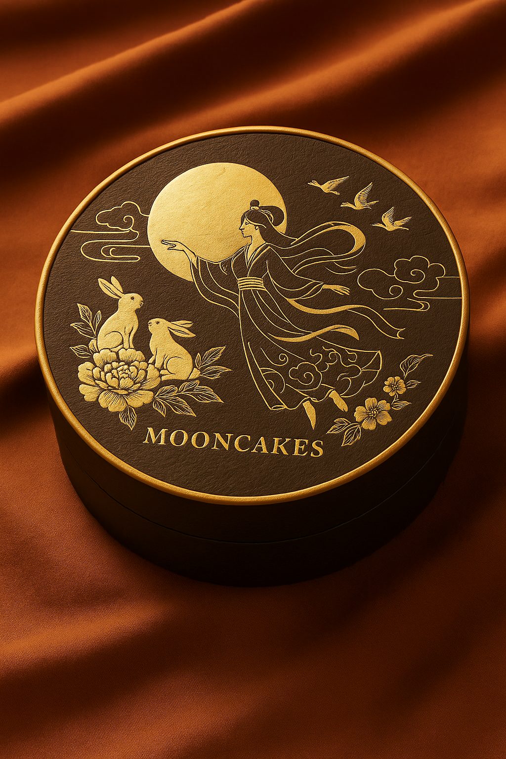
| Imported black card + embossed texture | Black all the way through, fingerprint-resistant texture, minimalist luxury | Foil stamping / emboss & deboss | Magnetic book-style boxes, flip-open display boxes | $$$ |
| Leather-textured / flock paper | Leather or velvet hand-feel — you can tell it's special the moment you touch it | Silver foil / debossing / spot UV | Folding rigid boxes, limited-edition collab boxes | $$–$$$ |
Cost key: $ = low, $$ = medium, $$$ = high (benchmarked against 250gsm C2S art paper).
2.1 Pearlescent paper on greyboard — a tough guardian that still shines ✨
Look & feel
- The pearl surface shimmers softly under changing light, instantly shedding the plain-white-card look.
- Greyboard thickness of 900–1200gsm gives the assembled box high rigidity, so it ships with peace of mind.
Recommended finishes
- Matte lamination: tames excess glare and leaves a soft, misty pearl glow.
- Foil stamping / holographic foil: plays beautifully off the pearl sheen, so your logo pops instantly.
- Spot UV: lights up details like the moon or streaks of light in an illustration.
Cost & proofing
- Pearl paper sits at a mid-range price; mounted on greyboard and laminated, it lands in the "mid" cost tier — but because it carries the whole box's feel, the payoff is very high.
- Proof with a blank white dummy plus a colour proof (a small printed sample) first, to confirm the sheen, lamination feel and foil placement before mass production.
In use
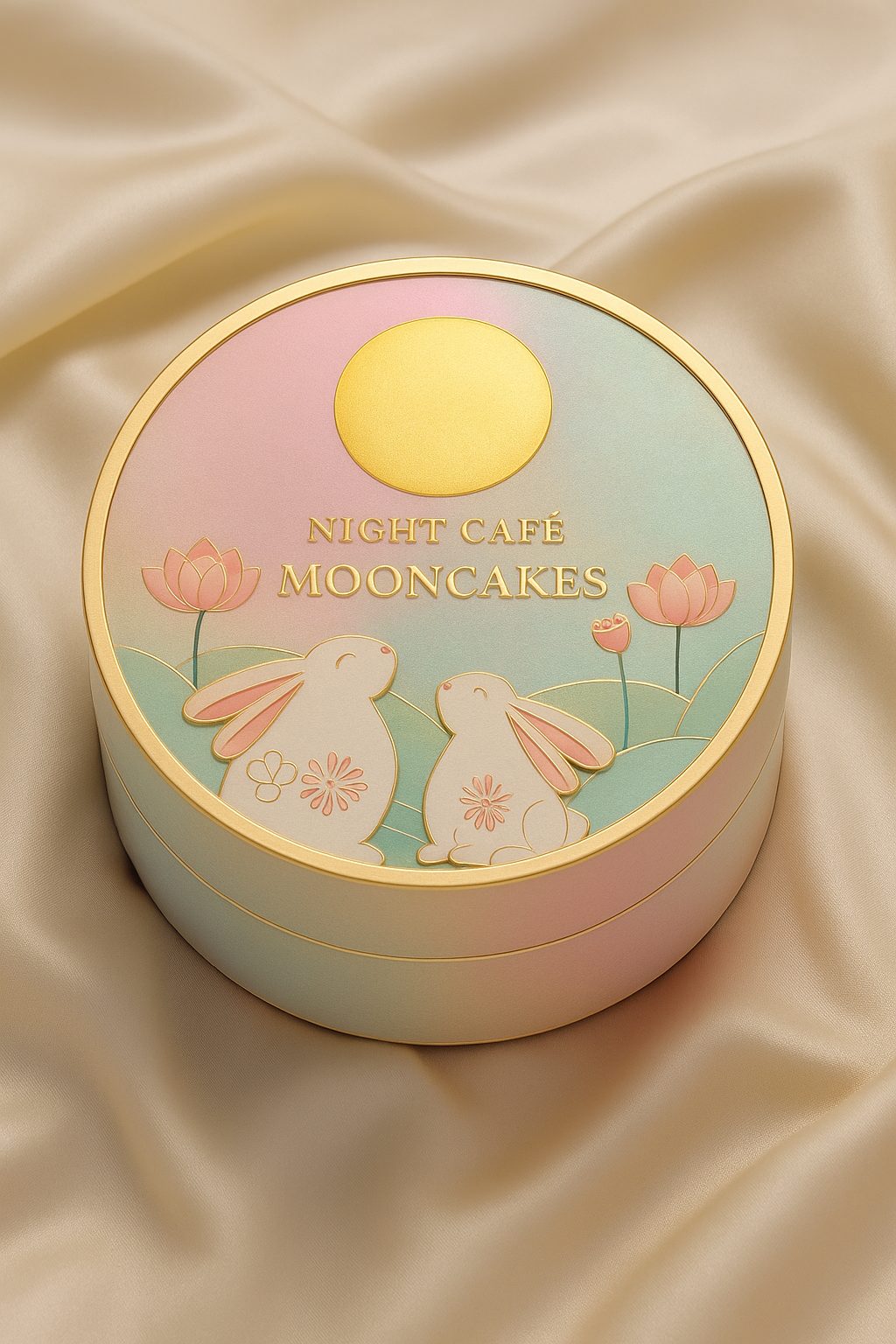
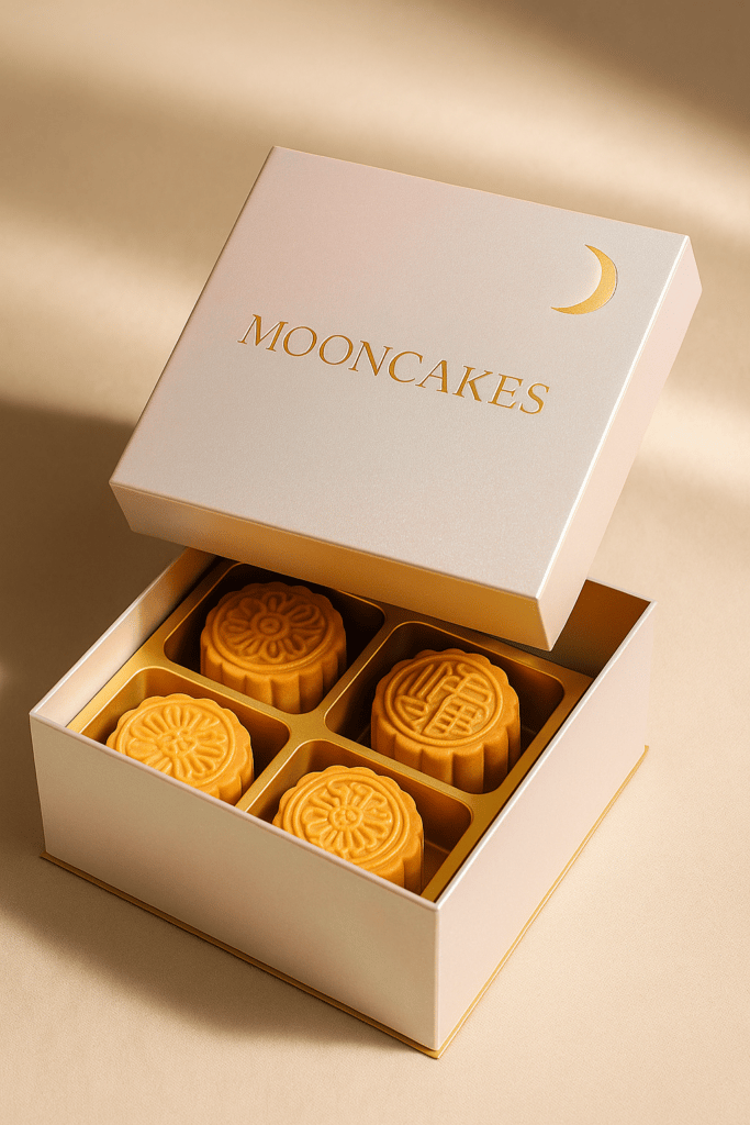
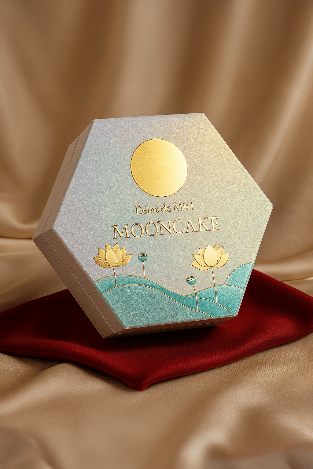
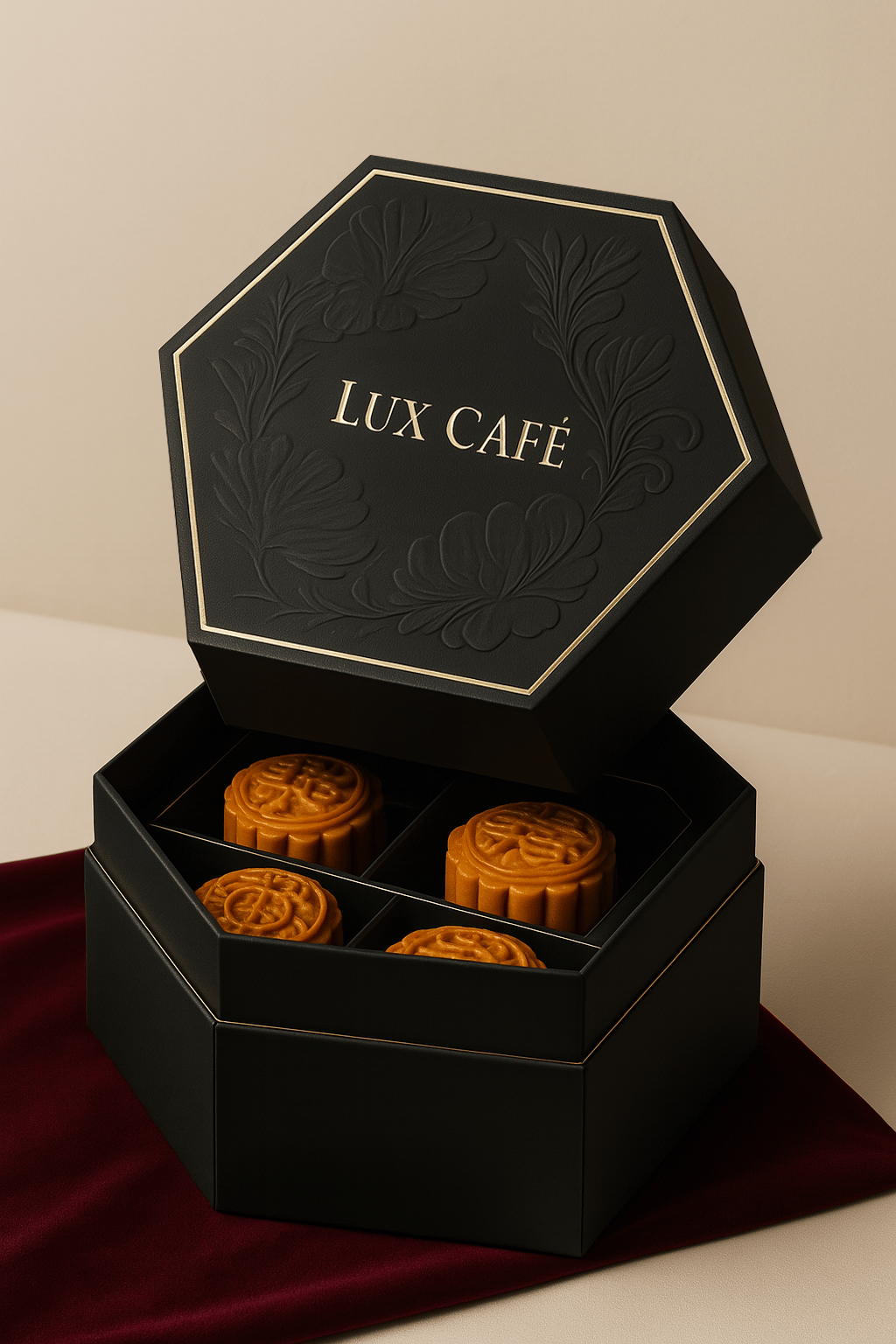
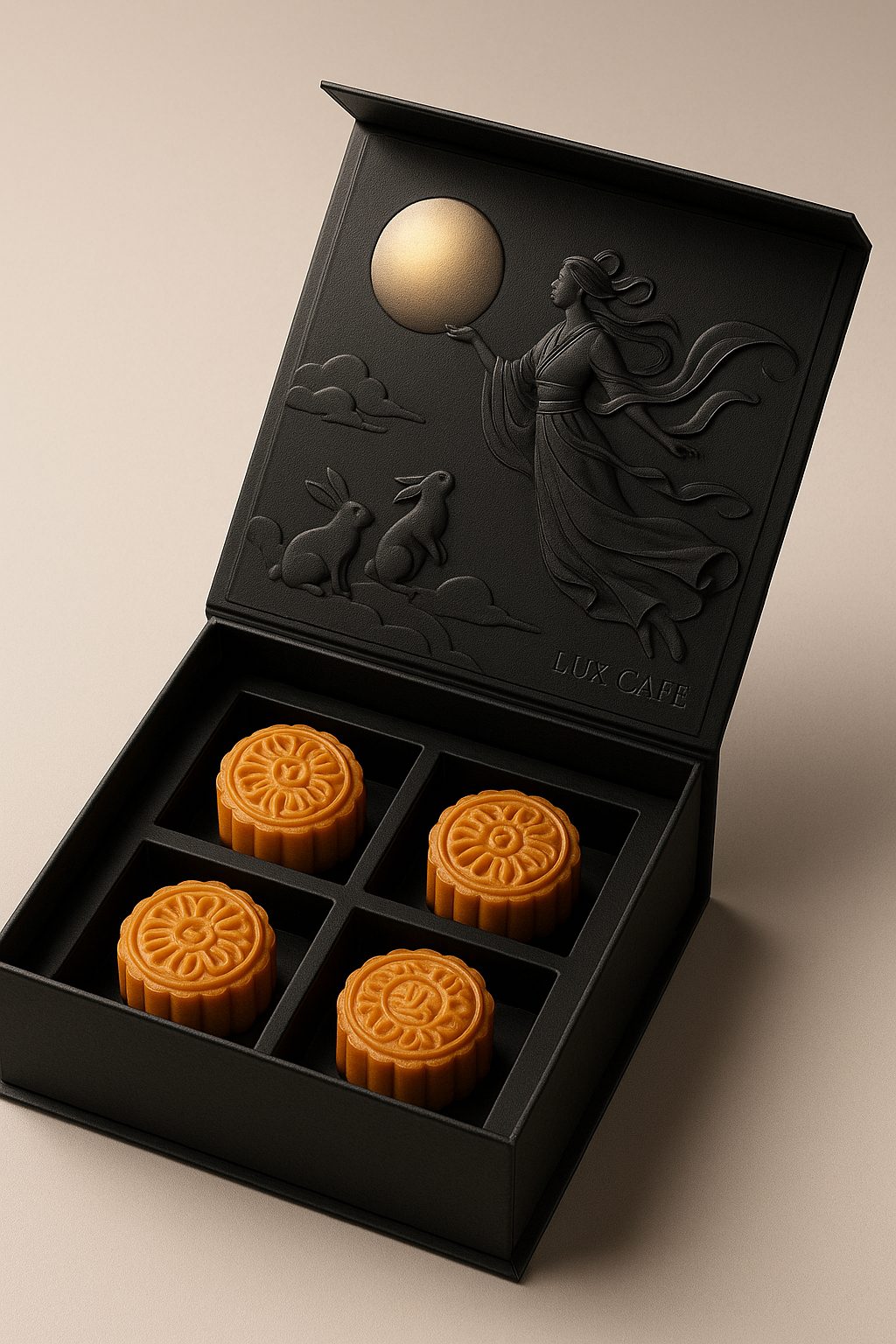
2.2 Imported black card + embossed texture — understated, pitch-black luxury 🖤
Look & feel
- Black card is black fibre through and through, so there's no white showing on the cut edges.
- An embossed finish (sand or linen texture) makes the surface fingerprint-resistant and feel more solid.
Recommended finishes
- Minimalist foil: a single stroke of metallic light becomes the focal point — keep it to ≤ 10% of the area.
- Emboss & deboss: a deep deboss on the logo or type instantly doubles the luxury feel.
- Avoid large-area four-colour printing — black card absorbs ink and struggles to show colour; lead with a minimalist "black + gold / silver" contrast.
Cost & proofing
- Imported black card runs roughly 1.8–2.2× the price of ordinary white card per tonne; per box, that adds about 25% to the cost.
- Black card scratches easily — during proofing, check the folding lines for white marks, and apply a matte varnish to protect it if needed.
In use
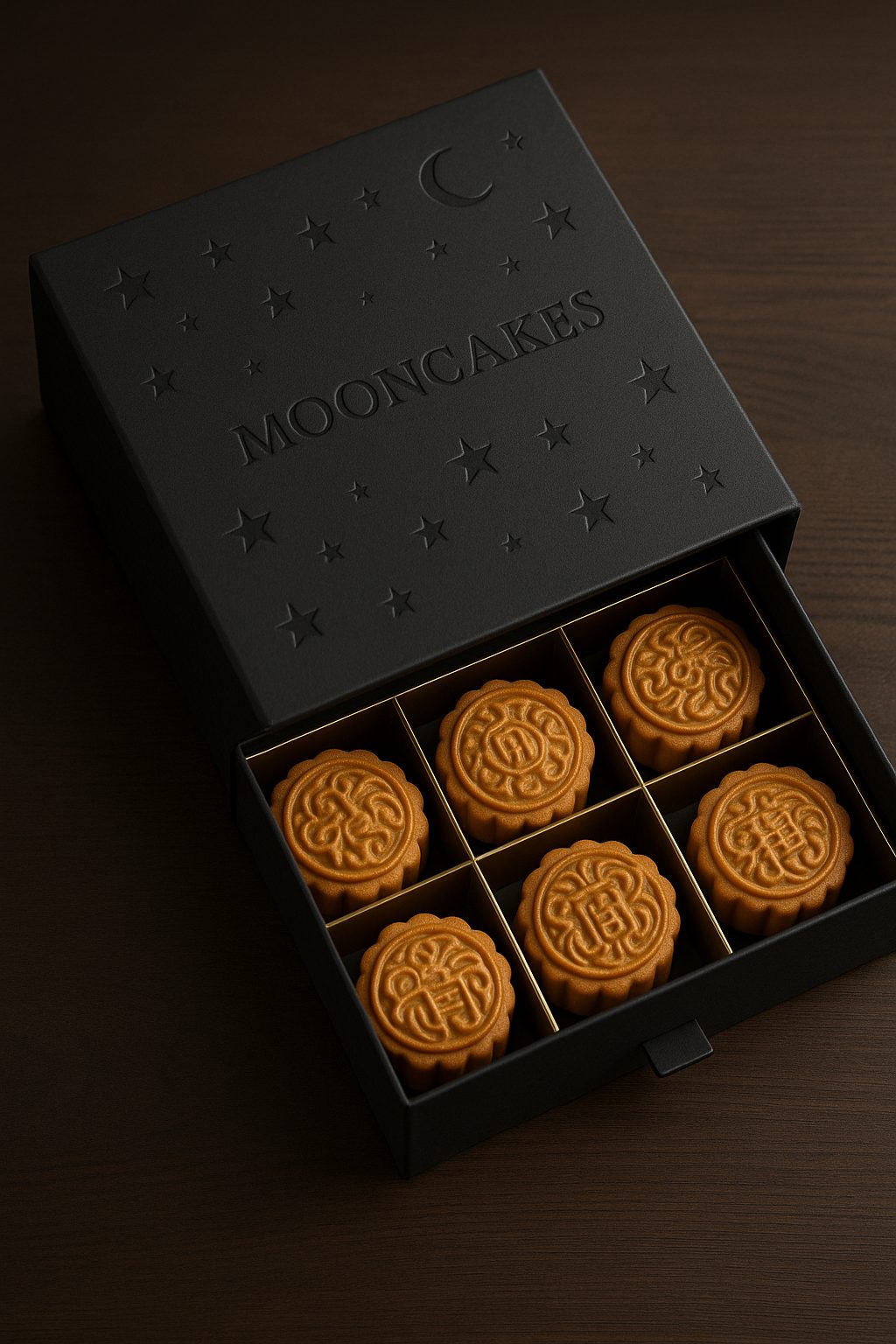
2.3 Leather-textured / flock paper — quiet luxury you fall for at first touch 🤎
Look & feel
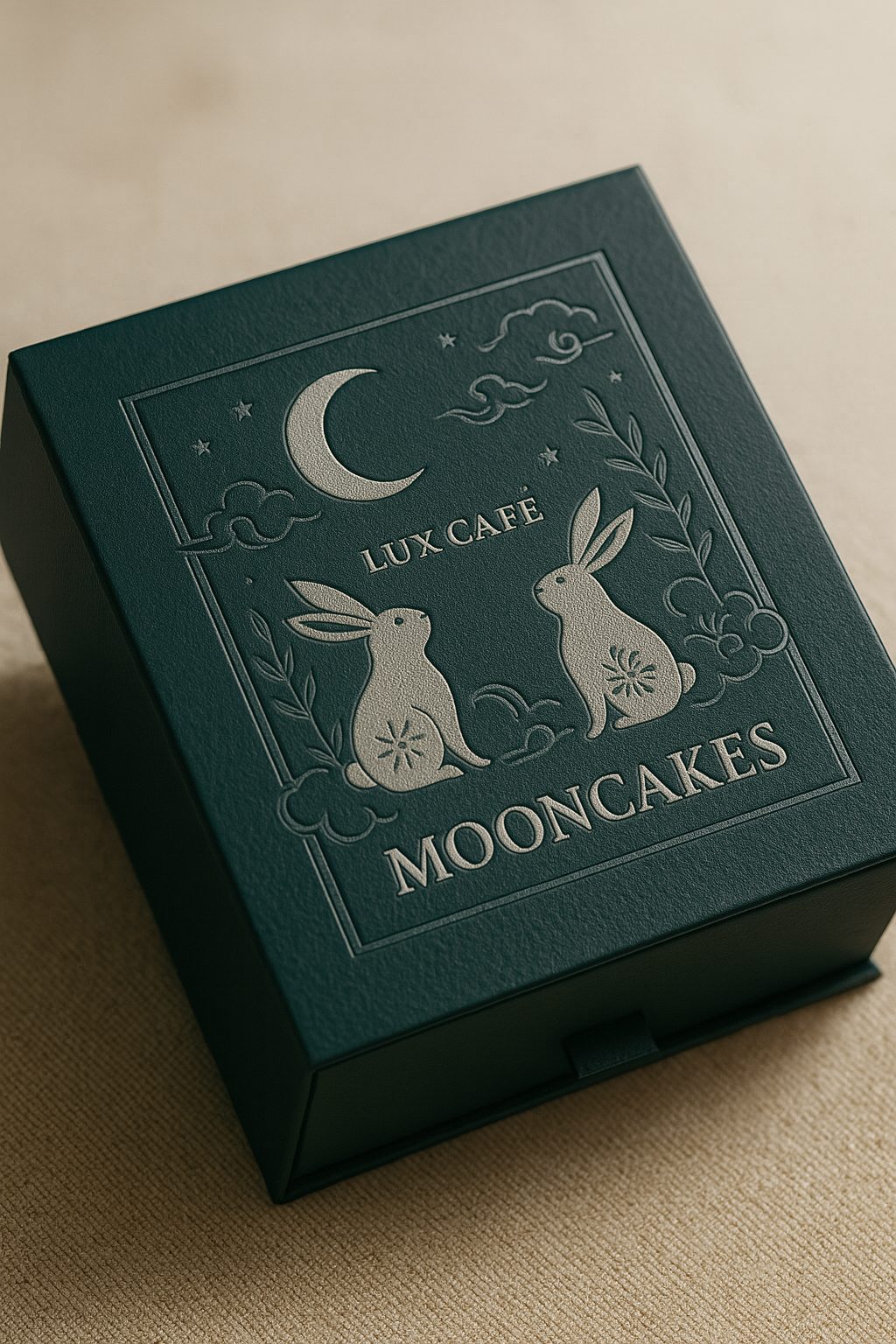
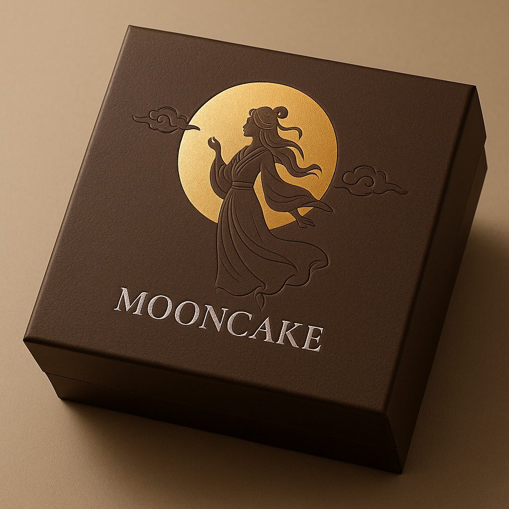
- Leather-textured paper mimics real leather grain; flock paper's short-pile surface gives a soft, "micro-fuzz" feel.
- Colours tend toward calm browns, greys and forest greens that suit the autumn-festival mood.
Recommended finishes
- Silver foil / matte silver foil: the silver tone strikes a premium contrast against warm leather textures.
- Debossing: deepening the grain in spots on the leather texture makes the layered, tiered feel more pronounced.
- A little spot UV can be added for low-gloss depth.
Cost & proofing
- Leather-textured paper runs about 1.5–1.8× the price of white card depending on the grain and import source; flock paper is higher still.
- At proofing, confirm: foil sits unevenly on a grainy texture, so choose a thicker foil or fine-tune the temperature and pressure; flock paper sheds under high heat, so adjust the temperature and speed.
In use
3. Premium feel = paper ✚ finishing ✚ design, working together
Approach 1: let the paper set off the finishing
- Pearl + matte lamination: a misty pearl glow ➜ pairs with gold foil for maximum sparkle.
- Black card + foil stamping: a black-and-gold contrast ➜ projects a top-tier aura.
Approach 2: play colour against texture
- Velvet surface + a low-saturation palette: a soft, atmospheric mood.
- Pearl surface + high-contrast spot UV: full of movement.
Tip: on a tight budget, use a "two-layer strategy" — premium paper for the outer box, cheaper white card for the inner tray and dividers. Concentrate the quality where customers see and touch it first: the outer box.
4. A 4S workflow for proofing and cost control
- Survey the brief: nail down your target audience, retail price and sales volume.
- Select the paper: weigh contrast, hand-feel and cost, and shortlist one or two options.
- Sample and proof: white dummy ✔ finishing proof ✔ final sample ✔ — confirm at every step.
- Scale up: lock in the bulk quote, production schedule and quality control.
5. Quick self-test — which paper is right for you?
Q1: Retail price above HK$300? → Pearlescent / black card / flock are all strong choices
Q2: Need high volume and cost-sensitive? → Pearlescent paper on greyboard (thin pearl face + medium greyboard)
Q3: Dark brand palette and chasing minimalism? → Embossed black card
Q4: Want to go viral on social? → Black card / pearlescent + a creative structure
6. Final thoughts & next step
Paper sets the ceiling on quality, finishing creates the three-dimensional layers, and structure defines the unboxing experience. Choose the right paper and, in the very first second a customer touches the box, you've already convinced them: "this box of mooncakes is the real deal!"
Want to feel the difference between all three premium papers for yourself?
- Planning a complete mooncake box? Book a one-on-one consultation and we'll take you from paper to finishing in a single step, giving your brand an instant Mid-Autumn upgrade.
We deliver across Hong Kong and Macau, and English is fine — WhatsApp us at +852 3001 5678 to request paper samples or a quote.
For a mooncake box, a tight budget isn't the problem — the wrong paper is. Choose your stock like a pro and let the quality speak for itself. Here's to a mooncake box that becomes an Instagram hit the moment it's opened!


