
We've all been handed a beautifully made foil-stamped card and instantly wanted to work that same metallic shimmer into our own. But once you actually print with foil, the finished piece somehow never looks as striking as the one that inspired you.
You're probably wondering, "Why is the foil on this card so bright?" — or "It's all foil stamping, so why does everyone else's look better than mine?" This article is written for exactly that. Read on and you'll understand how foil works together with your printed colours.
Understand colour contrast
Colour contrast matters more than you'd think. White only reads as white because there's black beside it. Without contrast, it's hard to tell one colour from another — no contrast, no impact. The same goes for foil against your printed colours: the stronger the contrast, the better the foil looks.
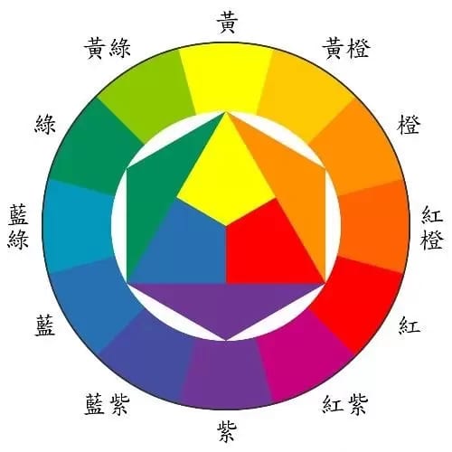
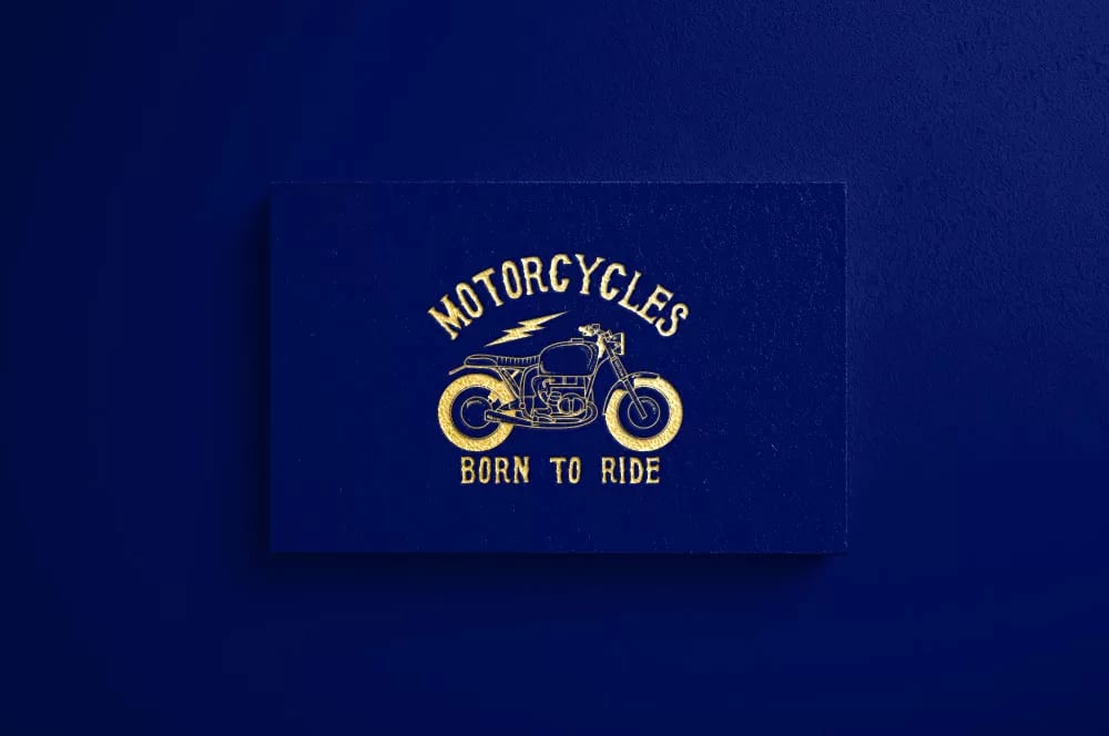
When people picture foil, they usually think of gold. Gold sits opposite deep blue and deep purple on the colour wheel, so setting your gold foil against a deep blue or deep purple background makes it sing.
For other foil colours, use the colour wheel below. A colour's contrast is whatever sits directly opposite it — red pairs with green, blue with orange, and so on.
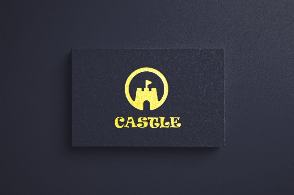
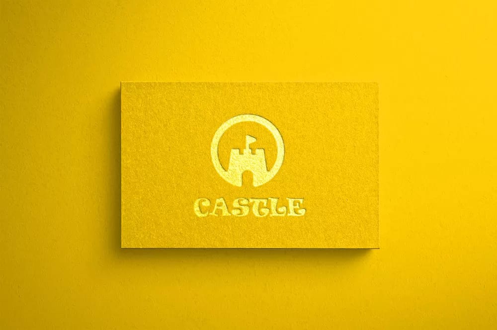
As the examples above make clear, pairing deep blue with gold makes the logo stand out.
Avoid foil on fine, detailed artwork
Even with contrast sorted, that alone won't guarantee a clean foil result. Very intricate artwork is genuinely hard to stamp well — in the example below, the fine detail on the tram's body simply doesn't come through cleanly. To keep your foil crisp, lean on simpler designs. A simple design, carried by foil, turns elegant and luxurious with very little effort.
Foil stamping does come with real constraints, and it's fussier about line weight than standard printing — miss the requirements and the result falls flat. So before you design, it's worth reading Foil stamping limitations — and how to build a clean, print-ready file. It should help you get a far better foil result.
Reserve foil for your key design elements
Beyond making a piece look better, foil also draws the eye to the information that matters most — a company name, a logo, a project title. Foil pulls attention straight to that spot and guides the reader to start there.
Foil also works beautifully along a border. A foiled edge makes the whole piece feel more considered and more premium — though border foiling costs noticeably more, so keep your budget in mind when you design.

Foil is a tool to amplify your print
Foil stamping is what lets your print stand out in a sea of paper — that's the real value it adds. Print exists to make people want to buy, use, or read something, and foil is the single most eye-catching finish you can layer on top of good design. That's exactly why it matters to make the foil truly shine, so the money you spend on it never goes to waste.
Ready to put these tips into practice? Browse our foil-stamped metallic cards, with delivery across Hong Kong and Macau. Not sure how to prep your file? WhatsApp us at +852 3001 5678 — English is fine.


