
Debossing is one of the finishes clients ask us about most. Whether it is debossing — pressed down into the sheet — or embossing, raised up above it, both break the flat plane of the paper, and to our eyes a three-dimensional design is simply more inviting than something printed flat.
So how do you actually put debossing to work in a design, and how do other designers use it to lift their print pieces? This showcase walks through real debossed jobs from Printing Banana customers so you can build a better feel for the craft — and, we hope, find the debossing approach that fits your own project.
Debossed card showcase
600gsm cotton card, logo deboss
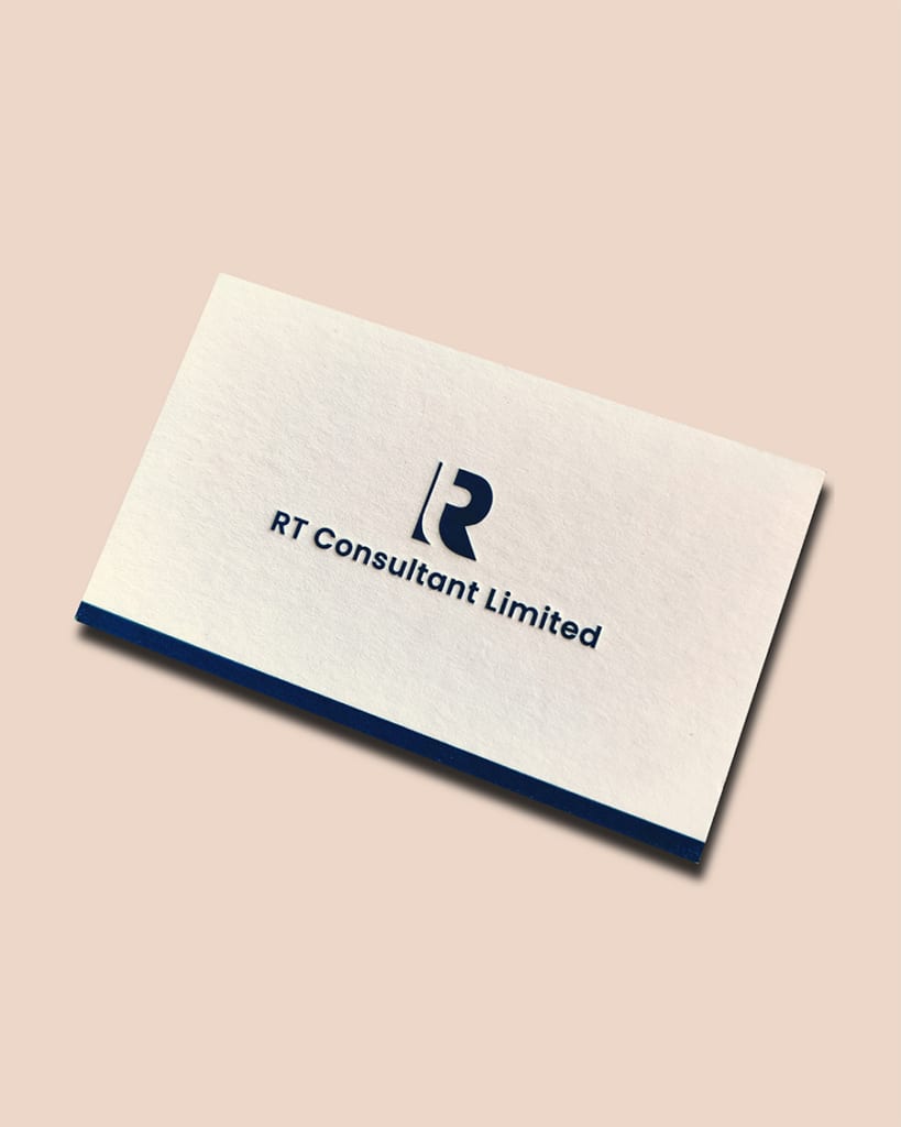
Debossing asks a lot of the paper's thickness: the thicker the stock, the deeper the press, and the closer the finished effect comes to what you imagined. Here the debossed shape sits in a dark colour against a light card base, so the pressed impression reads exactly as intended.
Recommendation: ★★★★☆
Design difficulty: ★☆☆☆☆
Eggshell paper deboss
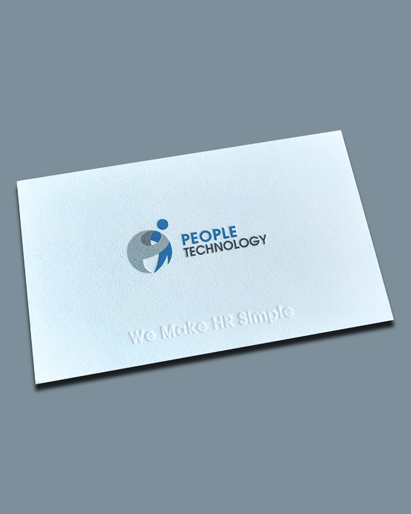
Eggshell paper has a fine surface texture, much like the shell of an egg, that feels wonderful in the hand. Alongside a coloured deboss on the logo, this design also uses a blind (colourless) deboss.
One thing to keep in mind: wherever the deboss presses in, the surface texture gets flattened, so those recessed areas lose the paper's tactile grain.
Recommendation: ★★★★☆
Design difficulty: ★★☆☆☆
Black card, blind deboss
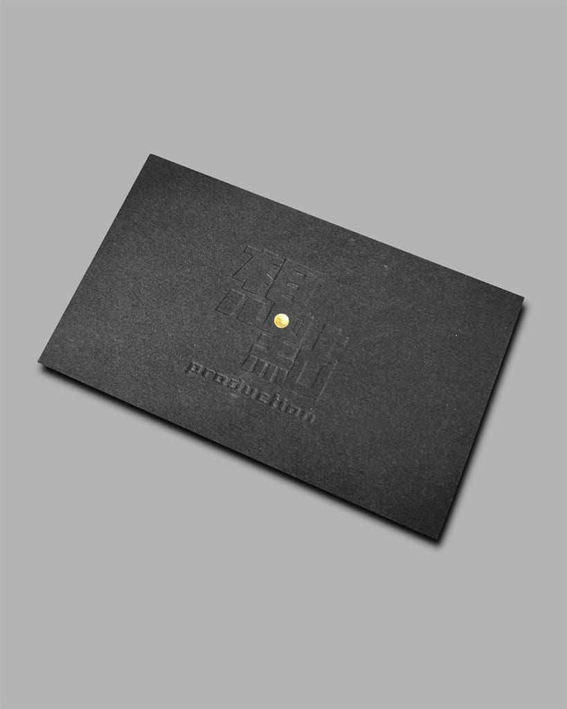
A blind deboss on black card is a common finish, but this design is genuinely creative. A single gold-foiled dot at the centre is the finishing touch that brings the whole piece to life.
It is not technically complicated, yet that central gold-foil detail gives the card a memorable hook.
Recommendation: ★★★★☆
Design difficulty: ★★★★☆
Large-area blind deboss
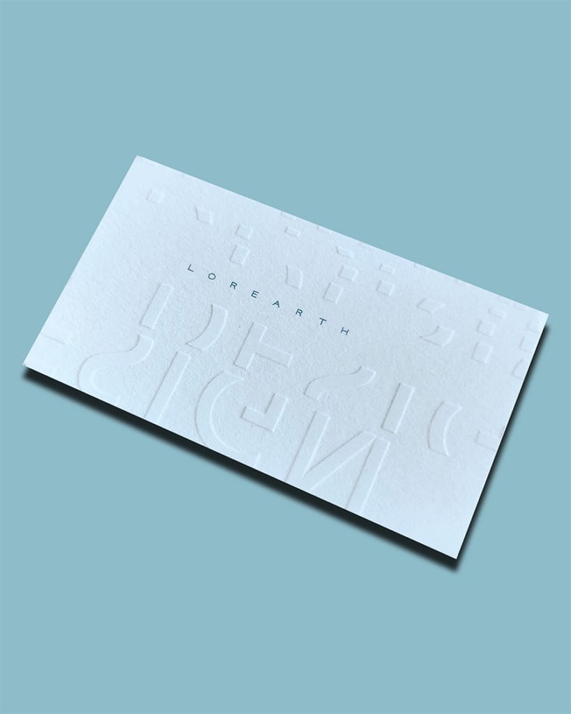
What sets this piece apart is that the debossed areas are not complete letters — you have to look carefully to pick out the words.
Many of the letters and symbols are also debossed right up to the edge, which gives the card even more texture.
Recommendation: ★★★☆☆
Design difficulty: ★★★★☆
Debossing paired with foil stamping
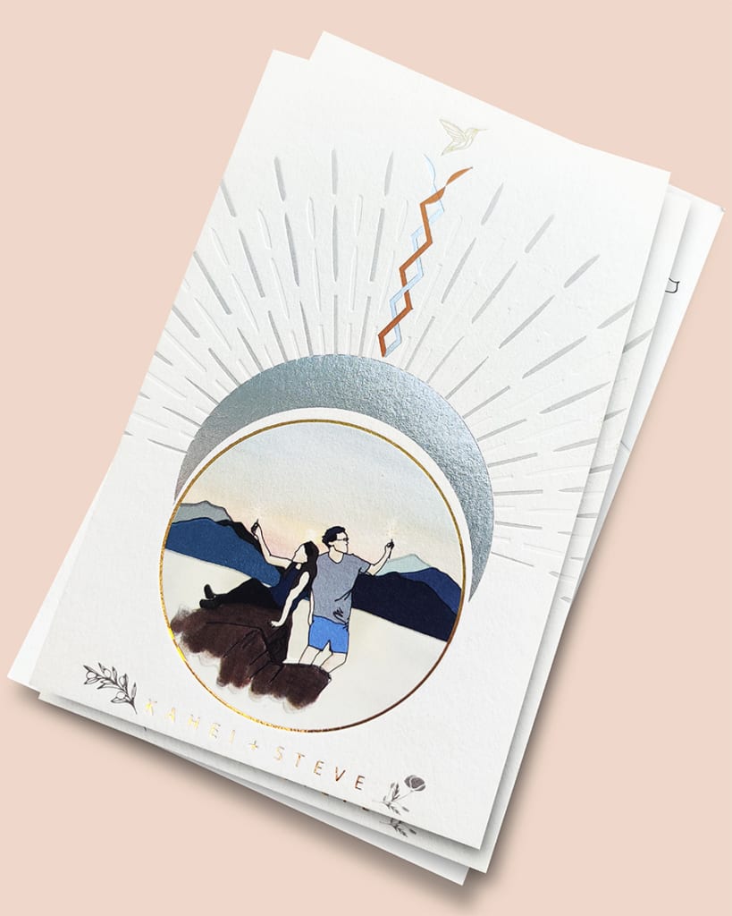
This invitation is a remarkable piece of design, blending several foil colours with both coloured and blind debossing. Marshalling that many finishes into one eye-catching design is far from easy.
But when the combination is well judged, the result is genuinely impressive.
Recommendation: ★★★☆☆
Design difficulty: ★★★★★
Reversed-out logo with deboss
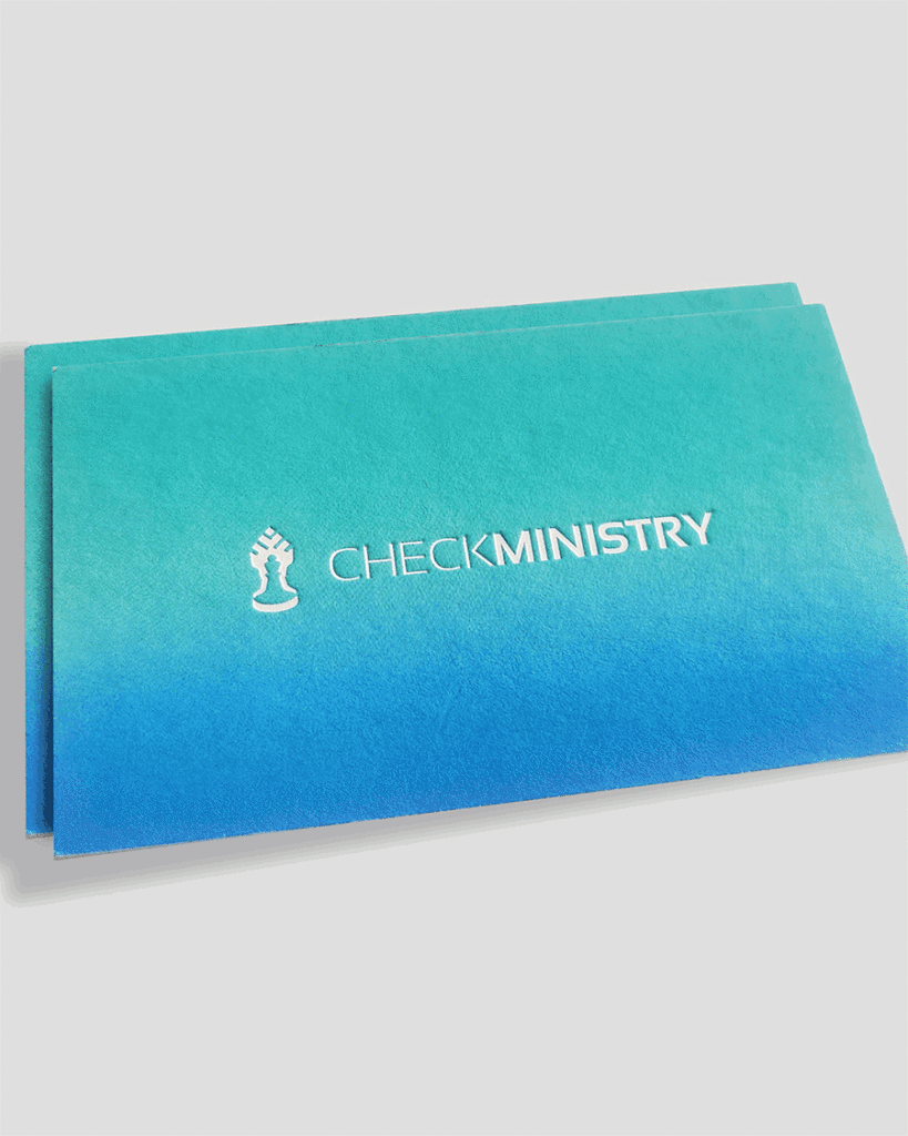
This design is simple, yet the finished effect really stands out. The card is printed with a large gradient, the logo is reversed out — left as bare card — in the centre and finished with a deboss: understated, but eye-catching.
Recommendation: ★★★★☆
Design difficulty: ★☆☆☆☆
Logo in white foil with deboss
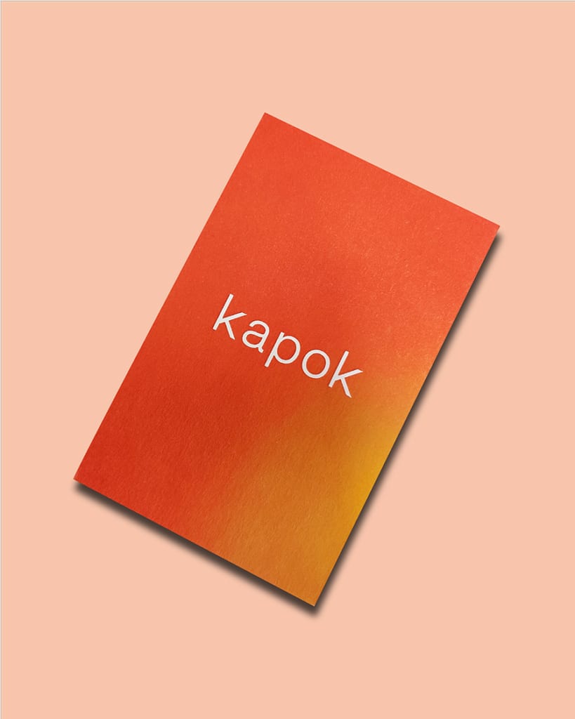
The same design approach as the previous card, but here the logo is stamped in white foil, which makes it stand out more clearly.
Recommendation: ★★★★☆
Design difficulty: ★☆☆☆☆
Curious about what debossing costs?
Get in touch and we'll recommend the finish and stock that best suit your project. We deliver across Hong Kong and Macau, and you're welcome to WhatsApp us at +852 3001 5678 — English is fine.


