"Hi! Here's my card — nice to meet you." In an ideal world, the reply is: "Nice card, what line of work are you in?" In reality, it's usually just: "Hi." We've all been there. We all hope the card we hand over gets kept for a long time, but the truth is it sits in someone's hand for only a few seconds. This guide starts with the design itself, to help you create a card that looks sharp and never embarrassing — so your personal or company card does exactly what it's meant to.
Is great card design really just about design?
We've all received business cards with wildly over-the-top designs — some so elaborate they defy imagination. But no matter how dazzling the card in your hand, none of it beats a simple "Li Ka-shing" and "TEL: 6XXX XXXX". The heart of card design isn't clever technique; it's how you present the written information. So that's where we'll start too — with the words.
Card design, prep step 1 — gather your details. Pull together all the relevant information first:
- Your full name in English and Chinese
- Job title / position
- Personal details (phone number, personal email)
- Company details (full name in Chinese and English, company phone, address, website, stock code)
Card design, prep step 2 — define your company's character.
- Your company's primary colour
- Your industry's character and style
- Your most representative element
Once that's done, you'll have something like this:
Name: Chan Tai Ming 陳大明
Title: Department Head (Chartered Engineer)
Phone: 6666 7777
Email: taiming@taiming.com
Company: Tai Ming Technology Limited 大明科技有限公司
Company phone: 3001 5678
Address: G/F, 1111A Mody Road, Tsim Sha Tsui
Brand colours: blue, white
Industry character and style: cybersecurity, startup, professional, reliable
Most representative elements: computer, internet, IP address
With the basics organised, you'll have a clear picture of what belongs on the card and the direction to take — and then you're ready for the next step.
Card shapes are endless: pick the size that fits you
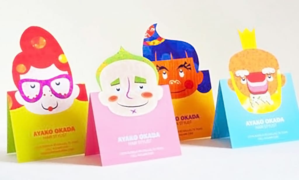
Before you arrange the content, decide the card's size and shape. The most common size is the 90 × 54 mm rectangle (for more on standard cards, see What is the standard business card size? Can you only print standard sizes?). It's the go-to standard, works without any real issues, and suits just about anyone. If you want a bit of variation, try a slimmer size such as 90 × 50 mm or 90 × 45 mm.
Admittedly, a common card size won't turn heads — so this is where you put those signature elements to work and strengthen the card's memorability. Using the "computer" element, for example, you could die-cut the whole card into the shape of a computer, tying it far more tightly to the industry.
Just note that special shapes require die-cutting, so the printing costs more.
Type is the soul of a card, and soul is what starts a conversation
With your content and size settled, you reach the core of the card — typography. Typography is a deep discipline: from typeface choice to font size and weight, every decision has an outsized impact on the design. This article won't dive deep into typography, but it will point you toward safe choices. If you'd like to go further, we'll cover it another time.
Here we'll recommend a few typefaces that are free for commercial use and work well on business cards. Before choosing one, you should know that fonts split into serif and sans-serif. Serif faces carry decorative details at the start and end of each stroke — Chinese examples include KaiTi (標楷體) and PMingLiU (新細明體) — while sans-serif faces are typified by Hei/Gothic (黑體). English fonts follow the same logic.
Body-text pairing suggestion: serif (Chinese) + serif (English), or sans-serif (Chinese) + sans-serif (English).
*This keeps the layout balanced. Avoid using more than two typefaces (decorative type aside), or the whole layout starts to look messy.
Suggested size: 7–8 pt (the name can be set larger than the informational text).
More free fonts to download: Google Fonts' brand-new site — download 800+ free English typefaces
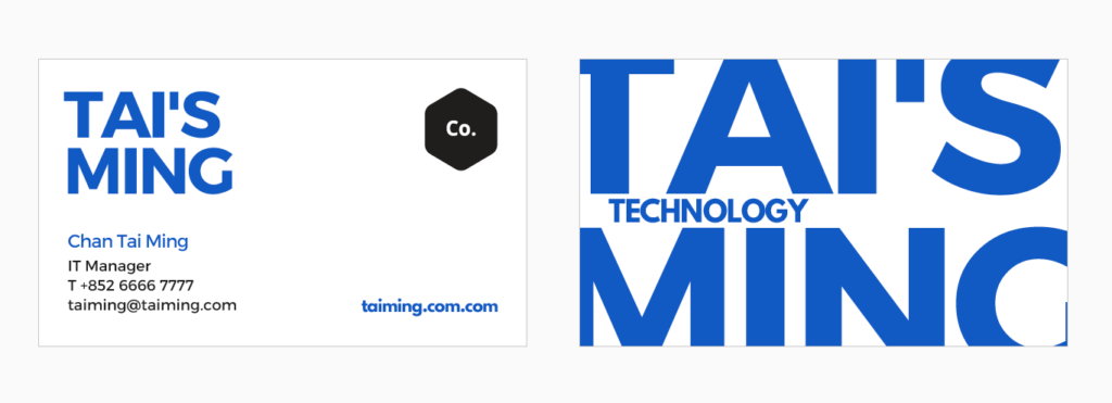
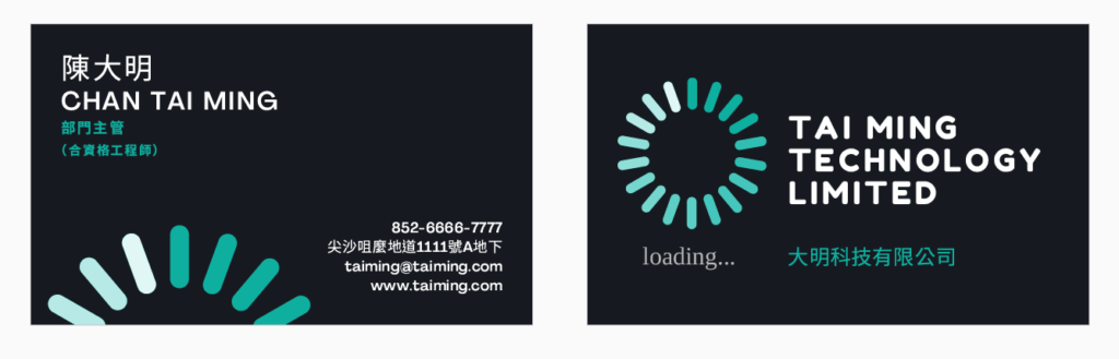
Using Tai Ming as our example, here are two sensible, presentable layouts to reference and use.
If type is the soul, the paper is the body
Once the design is done, you have to decide what paper to print it on. Different stocks give completely different impressions. Take our example — Tai Ming wants to convey professionalism, so a clean, flawless Dutch white card or Italian white would be a solid choice. For professionalism with a touch of maturity, try Conqueror laid paper, whose irregular horizontal grain lends a steady, understated feel.
There are hundreds of paper options — too many to break down one by one here. To make it easier to reference, here are stock recommendations based on a few common industries and their character:
Tech: semi-transparent PVC cards, UV matte cards
Education: white card, Conqueror laid, linen-textured stock
Automotive: PVC cards, matte cards (polygon die-cut)
Beauty: ultra-white card, ice-white card
Green / eco business: Japanese Daichi (Earth) paper, kraft paper
Content creators: Wild cotton card, black cotton card
Give your card some makeup — make it more special and eye-catching
Finishing makes your card more appealing, the way a bit of makeup adds allure. The main finishes for personal and company cards include foil stamping, embossing, letterpress, blind embossing, crystal raised lettering, die-cutting (the special shapes mentioned above), spot colour, rounded corners, edge painting / edge foiling, and spot UV. (Note: UV finishing only works on matte-laminated cards.)
For detailed information and product photos of each finish, browse them on our site or ask our team. Finishing places more demands on the design — letter size, spacing and stroke weight all affect the result — but text at 7 pt or larger generally works, and a sans-serif face like Hei/Gothic is even better.
For Chan Tai Ming's tech company, holographic silver foil and crystal lettering would help convey a high-tech feel.
- Holographic foil

- Crystal raised lettering

Should you design the card yourself or hire a designer?
Whether you ultimately design the card yourself or have a designer do it, understanding the card-design process is essential. It helps you land on the option that best expresses you or your company. The more thoroughly you interrogate what the card needs to say, the closer the finished card will be to what you had in mind.
Printing Banana card design service
Whichever route you take, we print and ship business cards across Hong Kong and Macau — and you're welcome to send your artwork or questions on WhatsApp at +852 3001 5678 (English is fine).
Thanks for reading! : )
For more on card design, here's some further reading:
Design your own business card: making a print-ready file with online tools
The 7 best business card design trends for 2021
10 premium business cards from different designers — 2019's standout styles