Picture the moment you hand over a card — a chance meeting, a client visit, a crowded industry mixer. Everyone trades their own card, and each one has its own shine: it carries your name and your work, and it hopes the person on the receiving end will use what's on it to take the next step with you. A business card is part of your identity, and it says a lot about your company's personality too.
So we went looking online and pulled together a roundup of designers' own business cards from overseas — a chance to see what they carry and, more to the point, to hear what each of them thinks makes a card good. We've thrown in a few of our own thoughts along the way, and from here we'll unpack the little secrets behind a great card.
1. SNASK — a card that pops in red
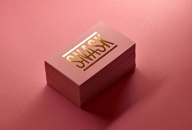
Stock: 400gsm deep-red coloured card
Finish: gold foil stamping
SNASK reckon "bold, beautiful and unique" is the key to a standout card. Bold type really can carry impact on a surface as small as a business card — but it isn't a cure-all. Some companies already have a locked-in brand logo, so setting the company name in heavy bold might not sit right. Used sparingly on the details you want people to catch, though — a name, a phone number — bold still does its job.
2. Modern Dog Design Co. — no two cards alike
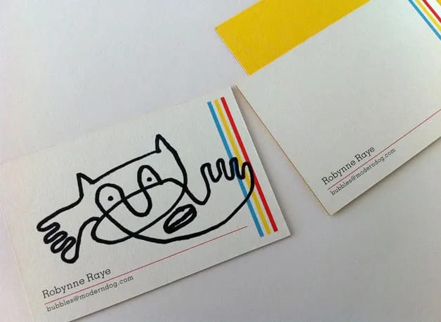
Stock: 750gsm Mohawk eggshell paper
Finish: double-sided full-colour printing
Modern Dog Design Co. point out that a good card is one that's hard to throw away. Theirs carries only a name and an email, leaving a big open field of white so they can draw straight onto each card — turning every one into a one-of-a-kind piece. It's a lovely approach, and genuinely striking if the people in your studio are game to draw. If they aren't, we'd suggest foiling a large shape into that empty space to give the same dreamy lift.
3. Paramore Digital — built for connection
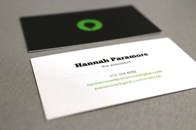
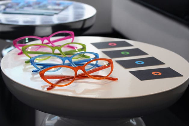
Stock: matte card
Finish: double-sided full-colour printing
Paramore Digital's CEO makes the point that a card's biggest job is to represent your brand and give people a way to reach you — and fusing those two things together is where the designer's magic comes in. A card is the most personal and yet most representative tool you carry, because it holds your name and your company's.
Hannah Paramore argues that cards today are drowning in information: personal number, office number, address, email, website, socials — on and on until it's almost dispiriting. The main point is simply to let the recipient contact you, and their card keeps it to exactly that: one phone number, one email, one web address.
She's right. Companies today load every last detail onto the card, as if trying to prove to everyone how big they are. But with the web as connected as it is, most of that can be found online anyway — the card only needs to introduce you and your company, and that's plenty.
4. Cameron Moll — a handmade card
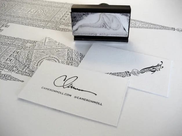
Stock: German cotton card
Finish: letterpress
For Cameron Moll, the cards that pull him in are the ones with a feel unlike anything else — because a card's greatest worth is how much it's worth to the person receiving it. When a good card lands in his hand, he can't help but give the giver a few extra points. His own card is cut down from a poster and finished with a stamp he made himself. Handmade cards are about as appealing as it gets — just make sure you've got enough material on hand to make them.
5. The Ugly Tree Graphic Design — a card you remember

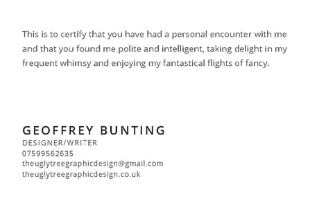
Stock: 300gsm recycled paper
Finish: four-colour printing
Geoffrey Bunting puts it bluntly: a good card is one that doesn't get slipped into a wallet and forgotten. A card is a tool for sparking interaction, and the goal is to make people go "WOW" — to tie that reaction back to you and your company as a hook they'll remember.
Here's the important part: the card is only the way in. If it does grab their attention, that's often driven by the conversation you have with them. Picture a card shaped like a pair of scissors, handed over by a hairstylist — that's a memory hook that sticks.
6. Jenn David Design — break the mould
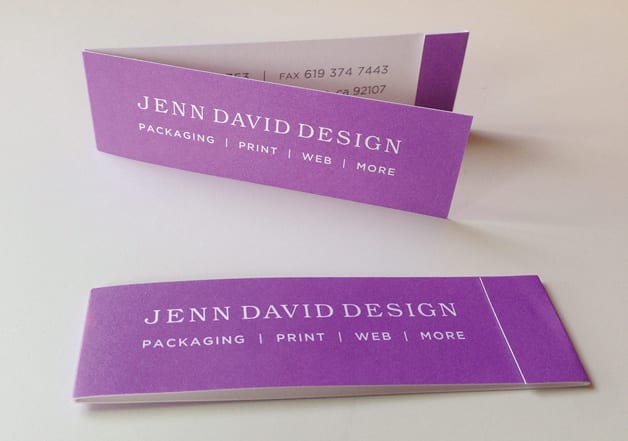
Stock: 330gsm white card
Finish: spot-colour printing
For Jenn David, the best card is one that lands with a jolt the moment it's handed over — one that fires up curiosity on the spot and invites people to dig deeper. A card can run to a non-standard size, she says, just not too big and not too thick. Breaking the standard size is a genuinely effective move: get handed something that isn't the usual 90 x 54mm and it's bound to catch the eye more. On the thickness point, though, we'd hold back a little. Here at Printing Banana we sell plenty of thick cards every single day — the pull of a thick card is exactly that solid, substantial feel in the hand, the kind that reads as reassuringly weighty.
7. Tag Collective — a card that stands out
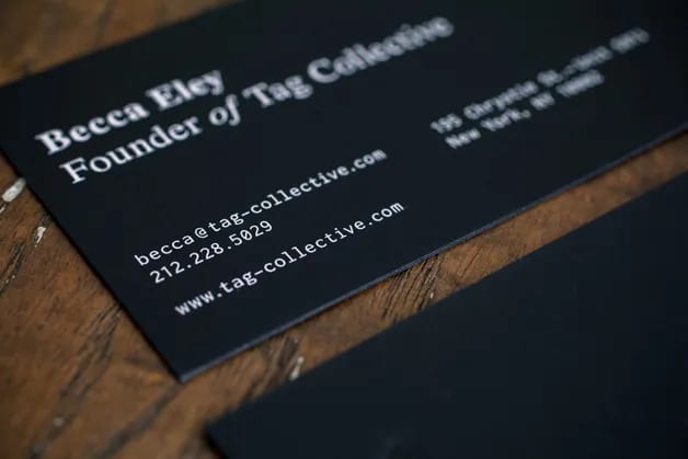
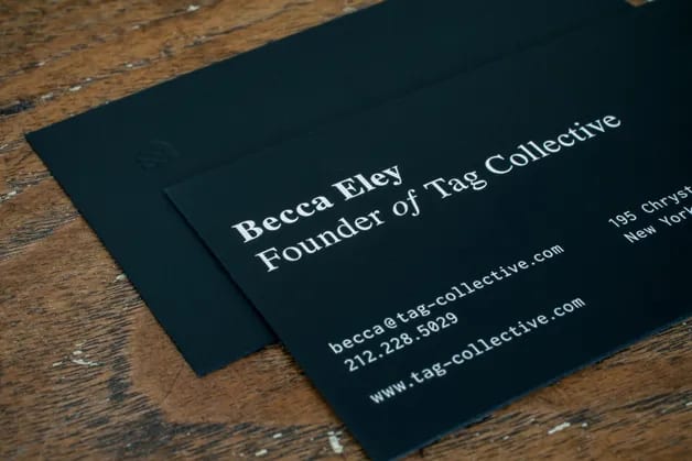
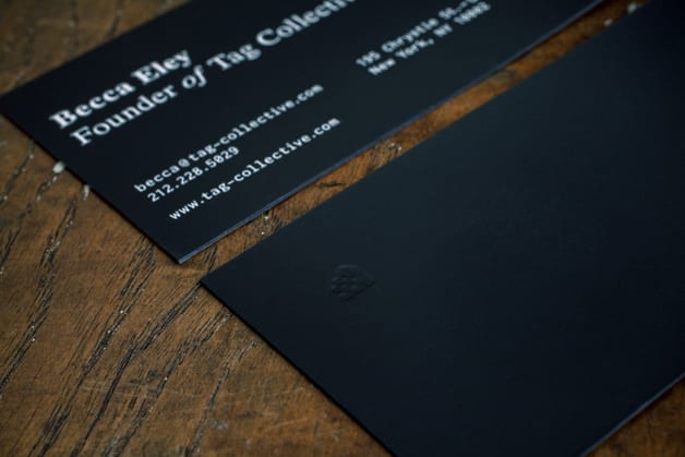
Stock: soft-touch black card
Finish: white-ink printing plus letterpress
Becca Eley says a good card simply has to rise above the pile — and her studio hits that mark by reaching for an uncommon stock. Soft-touch black card has a feel all its own, a grip that draws your fingers in and gets almost addictive to hold. Pair it with single-side white ink and a letterpress hit, and the card comes across as dependable, simple and quietly elegant. We're right there with them: a paper with real texture makes people reluctant to put a card down, which is exactly why we keep steering customers toward tactile stocks.
8. Tank Design — plain and understated
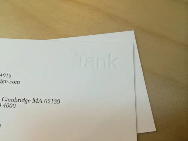
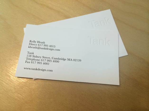
Stock: 400gsm cotton card
Finish: single-colour printing plus letterpress
Tank Design believe a good card is one that doesn't shout but still leaves a mark — one that catches the eye in the handful of seconds it takes to pass it across. Theirs is squarely in the understated camp: white card, black type. The idea is to keep clients from jumping to conclusions and boxing them in as one particular kind of design studio. Clean white with a simple layout has been a trend of recent years, and plenty of firms in the cultural industries lean this way — as long as the details read clearly and the card conveys the company's character, they'd call it a win. We'd say a card like this shines in a one-to-one meeting, though it loses a little ground at a big function.
9. Stitch Design Co. — a card that sells you
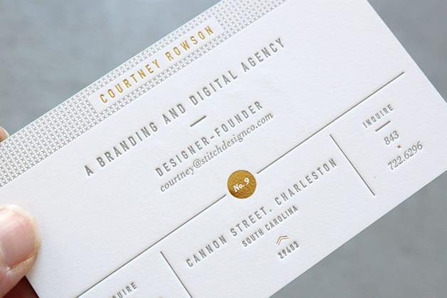
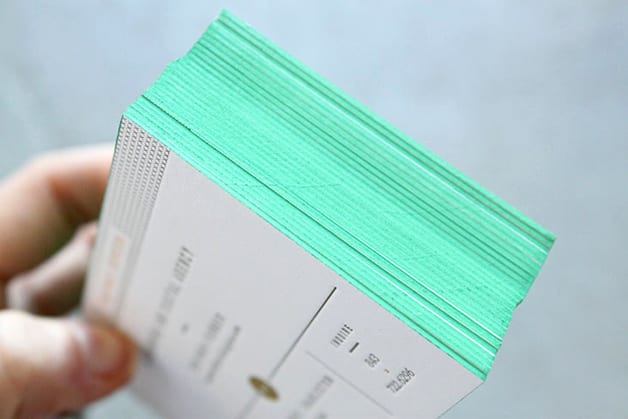
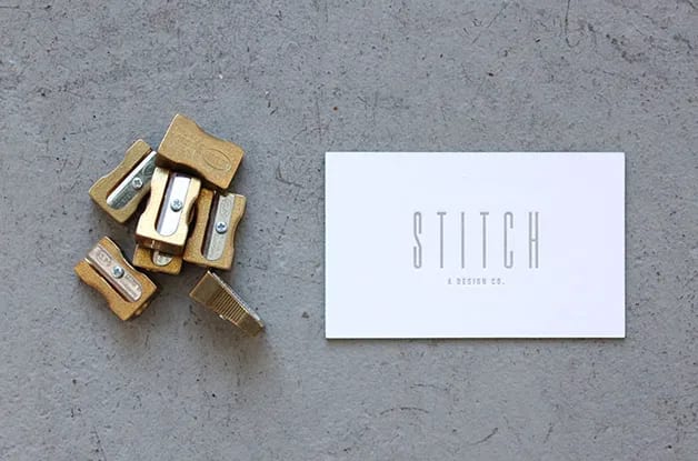
Stock: 650gsm smooth cotton card
Finish: letterpress, gold foil and painted edges
Stitch Design Co. say a good card is one you want to hold on to — not something you'd casually set aside. A card should be designed to be more than a card: it's a second ID for you, and it puts your company's values on display. If you're going for a luxury feel, that's what the card should reflect. We agree that a card mirrors your own and your company's worth, which is why it has to carry your brand's character. Hand someone your card and they should be able to read your pricing, your taste and more straight off it — so what goes on the card is never something to gloss over.
10. Elements LLC — the paper is the personality
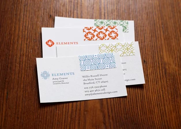
Stock: 300gsm eggshell paper plus a glossy sticker
Finish: digital printing
Elements LLC see a good card as one that starts from the details. From the paper you choose to the way it's printed, every decision shows how much you care about the card — and each one shapes the impression people form of your company. Theirs uses a tactile material with a sticker applied on top, pushing that hand-feel even further.
The takeaway
A business card is the single best tool for standing in for you and your company, so the design, the paper and the printing all have to pull in the same direction as your brand — all so the person you hand it to walks away with a positive, lasting impression of you in the few seconds they hold it.
Ready to put one of these ideas into print? We can help you choose the stock and finish that fit your brand and deliver across Hong Kong and Macau — see our premium cotton business cards, or WhatsApp us at +852 3001 5678 (English is fine).