
The most common waste on an A5 sticker sheet isn't leaving too much blank space — it's cramming the designs too tight, sizing them too small, and running the kiss-cut lines right up against the artwork. The sheet can look full, but end up hard to peel and awkward to use.
Whether you're making illustrated stickers, brand stickers, event giveaways, school reward stickers or DIY packaging stickers, don't rush to fill the whole sheet before you plan. Deciding what each sticker is for, how big it is, how many you need and how it peels off is far more reliable than fixing the kiss-cut positions after the fact.
If you haven't chosen a sticker material yet, work that out first, then come back to laying out the sheet.
First decide: is this sticker sheet to sell, to give away, or to use yourself?
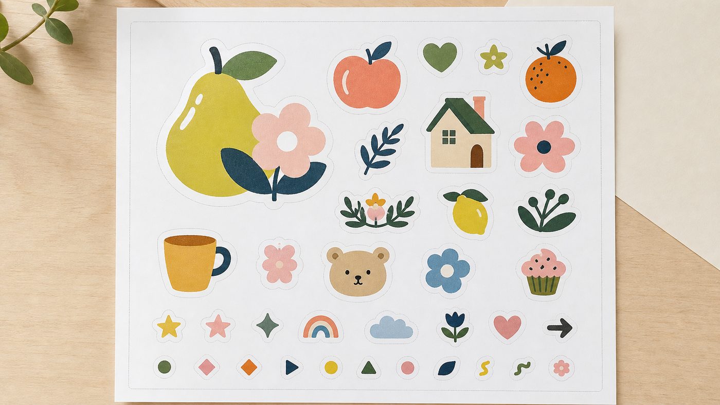
The first question when you lay out a sticker sheet isn't "how many designs can I fit on an A5" — it's how the sheet will actually be used.
For an art or illustration sticker sheet, buyers care whether each sticker peels cleanly, whether there's a standout "hero" sticker, and whether the whole sheet feels collectible. A sheet like this can have one or two larger hero designs, plus a few small icons, expressions, words or decorative elements.
For brand packaging stickers, the focus might be the logo, seal stickers, product categories, small thank-you stickers or social-handle prompts. These don't necessarily need many designs — they need practical sizes that sit well on a box, bag, bottle or card.
For school or event reward stickers, quantity and recognisability usually matter most. The stickers can be smaller, but the artwork and text have to stay clear — not so small that a child or participant can't make them out.
A5 or A4 sticker sheet: which one?
Printing Banana's sticker sheets (short-run available) come in A5 and A4 orientations. A5 suits a small number of designs, event giveaways, small brand stickers or a single themed set; A4 suits more designs, sheets you want to split into series, or when you want each sticker a bit larger.
Situation | Better fit | Why |
|---|---|---|
A set of 6–12 main designs | A5 | A tighter sheet — good for small sticker sets or giveaways |
Lots of designs, split into series, each one a bit bigger | A4 | More room, so it's easier to arrange hero and small designs |
Event handouts or classroom rewards | A5 or A4 | Depends on each sticker's size and how many you give out |
Brand packaging stickers | Decide by where they'll be applied | Seal, logo and product-category stickers all differ in size |
Quick rule of thumb: if you have one theme and only a few designs, A5 is usually easier to control; if you have a lot of designs and don't want each sticker too small, A4 is more comfortable.
More designs isn't better value
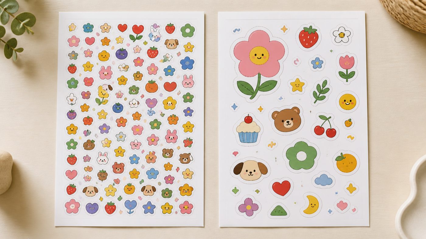
A sticker sheet tempts you to think, "I've got a whole sheet, might as well add a few more." But the more designs you add, the smaller each sticker gets and the tighter the kiss-cut lines sit between them. The result can look rich but be awkward to peel, with detail too small to read.
A safer approach is to sort your designs into three tiers first:
Hero stickers: the biggest and most eye-catching — usually 1–3 of them.
Everyday stickers: logos, short phrases, product names and category icons — medium size.
Filler stickers: stars, arrows, expressions and small icons to fill gaps — but don't let them steal the show.
Laying it out this way is more natural than giving every design equal size. The sheet gets a rhythm of its own, instead of looking like a pile of assets tipped onto an A5.
Common A5 sticker sheet layouts
If you don't have a layout in mind yet, start an A5 with "1 hero design + 4 to 8 medium and small designs + a few fillers", then adjust to the actual shapes of your artwork.
Layout | Good for | Roughly |
|---|---|---|
Hero-led | Illustration, IP, character stickers | 1–2 large designs + 4–8 small ones |
Practical | Brand packaging, seal stickers | Several same-size logos / seal stickers |
Mixed | Design goods, event giveaways | 2–3 medium designs + text stickers + small decorations |
Quantity-led | School rewards, event stickers | Many small designs — but keep the type legible and leave room for kiss-cutting |
For brand packaging, size the stickers by where they'll actually go — seal stickers, logo stickers, product-category stickers — rather than shrinking your everyday stickers just to fill the A5.
Kiss-cut lines need room — don't run them along the artwork edge
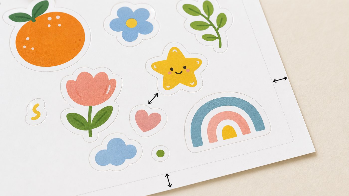
The kiss-cut is what lets each design peel off the backing sheet. The product information notes that sticker sheets can be kiss-cut; for the exact kiss-cut conditions, the number of stickers you can arrange and the file requirements, go by the latest options, diagrams and file confirmation on the product page.
As you lay out the sheet, avoid three problems:
Designs sitting too close together, leaving no room to place the kiss-cut lines.
A kiss-cut line running right against an important design, so the peeled sticker has a cramped edge.
Sticker shapes that are too fiddly or complex, making the finished sticker awkward to use.
Kiss-cut lines aren't at their best hugging the artwork edge — usually you leave a ring of safe space around each design, so the sticker isn't too tight to peel and thin corners, sharp points or tiny details don't wear out easily.
If a design has lots of sharp corners, thin lines or small decorations, it may not suit a tight cut everywhere. Consider simplifying the kiss-cut outline a little, so the sticker peels more easily and lasts longer.
Outer margins and blank space aren't wasted
Plenty of people see blank space on an A5 and want to squeeze in a few more small designs. But blank space on a sticker sheet has a real job: it keeps the whole sheet from looking crowded and reduces the risk of a design sitting too close to the trim edge or a kiss-cut line.
Especially when a sticker sheet gets picked up, photographed, put into packaging or handed out as a gift, a fully packed sheet looks cheap. A bit of breathing room actually makes the hero design stand out and makes the whole sheet feel like a finished product.
If you're making brand packaging stickers, think through which stickers you'll use often and which are just decorative. Give the everyday stickers enough size — don't shrink them just to fill the sheet.
Sticker material changes how the layout reads
Sticker sheets come in a range of materials: glossy coated, uncoated (woodfree) paper, holographic, clear, Conqueror laid-textured and kraft. Each material changes the overall feel, so your layout should suit it.
Material | Best feel for | Layout tip |
|---|---|---|
Glossy coated | Bright colour — good for brand and event visuals | You can use clean colour blocks and a strong hero design |
Uncoated (woodfree) paper | Natural — good for a handmade or writable feel | Don't lean too hard on high-contrast glossy effects |
Holographic | Eye-catching — good for decoration and a collectible feel | Keep designs from getting too fiddly so the effect has room to show |
Clear | Light — good where you want the background to show through | Watch legibility on pale artwork and thin type |
Kraft / Conqueror laid-textured | Papery — good for gifts, design goods and a handmade style | A simpler layout works well, letting the paper texture become part of it |
If you haven't decided at this stage, take a look at the sticker material selection guide first, then choose which material will carry your sticker-sheet design.
A quick check before you send the file
Before you send a sticker-sheet file, run through this quick checklist:
Have you decided on A5 or A4?
Is each sticker's purpose clear?
Do the hero, everyday and filler stickers have a clear hierarchy?
Is there enough space between designs to arrange the kiss-cut lines?
Are the important designs clear of the kiss-cut lines and the outer edge?
Are small text, QR codes and fine details still legible?
Does the material suit how the stickers will be used?
If there are special shapes, are the kiss-cut / cut lines clearly marked?
FAQ
How many designs can I fit on an A5 sticker sheet?
There's no fixed answer — it depends on the size and shape of each sticker. Rather than chasing a number, sort your designs into hero, everyday and filler first. Too many designs makes each sticker small and the kiss-cut lines harder to arrange.
Do I have to fill the whole sheet to get my money's worth?
Not at all. Blank space makes the layout clearer and the stickers easier to peel. A fully packed sheet tends to crowd the designs and tighten the kiss-cut lines, which makes the finished product less pleasant to use.
Can the kiss-cut lines hug the artwork closely?
Running them too close isn't recommended. Kiss-cutting needs room, and a cramped edge around a design raises production and usage risks. Go by the diagrams on the product page and the file confirmation for the actual kiss-cut conditions.
Are clear stickers good for a sticker sheet?
Yes, but watch the artwork colour against the background. If a sticker goes on a dark or patterned surface, pale artwork and thin type may not show clearly. Before you design, picture where the sticker will end up.
Are sticker sheets suitable for short runs?
Sticker sheets do come in a short-run option, good for a test print, event giveaways or a small batch of products. Go by the latest information on the order page for actual quantities and options.
Ready to lay out your A5 or A4 sticker sheet?
Once you have your designs, sort out the number of designs, the rough size of each, whether you want A5 or A4, the kiss-cut direction and your material choice, then head to Printing Banana's sticker sheets (short-run available) page to check the options or prep your file. We deliver across Hong Kong and Macau, and if you'd like a hand you can WhatsApp us at +852 3001 5678 (English is fine). That's a lot easier to quote and confirm than cramming your designs onto the sheet first.


