
A flyer earns its place by doing two things: pulling in customers and lifting your sales. To do that, its design has to communicate your message clearly. So what makes a flyer work? It grabs your target customer's attention, sparks their interest in your product, and gives them a clear cue to take the next step.
A professional flyer doesn't have to cost a fortune to produce. If you want to keep costs down and design it yourself, the suggestions below will help you sharpen your flyer and make a positive impression. Of course, if you don't have time to dig into this and you have the budget, you can always hire a graphic designer to solve it for you.
If you'd rather design it yourself, these six suggestions will help you produce a professional flyer.
1. Lead with benefits, not paragraphs
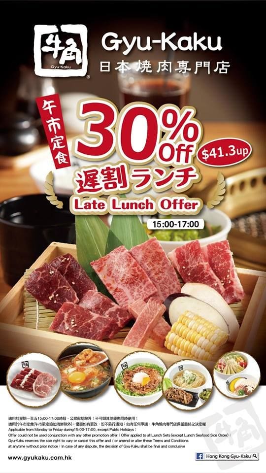
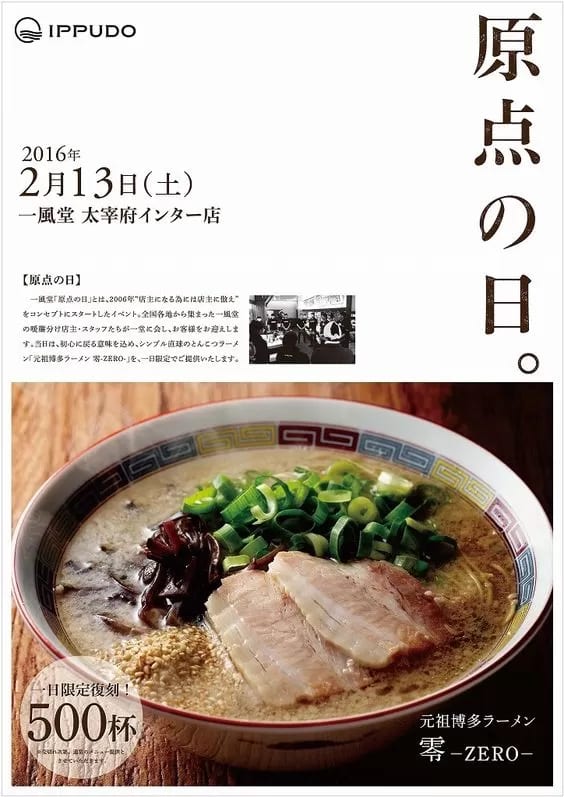
Unless your company is as well known as Apple or Google, no one really cares who you are. What customers want to know is what your flyer can offer them — the product or service they'll actually get.
What do you have? Why should they buy from you? And what's in it for them?
That's the heart of what your flyer needs to answer if you want customers to reach out on their own. Make sure the benefits are clear and easy to grasp. Survey data shows that most people are put off by a big block of text, so avoid dense paragraphs. The point of a flyer is to catch attention and spark interest, so readers go and find out more on their own.
Short sentences or bullet points work better for highlighting what matters. If you really must use a lot of text to explain a product or service, break the paragraphs up with subheadings, images, and different font colours, so it doesn't read like a long, cluttered article. Adding a website address to your flyer is another great move — when customers want to learn more, they know exactly where to go.
2. Use plenty of images — but never clip art
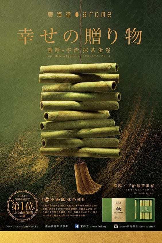
Creative, standout images get your flyer noticed, spark interest, and stick in people's minds. Flyers that are creative, fun, and visually striking get shared more, so it's worth investing time in your photography.
To save time and money, some small businesses turn to clip art for their flyers.
For a primary-school project, clip art might add a bit of polish and presentation value. But from a business point of view, clip art undercuts your professionalism. Others grab images off the web to save effort — but use those with real caution, because you run into copyright and low-resolution problems. The copyright owner has every right to demand you stop using the flyer and to pursue further legal action.
So if not Google Images or clip art, what should you use?
There are plenty of paid stock images out there to download. With paid images you don't have to worry about copyright, and you get a huge range of options to choose from.
Tip: use your own photos.
Photos you shoot yourself capture the strengths of your product or service best — because no one knows better than you how to show what makes them stand out. Set up your lighting and scene, and with a little time you can absolutely shoot product photos good enough for a flyer. And in the internet age, there are already plenty of online guides and props to teach you how to take better photos.
If you need to fine-tune an image, you can use Photoshop to touch it up.
3. Use attention-grabbing words
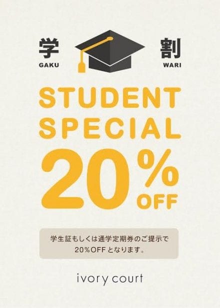
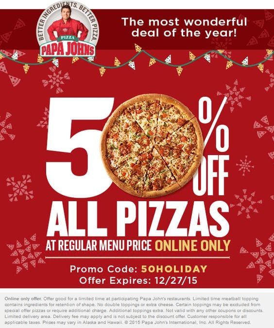
Certain words on a flyer draw the reader's eye, including: free, reward, earn, easy, enjoy, exciting, exclusive, prestige, extra, fast, learn, money, mystery, new, save, special, profit.
4. Use space well — don't cram in extra information

You don't need to fill the entire flyer with text or images. Arranging things thoughtfully helps readers take in your message faster and makes the flyer easier to read, keeping the highlights sharp and focused. Plenty of white space also makes for a more comfortable read, so people aren't overwhelmed or confused by too much crammed onto the page.
5. Add a call to action


A flyer's job is to drive sales, so tell your prospects exactly what to do next — but don't do it passively. "For more information, please call us…" is a passive call to action. That kind of flyer won't stir any interest; you have to spell out clearly how to take the next step.
For example:
- Register as a member on PrintingBanana before 31 August 2017 and get 100 cards free.
- Spend $500 at PrintingBanana today and get a free upgrade to a six-month 10%-off membership.
6. Focus on building leads and driving purchases
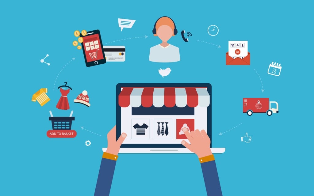
Not everyone who receives a flyer will buy right away. Use your flyer to find leads who might turn into paying customers down the line. A flyer's key purpose is to capture prospects who are interested in your product or service.
Say you run a carpet-cleaning business. Some people will read your flyer and call to book a cleaning straight away. Others might spend a few months mulling over whether to hire you. To give your flyer a longer shelf life, add some expert advice — tips on removing red-wine stains, say, or on dust mites and allergies.
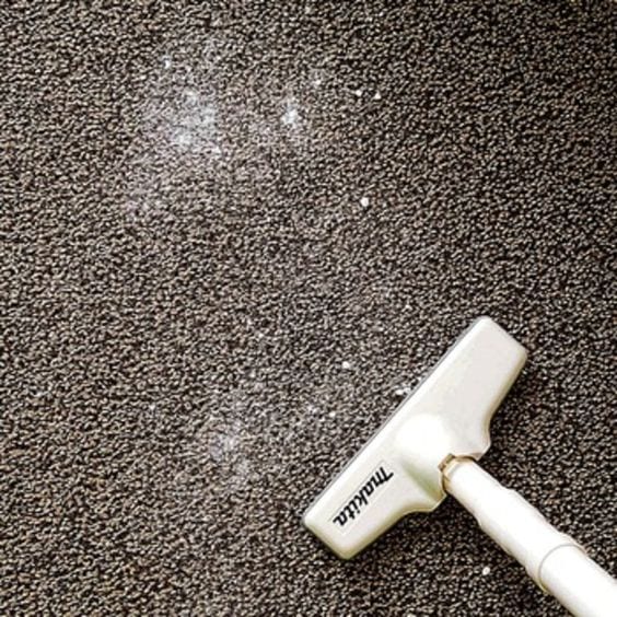
Keep the advice as relevant to your industry as possible; it helps build your pool of leads. Ask customers to hand over an email address in exchange for the advice. Once you have their email, you can stay in touch with these prospects — so when they need their carpets cleaned, you're the one they remember. Adding a QR code or URL for your website's sign-up page can nudge their intent to buy even higher.
Ready to print? Order your A4 flyers with Printing Banana, with delivery across Hong Kong and Macau. Have questions about printing, design, or promotion? WhatsApp us at +852 3001 5678 (English is fine) or email Question@printingbanana.com — we're happy to help.


