
Walk down any supermarket or shop aisle and the first thing that reaches you is the label. Long before anyone reads the fine print, a product's label sets the tone, sparks interest, and closes the gap between a shopper and the item on the shelf. That makes label design one of your most powerful marketing tools: a good label has to catch the eye, communicate what matters, and give buyers enough reason to choose your product over everything around it.
Why label design matters
A product label is a serious marketing tool, not an afterthought. A strong label helps your product stand out in a crowded field of competitors, tells shoppers what makes it special, and earns those extra couple of seconds of attention that so often decide a sale. Good design starts from the product's own character and the needs of your target customer — get that right and it can have a real impact on how well the product sells.
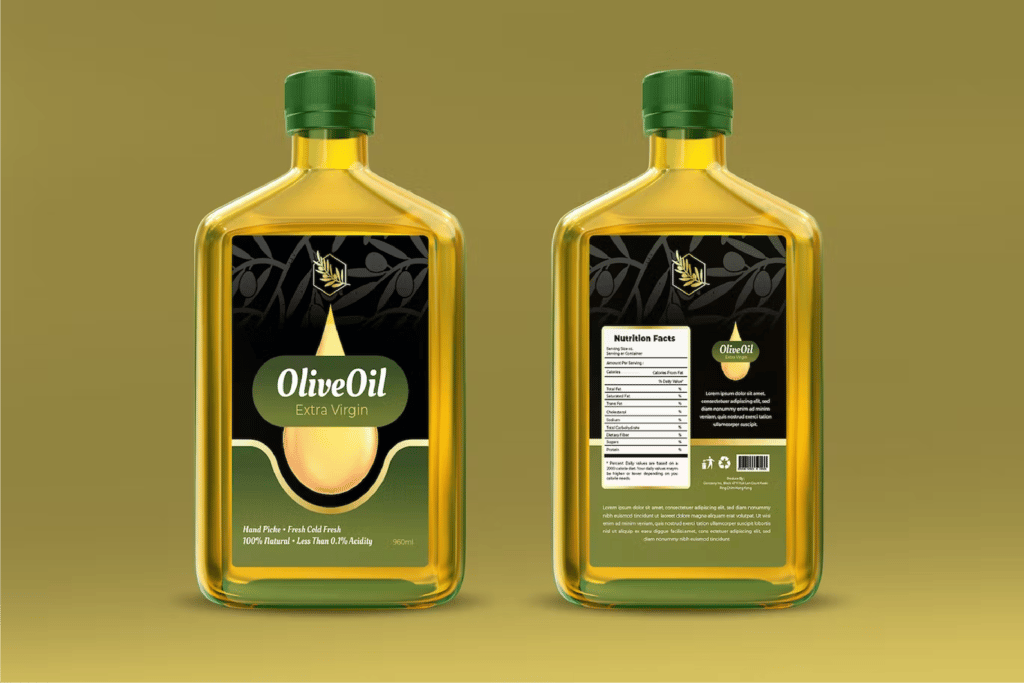
Choosing your design elements
A product label pulls together several elements — colour, typeface, imagery and layout. These need to be balanced and coordinated so the whole thing is easy to read and pleasant to look at. A few pointers:
- Colour: pick bright, vivid, appealing colours that draw the eye, and use them to express your brand's personality and values. If your brand colours aren't especially striking on their own, strong contrasting colours can add visual punch.
- Typeface: choose fonts that are easy to read and match your brand's style. Keep the type large enough that a shopper can grasp what the product is at a glance.
- Imagery: use images to help convey the product's features and value. They should sit comfortably with your brand style and your target market.
- Layout: keep the arrangement clean, tidy and easy to read, and put the most important information where it stands out most.
Keep the text simple, clear and readable
The words on a label should be concise, clear and easy to read. Use plain language and short sentences so shoppers can understand the product's features and value quickly. Put the key information — product name, brand name, description and how to use it — in the most prominent spot. And don't overload the label with copy, or it will look cluttered and become hard to read.
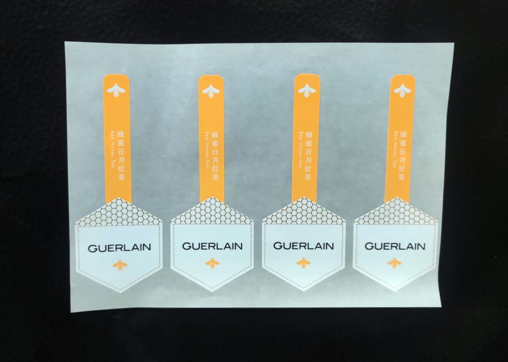
Getting the product information across
A product label needs to carry the essential details: brand name, product name, product description, ingredients, directions for use, shelf life and so on. Lay this information out so shoppers can find what they're looking for quickly.
Brand consistency
Your label design should stay consistent with your overall brand style, which helps build brand image and brand loyalty. As you design, keep your other marketing touchpoints in mind — advertising, promotions and packaging — so everything hangs together. Brand consistency also sets your product apart from the competition: when shoppers are faced with a wall of products and brands, a coherent look helps yours cut through and grab attention.
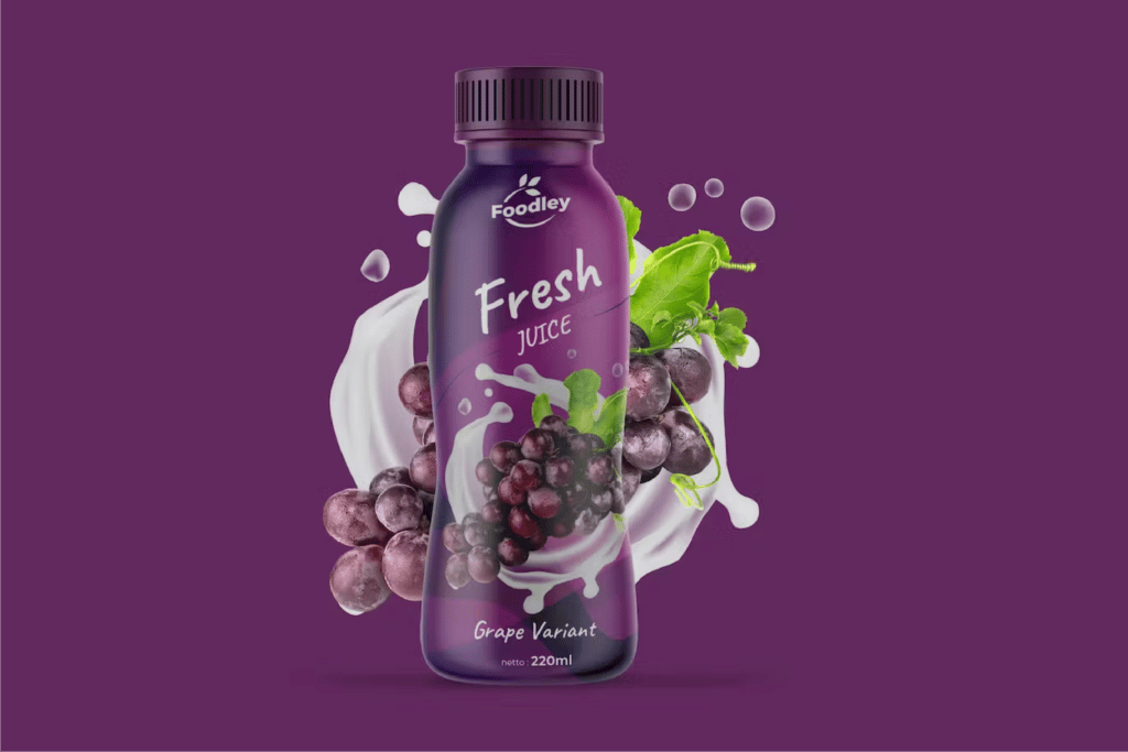
Learn from what works
Finally, studying other successful product labels can offer valuable insight. Look at how other brands use design elements, wording and layout to catch shoppers' attention and lift the perceived value of their products.
In short, a successful product label comes down to a handful of things working together: the right design elements, text that's simple, clear and easy to read, consistency with your brand, and lessons drawn from labels that already work. Coordinate and fine-tune those and your product has a much better chance of standing out in a competitive market — and selling more.
Printing your labels or stickers in Hong Kong? We deliver across Hong Kong and Macau, and we're happy to help you get your artwork press-ready. Message us on WhatsApp at +852 3001 5678 — English is fine.


