
Kraft paper is an eco-friendly board with an unmistakably retro character — its warm brown surface pulls in art studios, craft makers, creative labels, and sustainability-minded brands. Part of the appeal is honesty: kraft is never bleached, so it keeps the natural colour of the wood it came from. Bleaching paper takes an environmental toll, which is exactly why anyone who cares about nature and green credentials tends to reach for kraft first.
What to watch for when printing on kraft paper
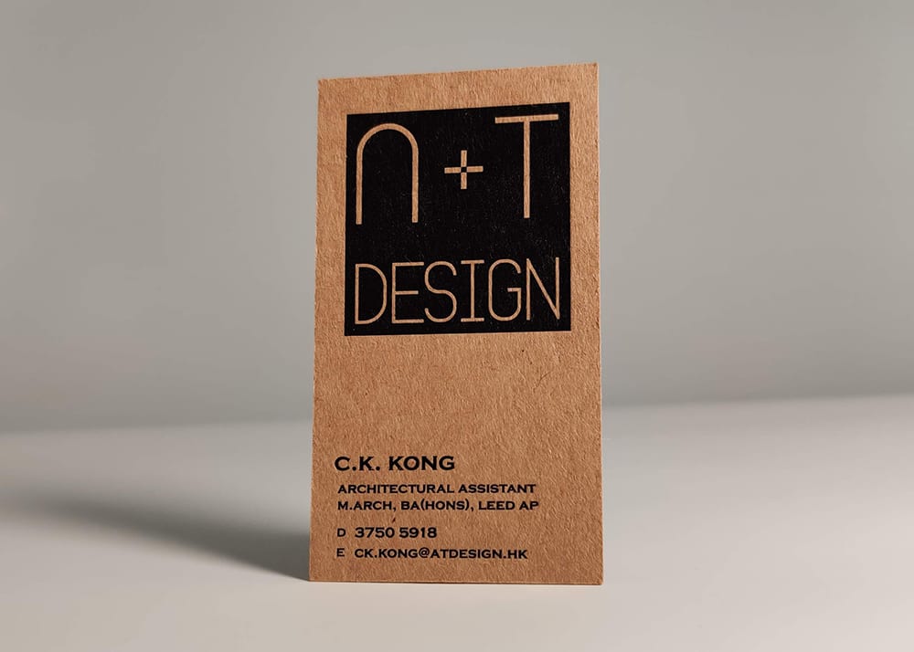
Because kraft skips the bleaching that white stock goes through, it carries a brown-yellow tone that is genuinely hard to print on. If your design uses colours that are too light, the paper's own base colour drags them darker — and yellow is the worst offender. Yellow sits so close to brown that the printed result rarely looks the way you intended.
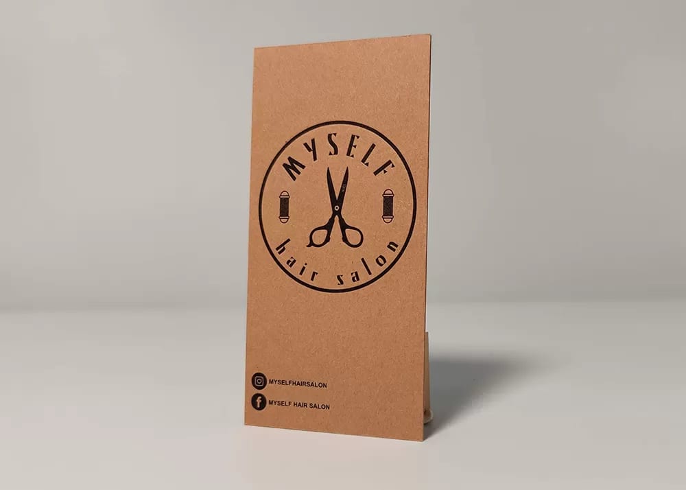
Black, dark blue, and deep brown are much safer choices. They are dark enough to begin with, and the ink lays down densely enough to cover kraft's natural colour.
Can you do full-colour printing on kraft?
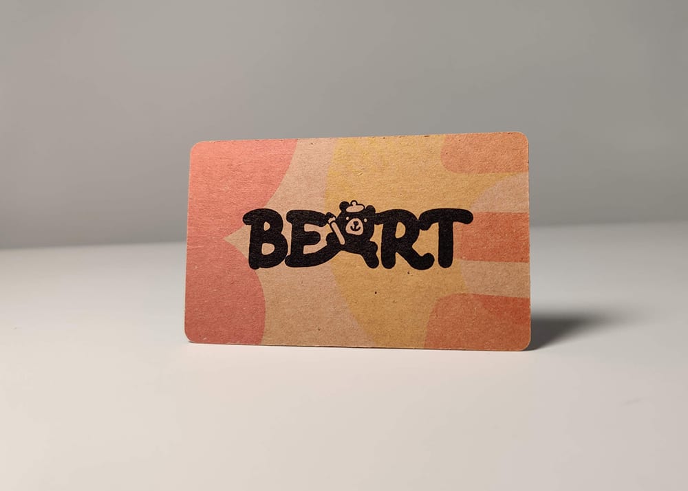
If you absolutely need full-colour work on kraft, we can lay down a layer of white ink first and print the colour on top. The white underprint turns those areas of the sheet white, so they behave much more like white paper. The kraft tone still shows through to a degree, but with the white ink underneath, colour printing on kraft comes out noticeably better.
Which finishes work on kraft paper?
Just about every premium card finish works on kraft: foil stamping, letterpress, embossing, crystal lettering, and gilded edges are all fine. Edge painting is the one to watch — like the printing on the face of the card, coloured edges are applied with ink, so the same rule applies: don't go too light.
With foil, gold reads less strongly on kraft because it sits so close to the paper's own colour, so the effect just doesn't stand out. If you want more contrast, go with silver foil instead. Silver's bright white plays off the brown of the kraft for a far stronger contrast.
Blind embossing is a great match for kraft. Because the stock is darker, the raised effect looks more three-dimensional than it would on white card — and it shows up clearly here, without needing a particular angle of light to catch it.
Kraft paper: the eco choice that keeps paper's true colour
If you're after a genuinely eco texture, or you want your print to carry a little environmental awareness, kraft paper is a great pick. Just remember it isn't the friendliest surface to print on — before you go to print, double-check that your design file has no colours that are too light. And if you're not sure, ask us: we deliver across Hong Kong and Macau and we're happy to talk it through. WhatsApp us any time at +852 3001 5678 (English is fine).


