
Designers often pick the wrong colour values, and the printed result comes out looking off. When our prepress team checks incoming files, we regularly find CMYK builds that simply won't print cleanly. The most reliable way to verify a colour is, of course, a CMYK swatch book — but not every graphic designer owns one, and plenty of people new to the trade never took a formal course, so their grounding in colour for print can be thin. So how do you choose colour values that actually print the way you intend?
Keep total ink between 10 and 250
Each CMYK channel runs from 0 to 100, but a printing press can't reproduce every possible combination, and every paper stock absorbs ink differently. The usable range is therefore narrower than the numbers suggest. As a rule of thumb, keep the total ink value — the sum of your C, M, Y and K percentages — between 10 and 250. Stay inside that band and your colour will render cleanly. Push the total past 250 and the result prints so close to black that it's hard to tell colours apart, even though they look distinct on screen. Drop below a total of 10 and the colour barely shows — it can come out looking almost white.
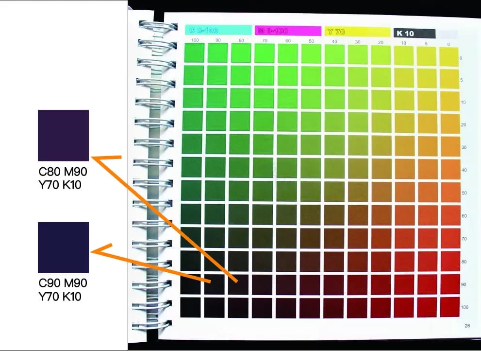
On screen one swatch reads as deep magenta and the other as deep blue, yet in the CMYK swatch book the two look almost the same — proof that once you go past a total of 250, the difference between colours all but disappears.
Black and grey: lean on the K channel
Beyond the overall range, watch how much K you use. K is the darkest channel, so it has an outsized effect on everything around it. Keeping it at 50 or below is usually the safer choice, as it minimises the influence K has on your other values. Many designers also build greys and blacks out of several channels at once. That's risky: every extra channel is another plate that has to register perfectly. For grey and black, printing a single channel — K only — is the ideal, cleanest option.
Reach for spot colours
A spot colour is a pre-mixed, ready-made ink rather than a colour built up by overprinting the four CMYK inks. Because a spot colour is laid down as a single flat ink, its coverage is excellent and it can reach a very high opacity. Its gamut is far wider than CMYK's, so it can hit colours that four-colour printing simply can't reproduce. Not every printer can run spot colours, so check before you commit to one. In principle you can approximate part of a spot colour in CMYK — just know that a simulation will never quite match the real thing.
Take Coca-Cola as an example. Different suppliers use different inks and presses, so their output varies slightly from one to another. Even when everyone mixes CMYK to the exact same values and ratios, the printed colour will drift a little. That drift is normal, but for a big brand even a small shift is easy to spot. A spot colour sidesteps the problem: Coca-Cola's red is a specially made ink, and because a spot colour is a single ink that needs no four-colour mixing on press, the finished job doesn't suffer that kind of variation.

Don't judge colour by your screen
Your monitor displays colour in RGB, so unless it has been through proper colour calibration you can't use it to proof print colour directly. On top of that, screens differ by brand, by model and by their colour settings, which means the same file looks different from one display to the next.
Not sure whether your colour values will hold up on press? Send the file over and our prepress team will flag any risky builds before we print — WhatsApp us at +852 3001 5678 (English is fine), with delivery across Hong Kong and Macau.


