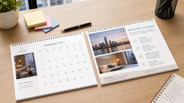
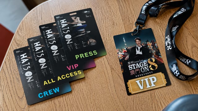
The best thing to put on a foamboard event prop isn't every piece of event information — it's the content people can register at a glance, want to photograph, and can act on straight away.
An event name, a short slogan, a brand mark, a photo-op element and a QR code usually work far better than a long paragraph of background.
Foamboard props are rarely something people stop to read carefully. They're made to be seen, picked up, photographed, shared, scanned, or followed as a cue. So before you make a set of foamboard event props, the first job isn't layout — it's deciding:
Is this prop meant to grab attention?
Is it a photo-booth or check-in prop?
Is it there to guide foot traffic?
Or is it driving sign-ups, enquiries, or QR-code scans?
When the job is clear, the content becomes clear.
First decide: what job is this foamboard prop doing?
The same foamboard prop can have a completely different job depending on where it's placed.
At the event entrance, it might be there to make people stop.
At an exhibition booth, it might introduce the theme or guide enquiries.
At a school open day, it might be for keepsake photos.
At a pop-up shop, it might show an offer, a product selling point or the brand's tone.
In an awards area, it might be something guests hold up for photos.
If you don't decide the job first, it's easy to cram in the event name, date, description, logo, sponsors and QR code — and end up with a busy board no one remembers.
Which one thing should the prop make your audience remember?
If that isn't clear, the design will struggle to leave a mark.
If you already know you need event props, take a look at Printing Banana's foamboard prop printing page first to see the basic options — 40 × 40cm, 50 × 50cm, PP-mounted foamboard, single-sided full colour and die-cutting — then plan your content direction.
A memorable event usually comes from one line, not a wall of text
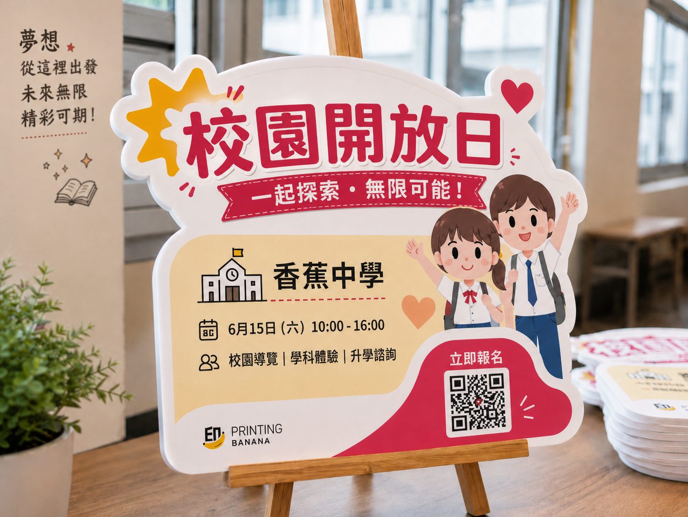
The most common problem with event props is content that reads too much like a poster.
A poster can carry more information, but foamboard props are often held up, placed in a photo zone, or set beside a booth — where viewing time is short. In that setting, one easy-to-remember theme line usually beats a whole paragraph of brand copy.
Start by splitting your foamboard prop content into three layers:
| Content layer | What to put there | Purpose |
|---|---|---|
| Layer 1 | Event theme / a single slogan | Lets people see what the event is at a glance |
| Layer 2 | Brand name / logo / date / short selling point | Fills in the identity and context |
| Layer 3 | QR code / URL / social handle / call to action | Lets interested people take the next step |
The most important thing is that the three layers have a clear hierarchy.
If the event theme, logo, QR code, sponsors and text are all the same size, people won't know where to look first. The point of a foamboard prop isn't to say everything — it's to make people on site remember the one thing that matters most.
For example:
School events can use a short line like "I did the challenge!" on a handheld sign — far more photo-friendly than a paragraph about the event's mission.
Pop-up shops can use "Today only" to make people stop, then add smaller text about the product or brand.
Exhibition booths can use a simple action line like "Scan to see our options," so visitors aren't left standing at the booth unsure what to do next.
Handheld signs, photo boards, wayfinding and QR codes: who does what?
Different foamboard props should carry different content. Don't force the same layout onto every board.
| Prop type | What to put on it | What to avoid |
|---|---|---|
| Handheld sign | Short slogan, expression, simple graphic | Long paragraphs, tiny QR codes |
| Photo board | Event name, key visual, brand elements | Cramped info, too many logos |
| Wayfinding sign | Direction, zone name, flow cue | Decoration that hides the direction |
| Offer sign | Headline offer, deadline, CTA | Long terms, unclear prices |
| QR-code sign | The reason to scan, a short prompt | A bare QR code with no explanation |
| Award / graduation board | Name, year, a sense of occasion | Too much detail that disappears in the photo |
Handheld signs: keep it to one simple line so it photographs well
Handheld signs usually suit a short line, such as:
I did the challenge!
Graduating today
New flavour, tasting now
We're here!
Checked in
Thanks for the support
Go Team A
Lines like these don't need much explanation. What matters is that people on site are happy to pick them up and photograph them, and that the shot still makes sense to others once it's shared on social media.
Three things to watch on handheld signs:
First, make the text big. Once a photo is scaled down, small text disappears.
Second, keep the tone natural. Copy that's too formal makes people less willing to hold it up for a photo.
Third, a logo is fine, but not so big that the photo turns into a hard-sell ad.
Photo boards: the event should still read in the photo
A photo board can carry the event name, key visual, brand elements and a single theme line. Its job isn't to explain every detail — it's to make the photo itself recognisable.
After the photo is taken, it should still be clear:
What the event is
Which brand, school or organisation is hosting
Whether the mood is fun, professional, cute, stylish or formal
Why someone would want to share the photo
If a photo board is crammed with small text, it vanishes once the phone photo is scaled down.
A safer approach is to keep one key visual and one theme line, then add a brand identifier that's clear without being loud.
If you want a full photo spot rather than a few handheld signs, it's also worth considering IG/FB photo frame printing.
Frames are better for large group photos, social-media check-ins and themed-event keepsakes; foamboard props are better for handheld interaction, short lines and on-site zoning cues. You can use both together — just keep each one's job clear.
Wayfinding signs: clear beats clever
Wayfinding signs are different from photo boards. What matters most isn't that they're fun — it's that they're clear.
For example:
Check-in
Queue this way
Event entrance
Workshop area
Photo area
Gift redemption
Scan to register
Enter here
This kind of content should be large, short and easy to understand.
In busier spots on the floor, a wayfinding sign should tell people where to go next at a glance. Arrows, zone names and colour contrast matter more than elaborate illustration.
QR codes: use them, but don't let them steal the shot
QR codes are useful, but they don't have to sit dead centre.
If a foamboard prop is mainly for photos, an oversized QR code wrecks the composition.
If the prop is mainly for sign-ups, prize draws, downloads or enquiries, the QR code needs to be big enough, with enough clear space, so it can actually be scanned on site.
A safer approach is to place the QR code in a corner or along the bottom, with a short call to action next to it, such as:
Scan to enter the draw
Scan for event details
Follow us
Scan to register
Scan for your offer
Scan to download the info
At busy events, the QR code shouldn't be the only CTA. Add a short URL, a social handle or a WhatsApp number as well, so no one leaves just because they couldn't get the scan to work.
How to choose die-cut shapes and sizes
Foamboard props can be die-cut into different shapes, which is where they get more interesting than a flat poster.
For example:
| Event type | Die-cut direction |
|---|---|
| Food event | Food, drink cups, utensils, product shapes |
| School event | Mascot, medal, book, star, speech bubble |
| Pop-up shop | Brand logo, product outline, key-visual element |
| Sports event | Trophy, race number, cheer sign, finish line |
| Beauty / retail event | Gift box, heart shape, product packaging, offer sign |
| Award / graduation event | Trophy, graduation cap, photo frame, name plate |
That said, the shape shouldn't be pure decoration — it should tie into what makes the event memorable.
Shapes that are too thin, too spiky or too complex aren't ideal to produce or to use. Design with the real 40 × 40cm or 50 × 50cm size in mind, and picture whether the prop will feel sturdy when it's held up or stood out on site.
40 × 40cm or 50 × 50cm: which to choose?
Common foamboard prop sizes are 40 × 40cm and 50 × 50cm. Both work as event props, but they suit different amounts of content.
| Size | Best for | Content suggestion |
|---|---|---|
| 40 × 40cm | Handheld signs, simple slogans, small photo props | One short line + a simple graphic |
| 50 × 50cm | More prominent photo boards, or when you need a QR code or more brand elements | Theme line + logo + QR code / CTA |
Whichever size you use, avoid long paragraphs of text — leave space so the theme reads at a glance.
How to build a prop set for a small event, school event or pop-up
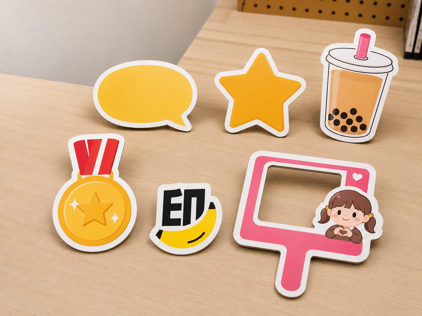
If you're making a set of event props, plan them by dividing the work. Don't put the same content on every board.
| Event type | Suggested prop set | Goal |
|---|---|---|
| Small retail event | Theme board + offer sign + QR-code sign | Stop passers-by, explain the offer, invite scans |
| School event | Event theme board + handheld slogan signs + photo board + wayfinding signs | Photo keepsakes, more engagement, guided flow |
| Pop-up shop | Key-visual board + product-selling-point sign + social-handle sign + photo board | Build brand memory, encourage sharing |
| Exhibition booth | Brand theme board + service-selling-point sign + scan-to-enquire sign | Simplify the message, guide enquiries |
| Award / graduation event | Theme board + name / identity sign + group-photo prop | Create a sense of ceremony, easy photo sharing |
Before you send the file: check the content fits the real size
The product listing gives foamboard prop sizes of foamboard props as 40 × 40cm and 50 × 50cm, on PP-mounted foamboard, single-sided full colour, with die-cutting available. The minimum order is 4, and production takes about 2 working days.
Before you send your file, check that:
The main headline is still legible from a distance
The logo, event name and slogan have a clear hierarchy
The QR code is big enough with clear space on all four sides
The die-cut shape isn't too complex, too thin, or full of sharp points
If you need die-cutting, you've built a clear cut line around the artwork
The content suits the real 40 × 40cm or 50 × 50cm proportions
You've confirmed the minimum order and how many designs you need
You've allowed about 2 working days for production
The hand-holding area won't cover key text or the logo
The event theme still reads when the photo is scaled down
The file is set in CMYK
The text has been converted to outlines
Images are embedded or correctly linked
A quick foamboard prop content template
If you're not sure what to put on them yet, start by organising along these lines:
| Prop purpose | Suggested content |
|---|---|
| Event entrance | Event name + date + key visual |
| Photo zone | Theme slogan + brand elements + photo-friendly graphic |
| Handheld sign | A short slogan / expression line / participant identity |
| Exhibition booth | Product selling point + scan to enquire + brand logo |
| School event | School year / event name / student identity line / mascot |
| Pop-up shop | Offer line + hero product + social handle |
| Award area | Award name + year + event theme |
| Wayfinding | Zone name + arrow + short prompt |
This table helps you avoid cramming everything onto one board from the start. The more clearly your event props divide the work, the better they perform on the day.
Frequently asked questions (FAQ)
What content works best on foamboard props?
The best fit is the event theme, a short slogan, brand elements, a simple graphic and a clear CTA. They're not the place for long paragraphs, because people usually only look at them — and photograph them — for a moment.
Are foamboard props good for photo props?
Yes. Foamboard props work well as handheld signs, photo boards, event wayfinding or brand-theme props. The key is large text and a clean layout, so the event theme still reads in the photo.
Should you put a QR code on a foamboard prop?
You can, but it depends on the purpose. If the prop is mainly for photos, keep the QR code subtle; if it's for sign-ups, prize draws or enquiries, give it enough size and clear space, plus a short, clear call to action.
40 × 40cm or 50 × 50cm for foamboard props?
For a simple handheld sign or a short slogan, 40 × 40cm is worth considering; if you have more content, want a more obvious photo effect, or need to add a QR code, 50 × 50cm gives you more layout room. In the end it comes down to how much content you have and how it's used on site.
Is a more unusual die-cut shape always better?
Not necessarily. A die-cut should help the event be remembered — not make the prop hard to hold, hard to read, or hard to produce. A simple, clear shape is often a better fit for the event floor than something overly complex.
What's the difference between foamboard props and IG/FB photo frames?
Foamboard props suit handheld signs, slogan boards, wayfinding, QR-code signs and small event props; IG/FB photo frames suit big group photos, photo walls and social-media photo moments. If you want to boost the photo experience, you can use both — just keep each prop's job clear.