A great restaurant poster does more than tempt customers with mouth-watering food — it lifts your restaurant's image and signals its style and class. At a minimum, a well-designed restaurant poster needs to carry a few things: a product photo, the product name, a tagline, the promotion dates, the restaurant logo, and the restaurant's basic details.
Beyond that, composition and colour matter just as much. Below we break down, in three points, what to watch for when you design — and at the end we walk through a worked example.
The three points are:
- Build the composition around the product
- Use high-quality product photos
- Let the dish, your restaurant's style, or the season decide the colour palette
1. Build the Composition Around the Product
A restaurant poster's layout usually puts the product front and centre, with everything else playing a supporting role. Keep a clear hierarchy, let the hero element stand out, and avoid clutter.
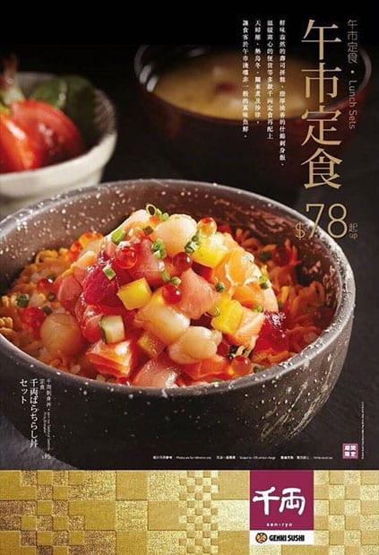
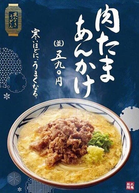
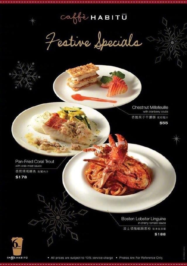
As you can see above, the product photo usually takes up the largest area of the poster. Among the text, the product name matters most, followed by the tagline and price, then the promotion dates; the restaurant logo and basic details generally occupy the smallest area.
Once the food is the focus, keep the text to no more than three colours — any more and the design starts to look messy. Usually you choose text colours that contrast with the background: in the two posters above, the dark backgrounds are paired with white and gold text. The reverse applies too — on a light background, use dark text, and try to keep it in harmony with the colours of the dish.
Because the whole point is to get customers through the door, design from the customer's point of view: the poster should make people's mouths water. Don't force the branding by making the restaurant's name or logo the centrepiece — if the food, the headline and the price are appealing enough, customers will go looking for your details on their own.
2. Use High-Quality Product Photos
Product photos have to be sharp and appetising. Photo quality is one of the biggest factors in whether a restaurant poster works.
Good design alone isn't enough — a great restaurant poster lives or dies by its food photography. You can shoot the whole dish as a close-up, or go for macro and depth-of-field effects.
a. Whole-Dish Close-Ups
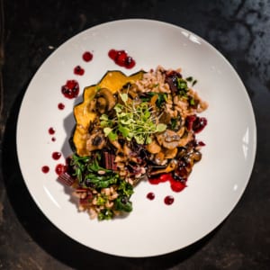
A whole-dish close-up is versatile and works with all kinds of layouts. If you don't have a suitable backdrop, enough props or much styling experience, shoot against black or a colour that contrasts with the dish, and shoot from directly overhead so the food and its plate are captured in full. That makes it easy to cut the product out of the photo for retouching later, and the same shots double as material for menu design.
b. Depth-of-Field and Macro Shots
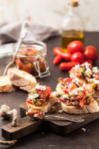

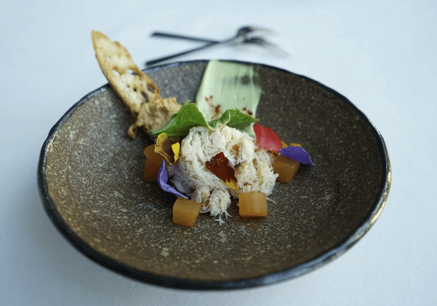
Depth-of-field and macro shots are another common choice for restaurant posters. For a depth-of-field shot you want the right setting — a clean background and plenty of light. Shoot from above or straight on, from slightly over the food or from the side, and you don't need to capture the whole dish.
If you're shooting more than one item, watch how you arrange the food — don't let it get too crowded or chaotic, because these shots often become the poster background and you need to leave enough clear space for the text.
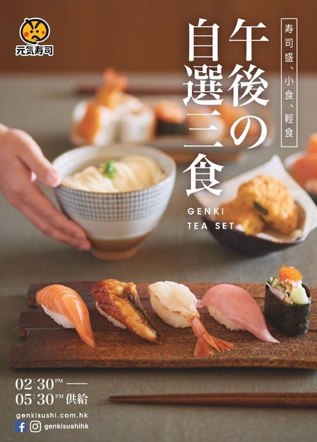
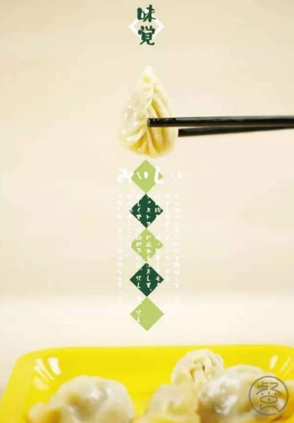
Saturation and sharpness matter too. Don't lean too hard on post-processing — if the shot comes out far from what you had in mind, editing won't necessarily rescue it.
3. Let the Dish, Your Style, or the Season Decide the Colours
If you're not sure what your main colour should be, here are a few examples to work from. The most classic restaurant-poster palettes use black, white and warm tones like red and orange as the background or main colour. Black or white backgrounds are almost foolproof and make the food stand out, while warm reds, oranges and yellows are the easiest way to stir up an appetite.
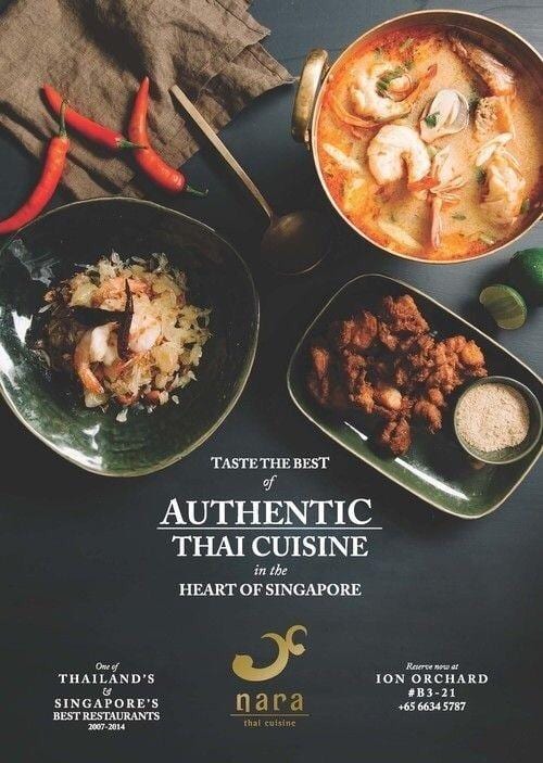
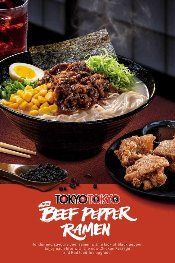
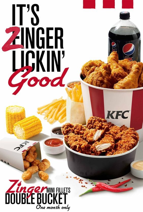
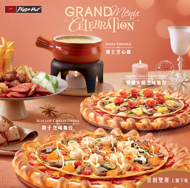
Alternatively, pick a main colour that echoes the colour of the dish itself — it makes the whole design feel more cohesive. Think green for matcha or avocado dishes, pink for desserts, and beige or light tones for noodle dishes.
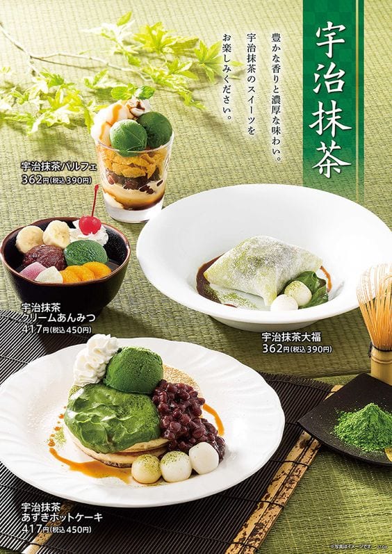
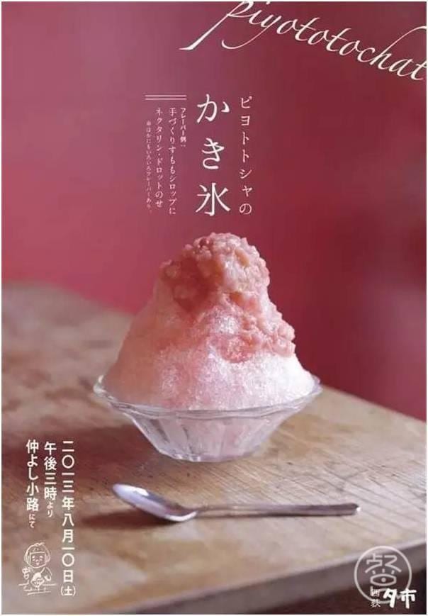
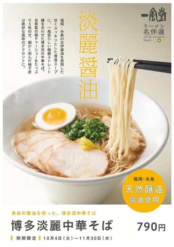
If you want to stand out and play up your restaurant's character, you can try a more unusual colour scheme, like the ones below.
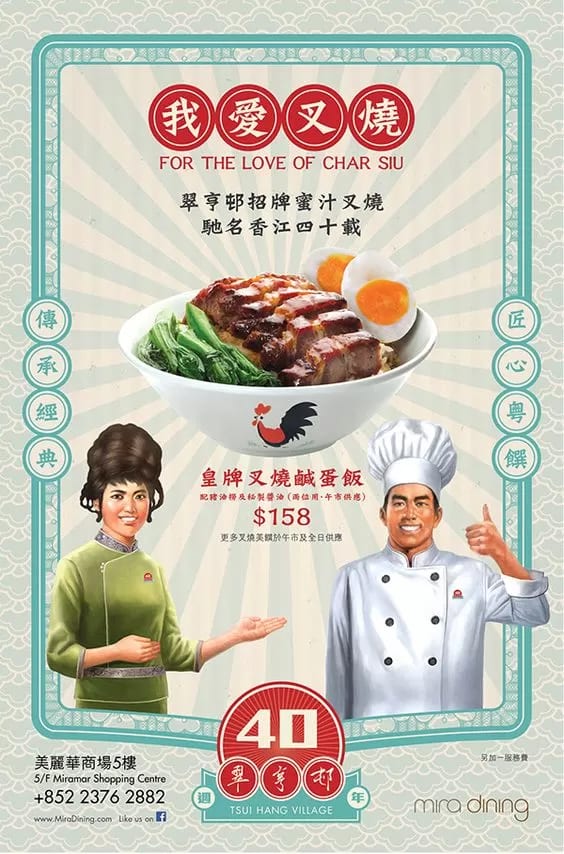
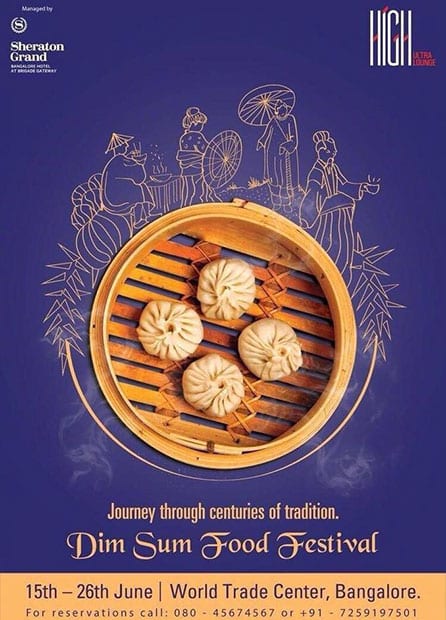
Chain restaurants and fast-food outlets tend not to stick to a fixed theme — beyond the classic colours above, their posters are often bright and varied, giving a cheerful, lively feel.
They also shift their palette with the seasons and upcoming holidays: pinks and light greens in spring, light blue in summer, orange and khaki in autumn, white and deep blue in winter; or pink and white for Valentine's Day, orange and black for Halloween, red, green and silver for Christmas, and red and gold for Lunar New Year — all worth keeping in mind when you design a restaurant poster.
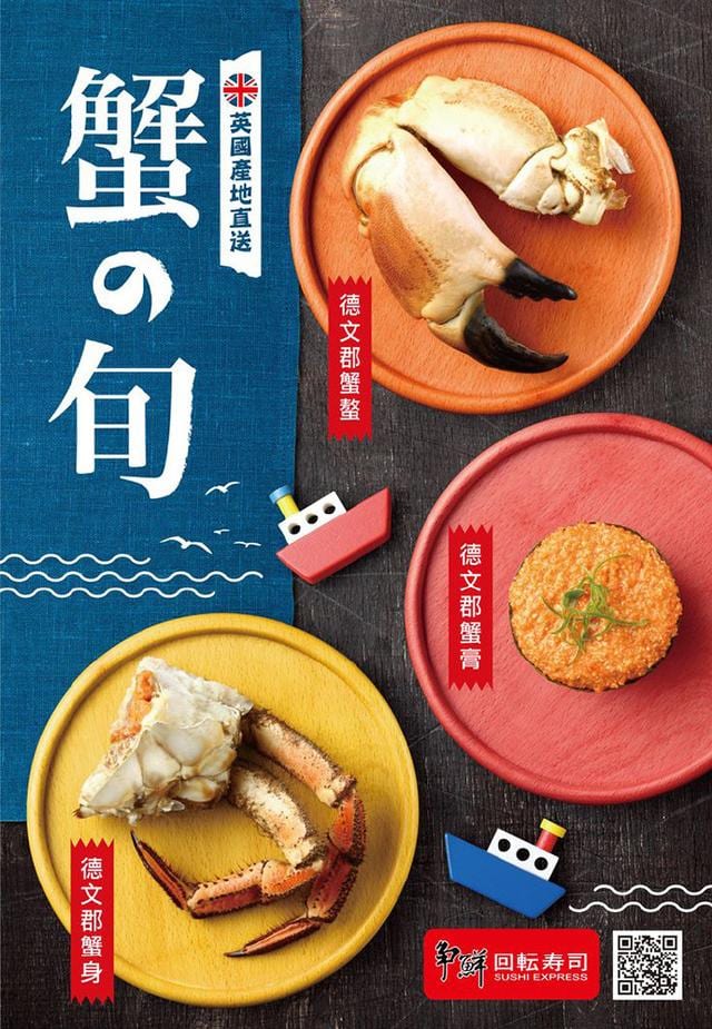
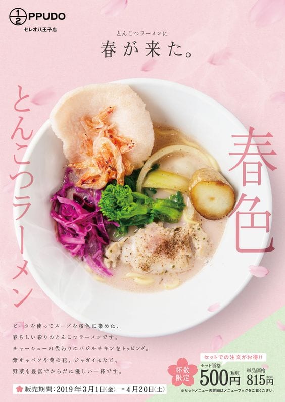
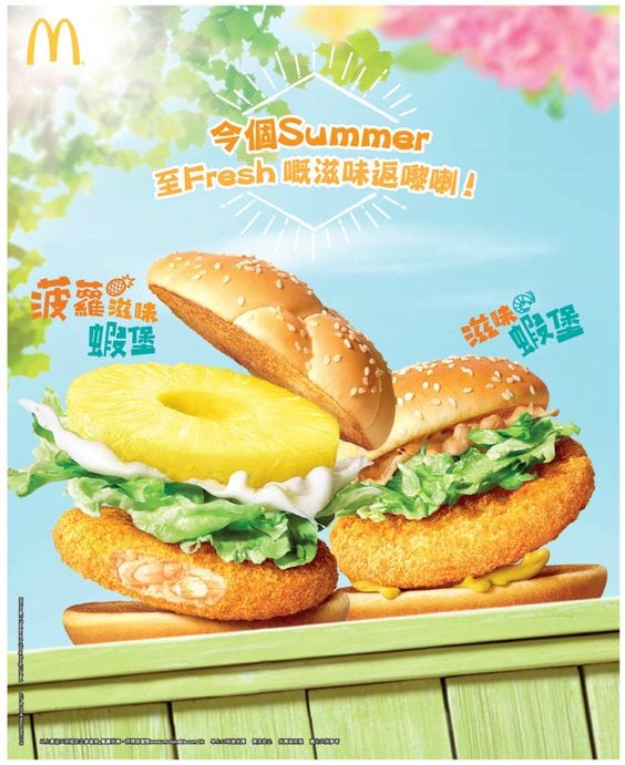
If you do go for a more unusual or colourful main scheme, you'll need to be very comfortable with colour: keep the number of colours down and bring a good eye, or it can easily backfire.

Putting It Together: A Worked Example
Pulling all three points together, let's walk through designing a restaurant poster.
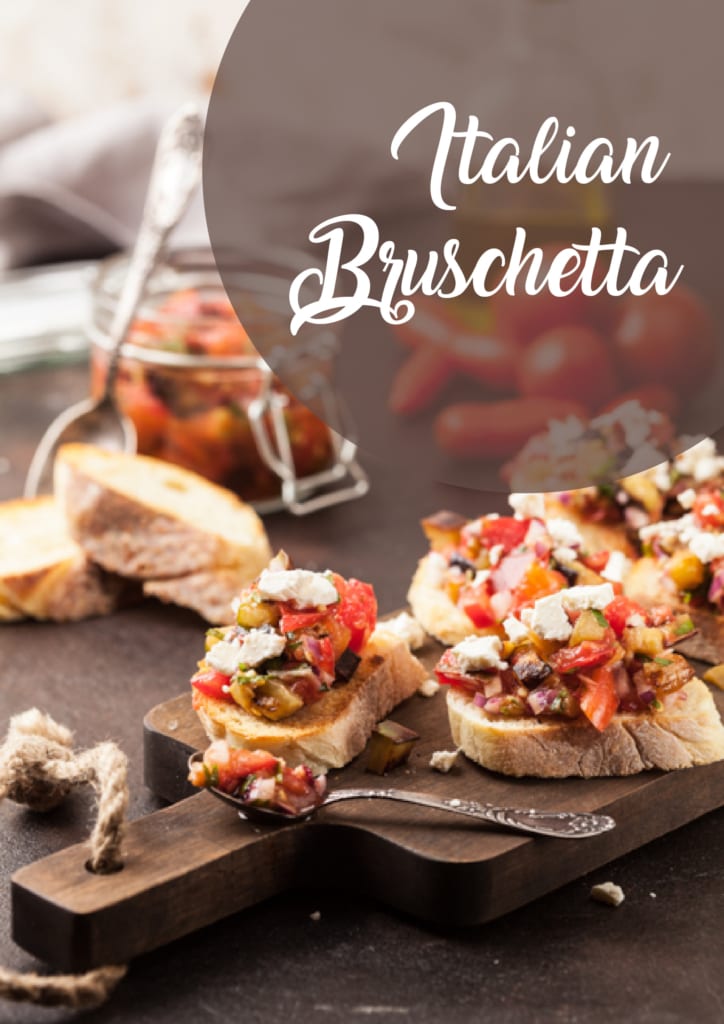
First, choose a high-quality product photo and place the product name in the top-right of the image.
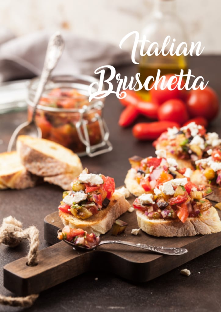
The product name usually sits near the product or in a blank space around it. Pick a typeface that suits the style of the photo, and use a colour that contrasts with the background — because this image is mostly dark brown, white type stands out best.
But since the background isn't a solid colour, some of the text still clashes with it, so we can add a semi-transparent dark-brown circle behind the words — it keeps them clear and legible without fully covering the background.
Next, add the tagline, the promotion dates and the restaurant logo.
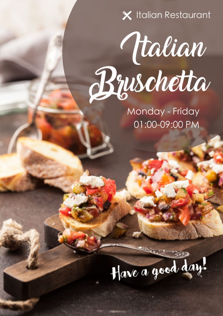
The tagline and promotion dates can usually go around the product name, or wherever there's a suitable gap in the photo; the restaurant logo generally goes in one of the poster's corners, or above the product name.
Finally, add the restaurant's details along the bottom of the poster, plus any extra information.
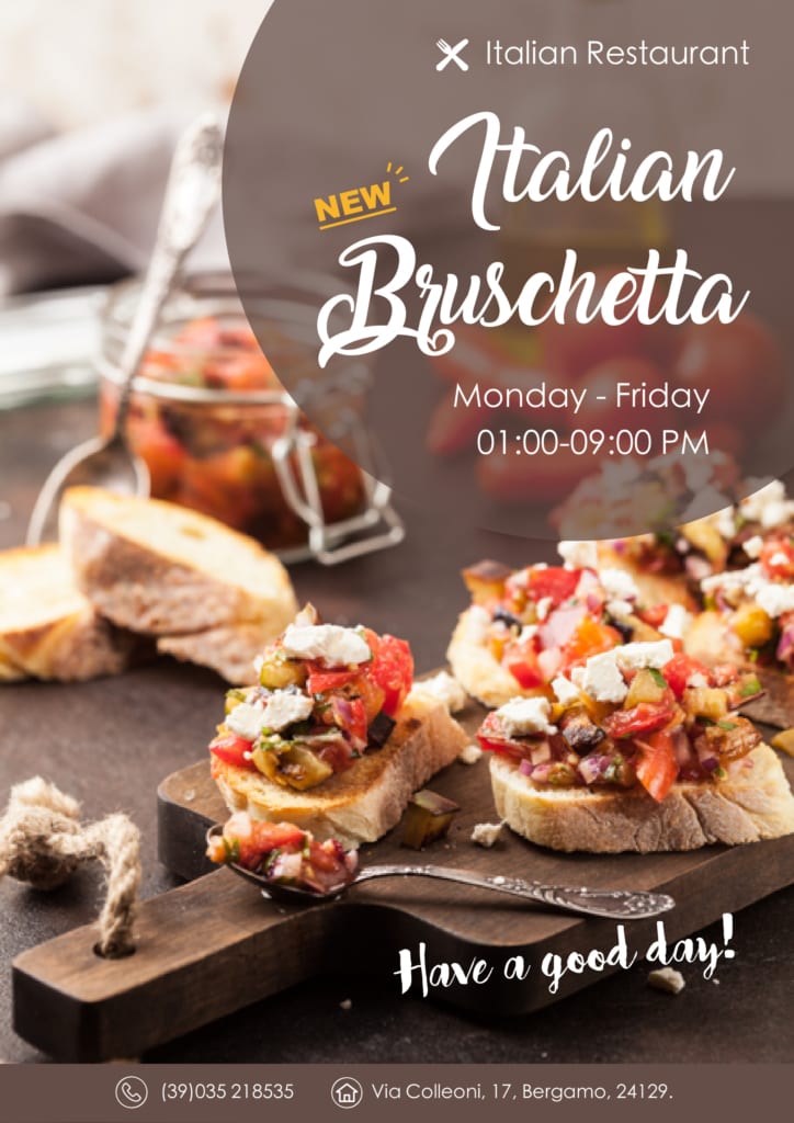
To clearly separate the contact details from the tagline, we can back the text with a brown rectangle — contact information usually lives at the bottom of the poster. Any extra information can be picked out in a brighter colour as a finishing touch, and just like that, a simple but stylish restaurant poster is done.
In truth, poster design allows for endless creativity and variation — as long as the layout and colours are balanced and attractive and the poster draws customers in, it's a success. The three points above are simply guidance for anyone with little or no design experience, a way to create a great restaurant poster with the least fuss. We hope this article helps.
When your design is ready, Printing Banana prints large-format posters with delivery across Hong Kong and Macau. Have a question about sizing or files? WhatsApp us at +852 3001 5678 — English is fine.