Every designer runs into the same headache: picking a font for print. It sounds simple, but it is a genuinely complex — and important — decision. Type is arguably the most important element in commercial design; the right typeface helps your reader take in both the message and its context, while the wrong one does not just look off, it can undermine how the piece actually prints.
If you have an eye for design, you can probably already choose a typeface that suits the look you want. What most designers overlook is how a font behaves once it is on paper — and that is exactly what this guide is for: looking at Chinese type through a printer's eyes.
The limits of printing Chinese type
With any Chinese font, in either digital or offset printing, we recommend a minimum size of no less than 7pt. Below 7pt, some serif Chinese faces — Ming (明體) and Song (宋體) — can print with broken strokes. To keep type sharp, 7pt or above is ideal.
If your layout forces you smaller than 7pt, use a sans-serif Hei (黑體) face wherever possible. In a Hei design the vertical and horizontal strokes carry the same weight, so as long as the stroke is 0.2mm or thicker, it will generally print fine.
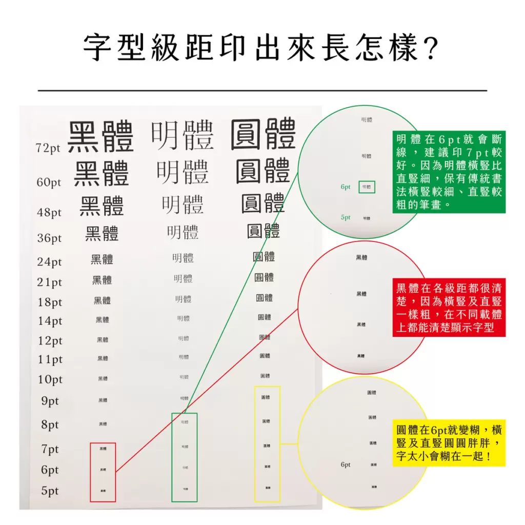
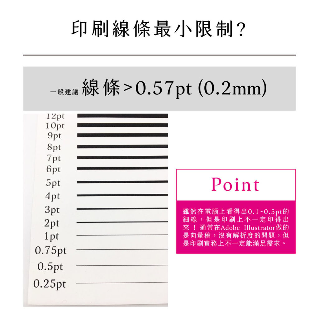
Image source: MindsCMYK (Taiwan)
Type sizes for special finishing
Foil stamping
For text that will be foil stamped, keep it at 8pt or above, make sure the strokes are 0.2mm or thicker, and leave at least 0.3mm between the strokes inside a character. With more complex characters, an 8pt Chinese glyph may not clear that 0.3mm minimum gap.
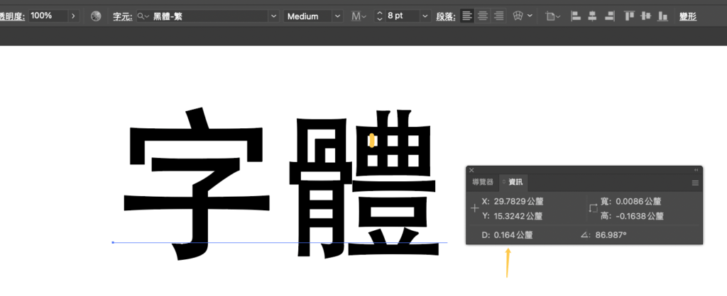
The ideal fix is to scale the text up until it comfortably clears the 0.3mm gap — that keeps the foil crisp and stops the finished stamp from looking muddy.
In the trade, most printers ask for 0.5–0.7mm or more between foil lines; on Hei type we can hold 0.3mm. For Ming and Song faces with hooks and tapering strokes, confirm the weight and stroke spacing first — Ming and Song need at least 0.5mm between lines.
Embossing and debossing
For debossing and embossing, aim for 9pt or above with strokes 0.3mm or thicker. If the pressed area is too small, the deboss or emboss barely registers. And because both processes rely on the paper's own give, the thicker the stock, the more pronounced the effect.
Recommended commercial-use Chinese fonts
We will suggest Chinese fonts that ship in many weights and meet the conditions above. Multi-weight families are simply easier to design with — you can match the weight to the piece — and you never have to fake bold by thickening the strokes yourself, which breaks the character's structure, spoils its looks, and makes both printing and finishing harder.
Plenty of people online share free commercial-use Chinese fonts, and TechHacker's roundups are among the most thorough — and still being updated. With sincere thanks, here they are:
Those roundups list a lot of Chinese fonts; from them I have picked the ones best suited to print. If the fonts below do not cover what you need, the articles have plenty more.
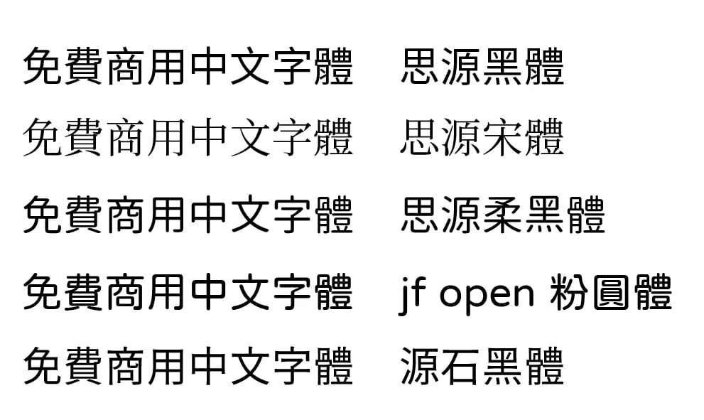
Source Han Sans (思源黑體)
Developed jointly by Adobe and Google, this family spans Traditional Chinese, Simplified Chinese, Japanese and Korean across seven weights. It is well worth keeping in your library: because it supports so many scripts, you rarely have to worry about a character that will not display.
Banana rating: 🍌 🍌 🍌 🍌 🍌
Download: Source Han Sans (Noto Sans TC)
Source Han Serif (思源宋體)
From the same Adobe–Google collaboration, this serif family also covers Traditional Chinese, Simplified Chinese, Japanese and Korean in seven weights, and is just as worth keeping around — with such broad script support, missing glyphs are seldom a problem. On more literary or editorial work it reads more elegantly than a sans, and it prints well too.
Banana rating: 🍌 🍌 🍌 🍌 🍌
Download: Source Han Serif (Noto Serif TC)
Genjyuu Gothic (思源柔黑體)
A Japanese-flavoured reworking of Source Han Sans, with noticeably more rounded corners in the details. It feels softer and less rigidly square than a standard Hei, which gives artistic pieces a distinct character and pairs beautifully with Japanese-style or cartoon illustration. It also comes in three degrees of rounding and seven weights.
Banana rating: 🍌 🍌 🍌 🍌
Download: Genjyuu Gothic (思源柔黑體)
jf open huninn (粉圓體)
Huninn is an open-source font that justfont released on White Day (14 March 2020). Its letterforms are based on the Japanese face Kosugi Maru (小杉圓體); justfont added 1,484 common Chinese characters and adjusted the structure so the strokes read more evenly and feel closer to a true Chinese typeface.
Banana rating: 🍌 🍌 🍌 🍌
Download: jf open huninn (粉圓體)
Genseki Gothic (源石黑體)
Made by But Ko, an admin of the Facebook group Type Hi (字嗨), this face is built around Universal Design (UD): even stroke weights and clean, sharp edges. It carries echoes of older Hei designs while keeping a touch of warmth.
Banana rating: 🍌 🍌 🍌 🍌 🍌
Download: Genseki Gothic (源石黑體)