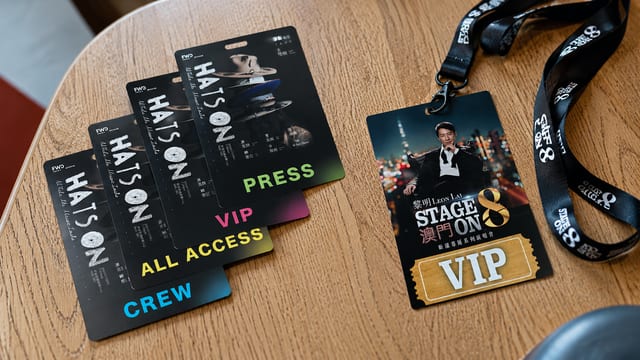
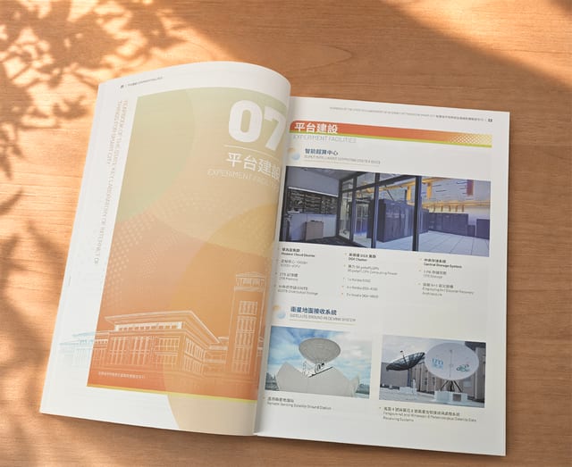
What makes a business card truly stand out — is it the finish, the typography, or the colours it uses? In this piece we look at a few beautifully designed brand cards, pick out the print finishes and design elements behind them, and share some practical tips to help you achieve a stronger visual result on your own cards.
Know the print requirements first
Before you start designing a card, it really pays to understand the print requirements. Every printing method and material comes with its own limits and quirks, so those are worth factoring into the design from the outset. You may need to think about things like the colour mode and the resolution of your artwork. When your design meets the print requirements, the finished card turns out far better.
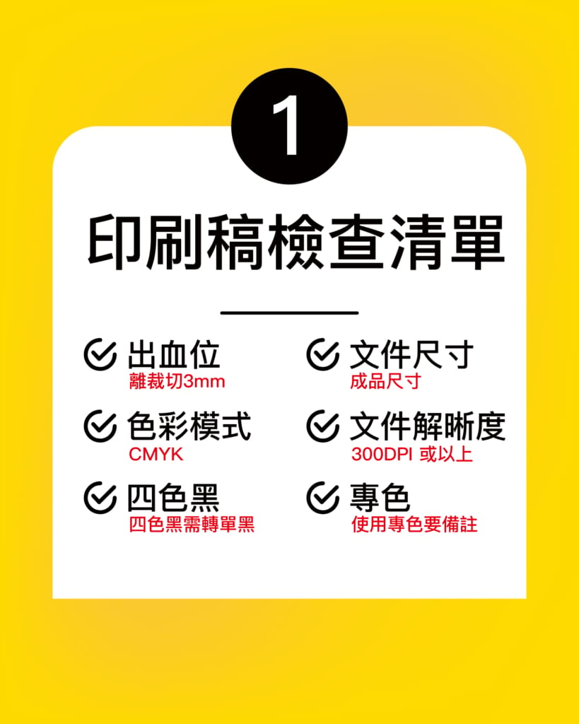
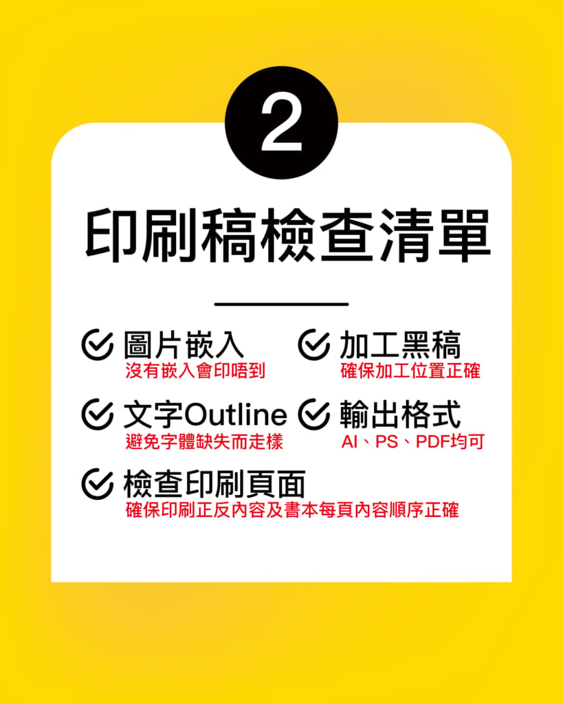
Before you begin, run through the checklist below — it heads off a lot of the problems that tend to crop up at the printing stage.
Choose the right size and proportions
Size and proportion are just as worth thinking through before you design. Picking the right dimensions for the card's purpose makes it more appealing and easier to use. For a name card, the standard size of 90 x 54 mm is a safe starting point — it's the most common format, it guarantees the card will slip into a card holder or wallet, and laying out your artwork cleanly is relatively easy at this size.
Then again, when everyone reaches for the standard size, it's hard to leave a lasting impression among a sea of cards unless the design is genuinely striking. For more on the different card sizes you can choose from, see the article below:
What are the standard business card sizes? Do you have to print standard?
Create a distinctive visual impact
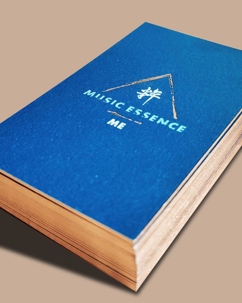
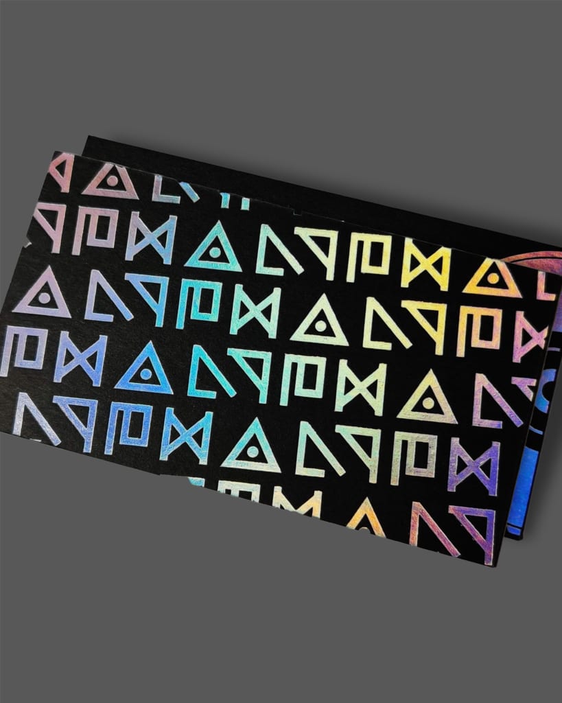
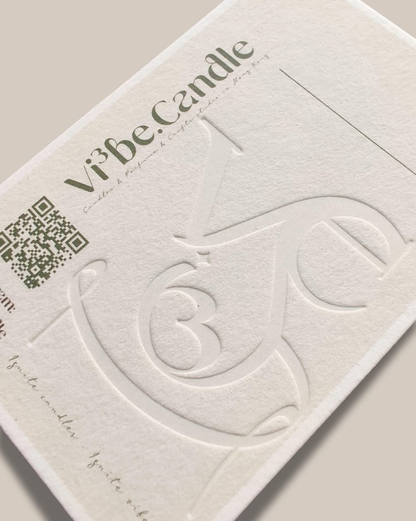
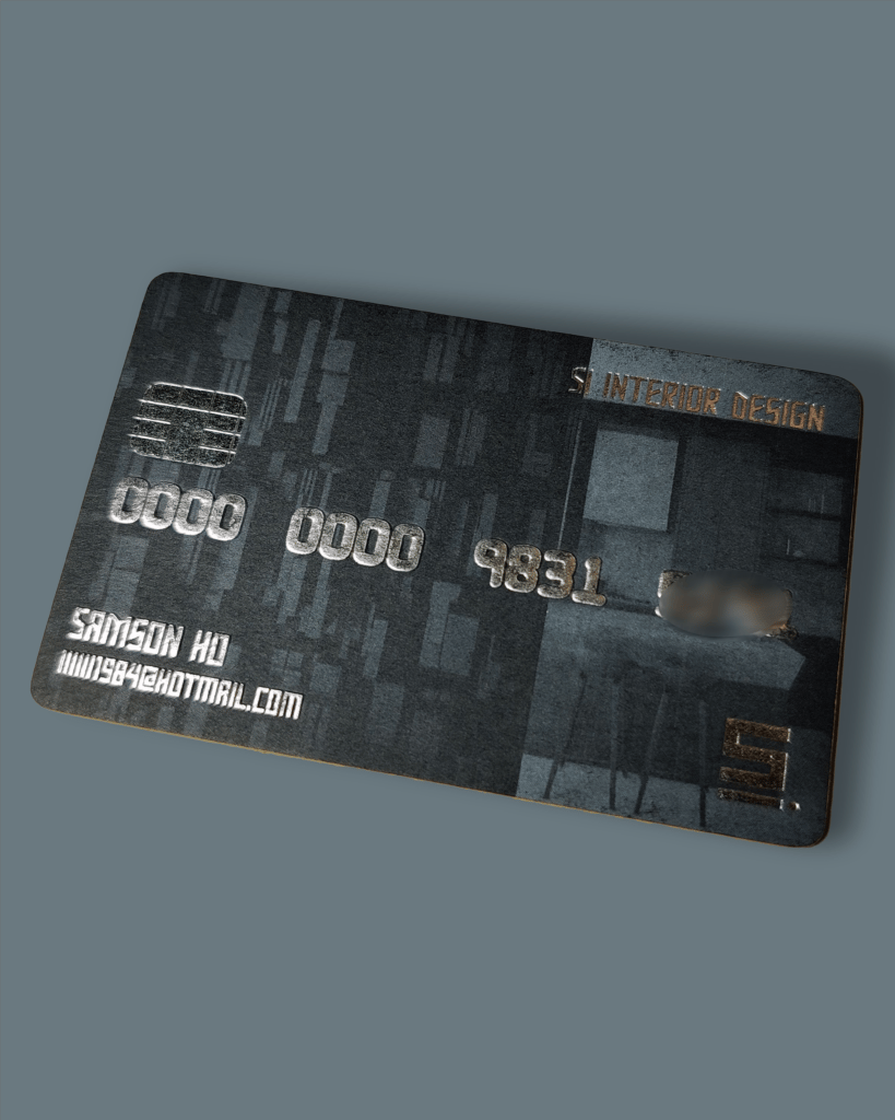
Most of us want a card that feels one of a kind — and while a lot of that is personal satisfaction, strong visuals genuinely catch the eye. On a card you can reach for all sorts of techniques to create a bold visual effect and boost its appeal: high-contrast colours, playful patterns or imagery, and textured paper stock all give a card its own character. Beyond the design itself, print finishing is indispensable too — think foil stamping, embossing and debossing, foiled embossing, edge foiling, or fluorescent effects, all of which add texture and a tactile quality to a card.
Pick the right typeface and layout
Typeface and layout play a big role in card design — but the content is the heart of the card. If you want to play it safe, stick to a single typeface for a highly unified, tidy look. One typeface need not be dull: you can strengthen readability by varying size and weight.
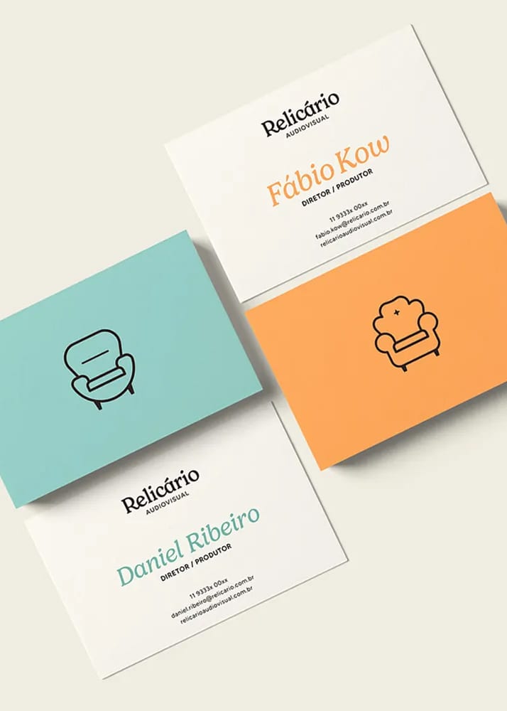
Often you'll want the name to stand out more, and you can do that with a larger point size, a distinctive typeface, or colour.

In summary
Designing a card that is both distinctive and print-ready means weighing up several factors: understanding the print requirements, choosing the right size and proportions, creating a distinctive visual impact, and picking the right typeface and layout. These tips should help you think more freely as you design — and catch your customers' attention.
We hope this article helps. If you have any other questions, feel free to reach us on WhatsApp at +852 3001 5678 (English is fine) — we deliver across Hong Kong and Macau. Here's to designing a card that's distinctive and genuinely memorable!