
"Hi, can you print in spot colours?"
"Sure — which spot colour did you have in mind?"
"Oh, we just need it to match the file exactly."
"…"
We field spot-colour enquiries almost every day. Usually a designer or a boss has said "print it in spot colour," and the client passes that instruction straight on to us — without actually knowing what spot colour is. After a quick chat, most people switch to ordinary four-colour (CMYK) printing instead. Understanding how spot colour really works cuts the back-and-forth for everyone, and it makes you far more convincing when you have to explain the choice to your boss or your designer.
What is spot colour printing?
A spot colour (also called a special colour) is an ink mixed to a precise recipe before printing ever starts. Ordinary colour printing builds every hue on press by combining four inks — CMYK: cyan, magenta, yellow and black. A spot colour skips that on-press mixing entirely: the exact shade is pre-blended in advance. That's why spot colour holds its colour far more consistently than four-colour printing.
Spot inks are mixed on the subtractive-colour principle. They tend to be lower in brightness but higher in saturation, which is exactly what you want across large solid areas — spot colour lays down a more even, denser fill.
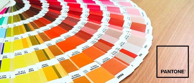
The best-known spot-colour standard in the trade is PANTONE, which defines close to 10,000 colours for graphic design. It's a huge help to designers and press operators alike, because it takes the guesswork out of describing a colour. Most printers work from a Pantone code: they mix the closest possible match before the job goes on press.
How much does spot colour cost?
Spot colour is the premium option — the finished piece is more accurate and more even — and the price reflects that. Expect to pay anywhere from 50% to 100% more than standard four-colour printing. The more spot colours in your file, the higher the cost climbs, because each one adds steps to the job: mixing the ink, swapping inks, and changing the ink ducts on the press.
When is spot colour the right choice?
Very few companies print an entire piece in spot colour — it's simply too expensive, unless it's something small like a personal name card. For most marketing collateral, running the whole file in spot colour costs too much. Where it really earns its keep is your brand colour, because that single colour carries your company's identity — think Ferrari red, Facebook blue, or Printing Banana yellow.
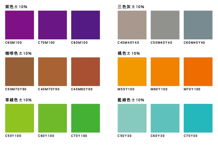
Spot colour is also the answer for sensitive colours and fluorescents — two families that four-colour printing struggles to reproduce well. In CMYK they're prone to big colour shifts. Over a small area that shift won't hurt the piece much, but across a large fill, printing sensitive or fluorescent colours in CMYK easily comes out patchy and uneven.
Sensitive colours: grey, purple, brown, orange, green and the like.
Save spot colour for brand-critical pieces
Because spot colour sits at the pricier end, there's no need to switch every job over to it. Concentrate it on the pieces that carry your brand — business cards, stickers, envelopes and the like. For one-off, disposable promotions such as flyers, you can safely skip spot colour altogether.
Not sure whether your job needs a spot colour or whether CMYK will do the trick? Send us your file — we deliver across Hong Kong and Macau, and you can WhatsApp us at +852 3001 5678 (English is fine) to talk it through before you go to print.


