
English typefaces are an essential part of design — you see them everywhere, on business cards, in books and magazines, on posters, in almost every corner of daily life. Different typefaces give people different visual impressions, and well-arranged text is comfortable to read and easy to understand. But when you sit down to design something yourself, it can be hard to know which typeface to choose, or how to lay the text out so it looks its best.
Every design beginner runs into these questions. This article introduces the characteristics of English typefaces and how they differ from one another, along with the typography basics you need to know when setting English text — plus a few hand-picked fonts and free-download sites to get you started.
- 1. Serif and sans-serif (serif / sans serif)
- 2. Handwriting fonts
- 3. Monospaced typefaces
- 4. Readability and legibility
- 5. Where to download fonts
1. Serif and Sans-Serif (serif / sans serif)
In modern type classification, typefaces fall into two main families: serif and sans-serif.
What is a serif typeface?
Serif type traces back to ancient Rome, where it was carved into stone monuments — which is why it still feels traditional, classical and elegant.
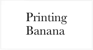
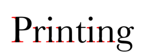
The typeface above is a classic serif face called Baskerville. In the letters below, the parts marked in red are the serifs — the small finishing strokes at the head and foot of each letter.
Baskerville was designed by England's John Baskerville in 1750. Its qualities make it very well suited to long-form text; it looks refined and carries a sense of history, so many formal newspapers and novels use it.
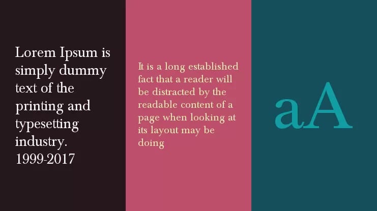
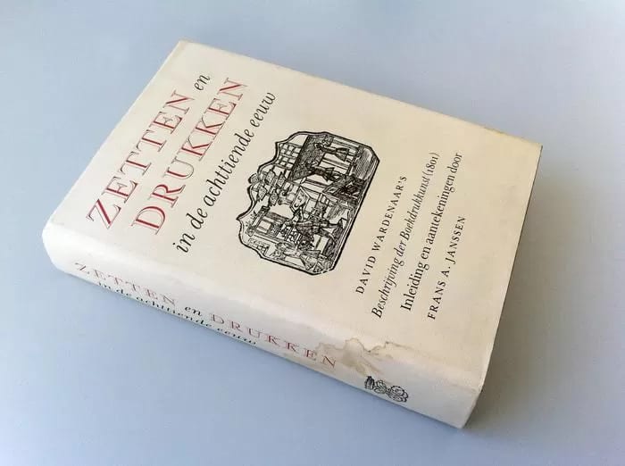
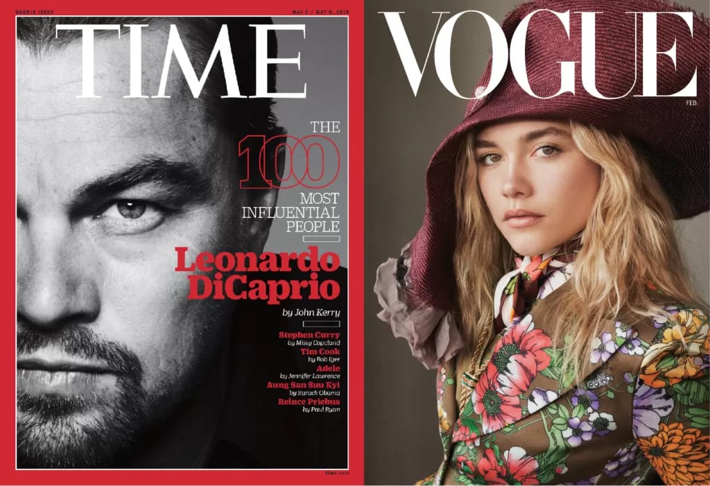
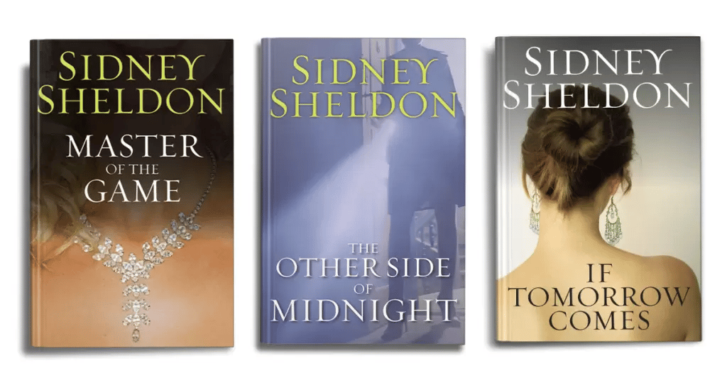
Other common serif faces include Times New Roman, Caslon and Georgia. Typefaces like these often appear on official promotional material, in newspapers and in books, giving a sense of dignity, nostalgia and mystery.
What is a sans-serif typeface?
A sans-serif face, as the name suggests, is an English typeface with no serifs. Its strokes are even in weight and the ends of the letters carry no extra ornament. The example below uses the sans-serif typeface Avenir.
Avenir is a very clean, modern typeface, designed in the 1980s by Adrian Frutiger after he was inspired by the Futura typeface — the name is French for "future".

(Avenir)
Other well-known sans-serif faces include Gill Sans and Lucida Grande. Sans-serif type works well on web pages, in app interfaces, and in fresh, on-trend designs.
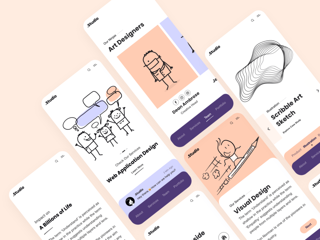
Beyond these two families, designers draw on plenty of other styles of English type — handwriting faces, monospaced faces and so on — and these give a designer's work a more distinctive character.
2. Handwriting Fonts (handwriting fonts)
More and more handwritten English typefaces are appearing, created by designers, artists and font enthusiasts, and most allow free personal use. Handwriting styles are varied and full of character — more so than ordinary fonts — and can instantly give a design a focal point.
Here are a few hand-picked handwriting fonts, with download links:
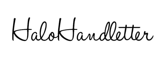
This casual yet elegant font was created by graphic designer Mario Arturo; its free version is limited to non-commercial use.
2. Debby
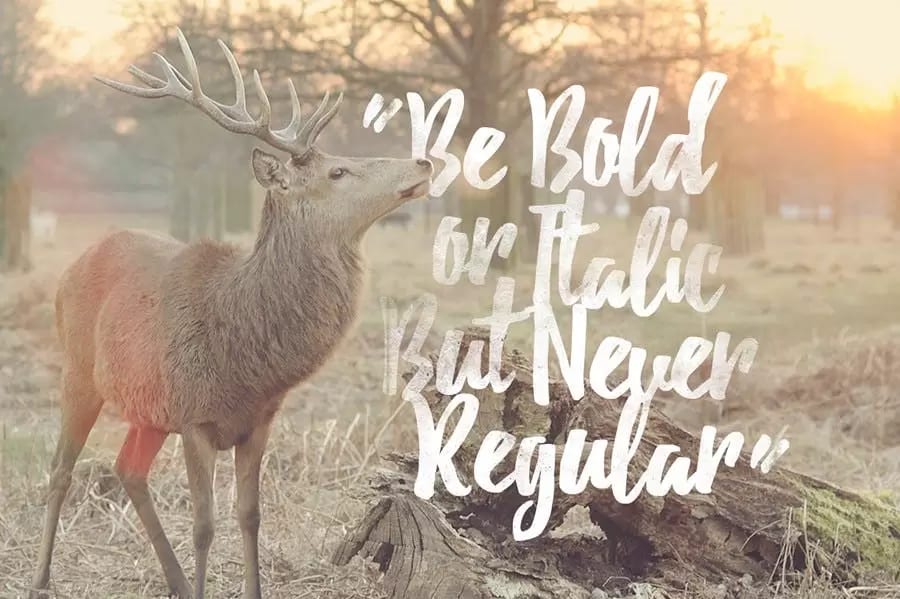
Debby's creator, Artimasa, wanted this English typeface to feel natural. It works well on posters, logo designs, wedding invitations and greeting cards — again, free for personal use only.
3. Olivia
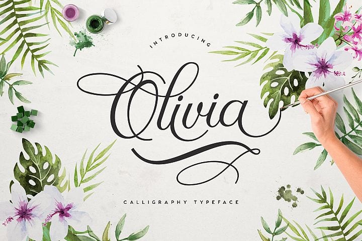
Olivia is a beautiful, refined English calligraphy script, perfect for wedding invitations, birthday cards or feminine designs. It comes with some commercial-use restrictions — check the download page for details.
Ornate handwriting faces like these are generally used only for short text such as titles or slogans; they don't suit long-form setting and don't pair easily with Chinese type. Use no more than two decorative handwriting fonts on a single layout, or the result becomes dizzying and the design loses its focus and appeal.
3. Monospaced Typefaces (monospaced typeface)
Courier was originally designed by IBM in the 1950s for use on printers, but because the company never defended its patent, the typeface later became the standard across the typewriter industry.
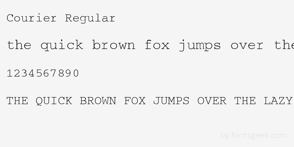
The hallmark of this English typeface is that every letter takes up the same width — an 'm' is as wide as an 'i'. The downside is that it's hard to make it look attractive in layout, so unless you're especially fond of it, it's best used sparingly.
4. Readability and Legibility (Readability / legibility)
Besides knowing which font styles suit which designs, another thing to watch is a typeface's readability and legibility.
Readability is about how easy the text is to read on the page. A typeface's tracking (letter spacing), leading (line spacing), point size and colour all affect readability. How does the arrangement below strike you?
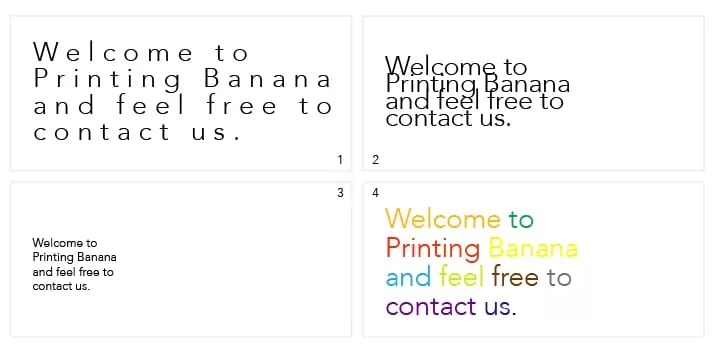
Clearly, in Figure 1 the space between the letters — the tracking — is too wide, and the whole typeface looks odd. In long-form setting it's best to keep the tracking fixed rather than open it up; unless a particular design style calls for it, don't change tracking on a whim.
Figure 2, on the other hand, looks too cramped: the vertical distance between lines is too tight, which hurts readability. The renowned British graphic designer Drew De Soto recommends setting the leading 2pt–2.5pt larger than the type size — that way it works for any typeface. As in the image below, if the type size is 22pt, the leading is set to 24pt.
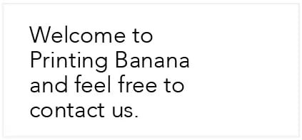
Point size is simply the size of the type, and how big it should be on the page also depends on how important the text is. In Figure 3, as the only text on the layout, a point size that's too small makes it hard to read.
Have you heard that colour affects how we read the meaning of text? When you see Red, is your first reaction that the word is red, or blue?
In the same way, using several colours in a single word or sentence — or setting text in a colour too similar to the background — will also hurt readability.
So what about legibility? Let's take a look at the few typefaces below.
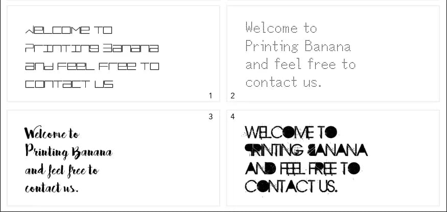
Aren't the 1st and 4th typefaces hard to make out? Those two have low legibility.
The 3rd is a little easier to read, though it still takes some effort; the 2nd is the most legible of the bunch, but it still falls a little short of more conventional typefaces.
In everyday design we avoid low-legibility type — ornate scripts and oddly styled faces — unless the text doesn't carry much meaning, or you deliberately want a mysterious, attention-grabbing effect.
By now you should have a basic grasp of how to lay out text. If you'd like to learn more about typography, stay tuned for our upcoming articles, where we'll dig into it piece by piece.
5. Where to Download Fonts
Finally, here are a few sites for downloading free English fonts.
When you use an English typeface, always check whether it's limited to free personal use.
Fonts are copyrighted — a typeface represents a huge investment of money, labour and skill by a company or designer, so some fonts require a paid licence for commercial use, and a careless slip could even get you sued for infringement.
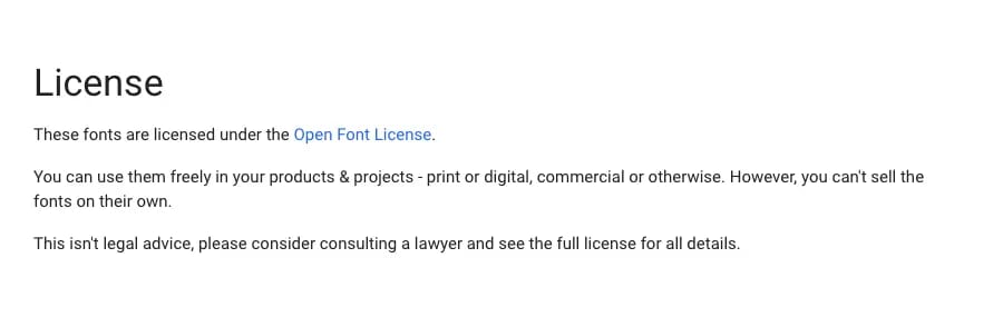
When you download a font, you'll see the terms the type designer has set. Every designer's usage restrictions can differ, so before putting a font to commercial use, always read them carefully!


