
Colour variation is the print industry's oldest complaint. No matter what you're printing, some difference between what you designed and what comes off the press is unavoidable. There's surprisingly little plain-English explanation of why it happens, so we've approached it from the customer's side and pulled together the three questions people ask us most — each with a practical way to keep the difference down.
Question 1: Why does the colour on screen look different from the print?
How is colour actually produced?
This is the question almost every customer new to print asks, so let's start with the physics. A computer or phone screen actively emits light so you can see colour, whereas a printed piece relies on reflected light. Because some of that light is absorbed, the range of colour the paper can bounce back is smaller. In other words, a printed piece shows fewer colours than a screen, which makes the two fundamentally different.
On top of that, print works in CMYK (cyan, magenta, yellow, black) while screens work in RGB (red, green, blue). Even the primary colours are different, so a printed result will never be identical to what's on your screen.
Do all screens show the same colours?
Not only does the print differ from what you see on screen — different screens don't even agree with each other. Put two different phones side by side and you'll easily spot that the colours don't match, and the same goes for monitors. That's why, in the trade, we never colour-match to a computer or phone screen. The best way to match colour is against a physical proof, which gets you closest to the real thing. Telling your printer "just match the screen colour" is effectively the same as printing your file as-is — there's not much difference.
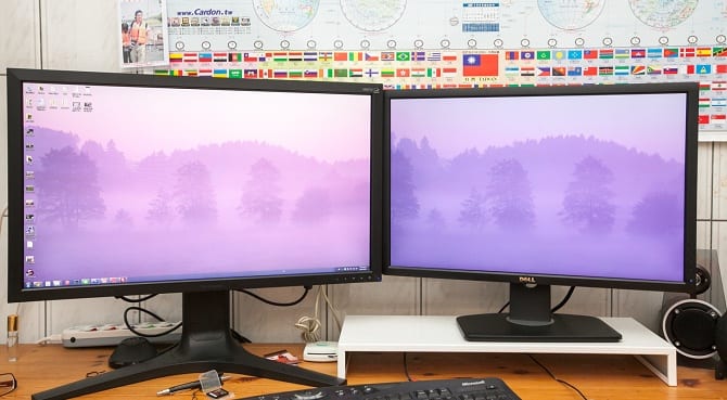
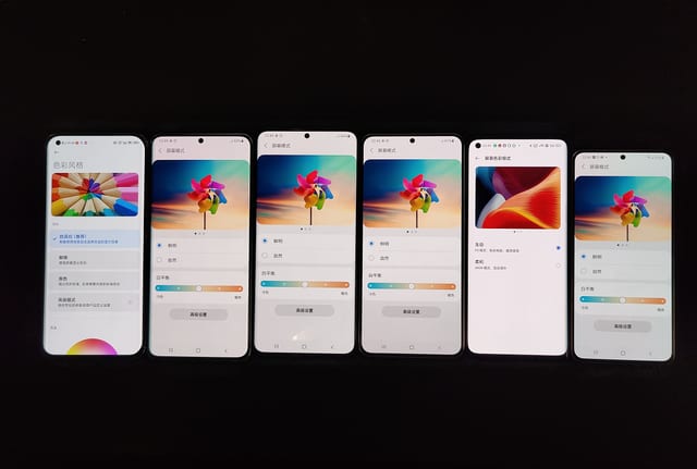
The same image can look very different on monitors from different brands.
Image sources: Spyder5 Elite: a handy monitor-calibration tool, Even Samsung's flagship takes notice? The Reno5 Pro+ display wins praise.
Fix 1: Print a proof before the full run
If you want to see how the print will turn out, ask for a proof first. Proofs generally come in two types: digital proofing and offset dedicated-plate proofing. They use different printing methods and machines, so which one you choose depends on the requirements of your main run.
If your production run is digital, proof it digitally — the two won't differ much and the colours will be close. Digital can print from just a few copies, so proofing is cheap, though the per-unit price is higher at volume.
If the run is in the thousands or tens of thousands, or uses spot colour, it's essentially offset (litho) dedicated-plate printing, and we'd recommend an offset proof (also called a press proof). Because a press proof involves plates, plate setup and press time, it costs far more than a digital one — but the proof matches the production run much more closely, and colour is easier to fine-tune.
Question 2: It's the same file as last time — so why is the colour different?
You're using gang-run printing
Gang-run printing places several different jobs on one large sheet, which cuts cost dramatically because you only pay for a small part of the sheet. The trade-off is that it offers little colour guarantee. Each gang run is made up of different artwork, and the colours in that mix are never fixed, so the ink balance changes from run to run and colours shift. To limit this, the ganging operator groups jobs with similar colours together to keep the difference as low as possible.
Colour variation on a gang run is around 10%. If colour accuracy really matters to you, go with a dedicated plate — the whole sheet carries only your artwork — though it costs more. Gang runs are also fussy about ink values: the total CMYK value must not exceed 250 or drop below 10, or the result prints poorly.
Gang-run printing exists to cut costs. If you can't live with some colour variation, it isn't the right choice — choosing a gang run means accepting that colour can't be held to a tight standard.
Printing-environment differences
During printing, the result is affected by environmental factors such as ink drying time, temperature and humidity. Dark colours, for example, lay down more ink and take longer to dry; if a customer is in a hurry to ship, ink that hasn't fully dried can cause set-off (ink transferring onto the sheet above it). Humid weather also means ink needs more time to dry. These different drying speeds change how the paper absorbs ink, producing colour variation.
Material batch differences
The batch of your printing material adds to the problem too. Take paper: different paper batches vary slightly in colour — with coated (gloss) art paper it shows up as differences in whiteness, ink absorption and paper weight. All of these affect the finished print. So to reduce colour variation, we try to print on paper from a single batch wherever possible.
Fix 2: Send in your previous printed sample
Because most printed jobs aren't kept, it's hard for us to tell how closely a reprint matches the last run. So if colour accuracy is important, send your printer a sample from the previous print run. With a physical proof in hand, the operator can adjust colour to match it — but this only works for dedicated-plate printing. You can't colour-match to a sample on a gang run, because it holds many different designs, and adjusting one on its own drags all the others along with it.
Question 3: Why is there colour variation even within one batch?
It's most common on gang runs
Same-batch colour variation shows up most often on gang runs, because a gang carries many different jobs, so the ink volume is harder to control and keep stable. That means colours differ from sheet to sheet, and the problem is worse on artwork built from heavy, dark values. Besides ink volume, misregistration in the four-colour process (colour printing is built by overlaying the four CMYK inks layer by layer) is another cause of colour variation. If you want a gang run but don't want much colour difference within a batch, it's best to avoid dark or sensitive colours.
Sensitive colours
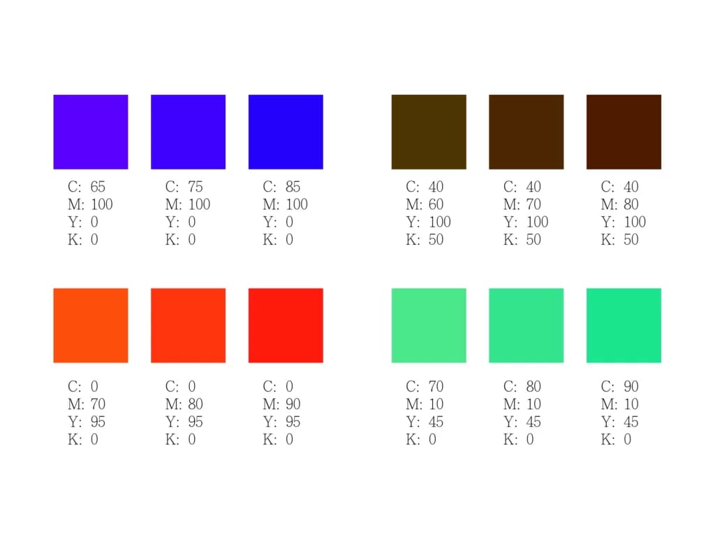
Sensitive colours in your artwork can also cause colour variation within a single batch. Common sensitive colours include brown, orange, teal (blue-green), purple and three-colour grey — they're called "sensitive" because each is built from three or more ink values. During printing, a difference of just a few percent in ink is enough to look very different to the eye (see below). To reproduce sensitive colours well, spot-colour dedicated-plate printing is the better choice.
Fix 3: Two ways to keep a batch consistent
If you're set on a gang run
As digital marketing has grown, companies spend less on print than they used to, and gang-run printing genuinely lowers costs. So if you want to use a gang run while keeping colour variation down, here's what we recommend:
- Avoid sensitive colours (brown, orange, teal, purple, three-colour grey).
- Avoid four-colour black; use single black (K100) or a rich black (C10 K100).
- Use colours mixed from just two ink values.
- Keep the total ink value between 10 and 250.
Go with spot-colour dedicated plates
The most effective way to reduce same-batch colour variation is, of course, spot-colour dedicated-plate printing. The plate carries only your artwork, and spot inks handle any sensitive colours — which cuts the risk of colour variation dramatically.
The bottom line: mass production can't fully escape colour shift — only reduce it
Colour variation crops up in any industry that deals with colour. The garment trade has exactly the same issue — if you're curious, see this write-up on how the garment industry (textiles and dyeing) judges colour difference. As consumers we usually only ever see a single item, and rarely receive a large quantity of the identical product.
Whatever you need, a printer will help you get a result you're happy with — but print quality is proportional to price and turnaround. Better quality simply takes a little more of both.
Planning a print run in Hong Kong or Macau and worried about colour? Message us on WhatsApp at +852 3001 5678 (English is fine) and we'll walk you through proofing and spot-colour options before you commit to the full run.


