
The "white" in colour printing is really the paper
White is the colour people forget about in printing. On a lot of printed work, the white you see isn't ink at all — it's the bare paper showing through. Anyone with printing experience spots this straight away, but if you're new to print it's an easy trap: your design software has a white swatch on the palette, so it's natural to assume a press can lay down white the same way it lays down every other colour.
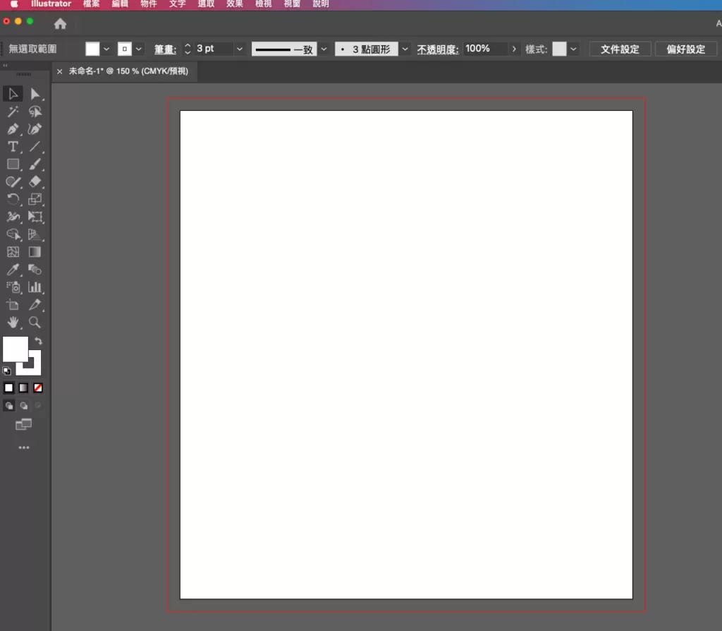
Normally the artboard in your design software is white. That's because most of the time we print on white paper — white stock simply prints well. Every colour lands close to how you intended, with no clashing between ink and paper. So unless you say otherwise, the white in your design file is understood to be the colour of the paper itself, not a layer of ink.
How do you get white onto a non-white material?
Printing white onto a material that isn't white is not straightforward, and you have to think carefully about the result. If the card stock is fairly dark, a layer of white ink won't necessarily cover the card's own colour. You may need two passes to build the white up properly — and even then the coverage can be patchy. That's why we often recommend foil-stamping the white rather than printing it: pressing white foil onto the stock sidesteps the whole problem of ink that won't cover solidly.
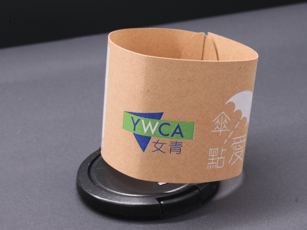
Why white ink is essential when colour-printing on coloured card
Why do we say white ink is indispensable for full-colour work on coloured card? Can't you just print colour directly onto the card?
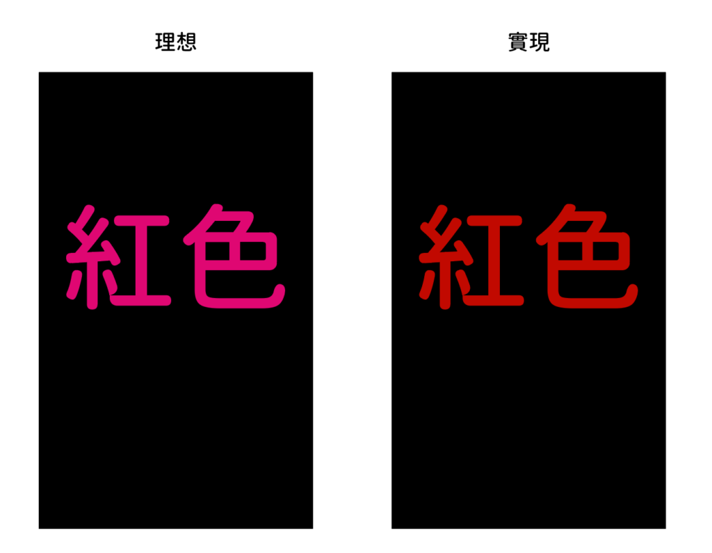
You can't colour-print coloured card directly, because it creates a serious problem: the printed colours are affected by the colour of the card underneath. Print bright red on black card and it comes out a dark, muddy red. (The image below is a mock-up for illustration; the actual result depends on the specific job.)
So in most cases coloured card — dark card especially — isn't well suited to direct full-colour printing. There are exceptions, of course: a light card with dark content works fine, such as black text on yellow card.
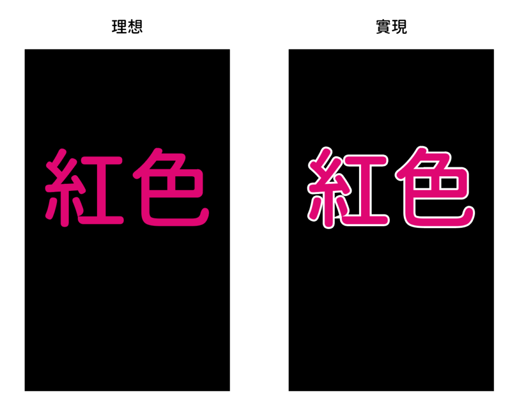
This is where white ink earns its keep. We print a layer of white first, then print the red on top of it. That gives you a colour close to what you'd get on white paper — though the vibrancy is still noticeably softer than printing on a true white sheet. We call this technique a white-ink underbase: red on black card with a white underbase means laying down white first, then red, so the second print run has to register on top of the first. Bear in mind that registration always carries a small margin of error — typically 1–2 mm — as shown below.
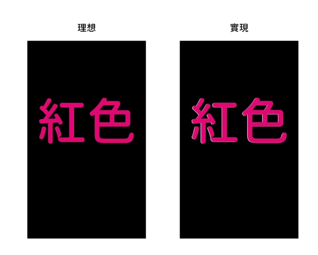
Because of that tolerance, the finished print can end up with a thin white edge showing. If your standards are high, there are two ways to handle it. One is to foil-stamp instead of print. The other is to extend the white-ink area slightly so it deliberately forms an outline around the text or graphic, as shown below.
Printing white isn't hard — knowing how it renders is the point
Once you understand the different ways white can be produced and where each one falls short, you can pick the method that gives you the result you're after. If you're colour-printing on coloured card, check two things: whether there's any white in the artwork, and whether the image colours are darker than the card. If the card is dark, plan for a white-ink underbase — or switch to foil stamping.

Printing isn't complicated, but getting it right does take experienced hands to guide you. If you've got a job with white on coloured stock — or any other question — WhatsApp us at +852 3001 5678 (English is fine) and we'll talk it through, with delivery across Hong Kong and Macau.


