
When a graphic designer hands off a finished layout to be printed, color consistency is everything. On press, the final color can be pushed around by all sorts of things — the printing machine, the paper and ink, even the lighting you view it under — and any of them can introduce a color cast or a visible color shift. So designers need a few reliable habits to keep the printed piece close to what they actually designed.
Here are practical ways graphic designers in Hong Kong keep color differences to a minimum.
Use a color management system (CMS)
A color management system is software built specifically to manage color. It helps designers keep what they design closer to what actually comes off the press. With a CMS, you can assign your artwork to a specific color space and make sure every printing machine interprets those colors the same way. Different presses can work in different color spaces, so a CMS is what keeps color consistent from one machine to the next. It cuts color shift down significantly — though it also asks a lot of the designer.
Use color-calibration equipment
Color-calibration equipment is hardware built to correct color. It helps you tune both your monitor and the printing device so they stay consistent through the print process. By calibrating, you make sure the colors you design show up the same across different media — for example, calibrating your monitor so your design looks close to the same on different computer screens.
Work with standard color libraries
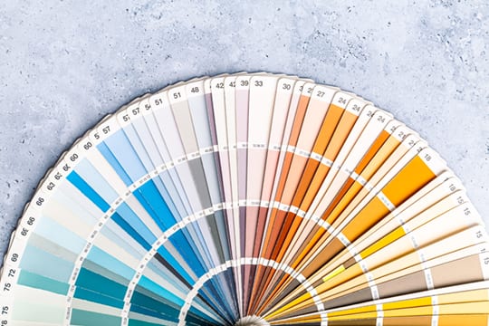
Designers can build a layout around a standardized color system such as Pantone to lock in color reliably. Pantone maintains its own printing color system, and you can look those colors up in a Pantone book. Working from standard colors means your design reproduces more consistently across different presses — and it makes it far easier to communicate with your printer so the finished piece lands close to the color you wanted.
Collaborate with your printer
Working closely with your printer is one of the best ways to reduce color differences. Printers use proofs to align with the client on the exact color you are after, which helps you settle on the shade you had in mind. It lets you judge the real printed result instead of guessing from imagination. Collaborating also helps you understand the print workflow and anticipate problems that can crop up along the way. When you do, hand your printer color samples so the printed piece stays close to your artwork.

Beyond the methods above, a few more habits help keep color consistent. Avoid oversaturated colors — as a rule of thumb, keep the total CMYK value at or below 200, since very high ink coverage tends to distort on press. Darker colors are also easier to control during printing.
It is also worth paying attention to the paper stock and its surface finish. Different materials and finishes change how color reads: the same color printed on glossy coated stock will not match the same color printed on uncoated woodfree paper. Choose the material and finish to suit the job and the result you need.
In short, getting the printed piece to match what the designer had in mind takes a mix of methods and habits. Between a color management system, calibration equipment, standard color libraries, and close collaboration with your printer — plus the right choice of paper and finish — it is all of these working together that keeps the print close to the original design.
If you are printing in Hong Kong or Macau and want to get the color right before committing to a full run, we are happy to help you proof it first. Message us on WhatsApp at +852 3001 5678 — English is fine.


