
After foil stamping, embossing and debossing are the print finishes clients love most — and it's easy to see why. Where a plain card can feel a little flat, a raised area (emboss) or a recessed one (deboss) gives the surface real dimension you can feel with your fingertips. The effect is created by pressing the paper between heat and a sculpted die so the sheet itself deforms into a three-dimensional shape. It's a favourite on business cards, postcards and other premium pieces because it leaves a lasting impression. It looks simple — but the process behind it is anything but.
Angle and depth
An emboss really stands out on a printed piece — people can't resist reaching out to touch it — and it reads differently depending on the angle and the depth of the die. Most print shops work to a single in-house standard rather than offering every possible option, for two reasons: too many choices leave customers confused, and the relationship between angle and depth is genuinely hard to explain. So each shop settles on its own defaults, usually 45°. In practice, embossing and debossing are cut at four different angles — 30°, 45°, 50° and 60° — never a vertical 90°. Depth comes in 1mm, 1.5mm, 2mm and 2.5mm, and the right depth depends on how thick your paper is: too thin, and the die can punch straight through.
Choosing the right paper
Before you emboss, you need to know whether your chosen stock can actually take it. Thin paper has a low tolerance for pressure and can crack or split during finishing. Beyond thickness, you also have to consider the surface texture and the fibre of the sheet — those are what make or break a clean emboss. As a rule, the thicker the stock, the better it embosses; but go too thick and a raised emboss loses definition. The quickest, most professional answer is simply to ask your printer.
Common embossing stocks include gloss art paper, Yuan Mei paper, Inspiration paper and Conqueror paper. If you go with a textured sheet, take extra care with the artwork sitting on top of it, because the texture shifts as the paper is worked. And note that recycled eco stocks — ice-white paper, for example — are not suited to embossing: their fibres are loose and crush too easily.
Adding colour to an embossed area
To make a piece pop, many customers want the embossed area to carry colour. It's a common misconception that the colour is added after embossing — it isn't. Every finishing step happens once printing is complete, so any colour on an embossed area is already printed on the sheet; there is no "colour it in afterwards" stage. Because embossing disturbs the paper fibres, though, you should adjust the size of a coloured emboss slightly at the design stage — make it a touch bolder than a plain emboss — since the process carries a tolerance of a fraction of a millimetre. If you don't enlarge the coloured block, the registration drifts and the effect looks weak and unconvincing.
Emboss and deboss design tips
- Line weight must be 0.6pt or above.
- Coloured emboss lines must be 1pt or above.
- Keep embossed or debossed shapes as large and bold as you can — anything too small or too intricate won't read clearly.
Embossing in action
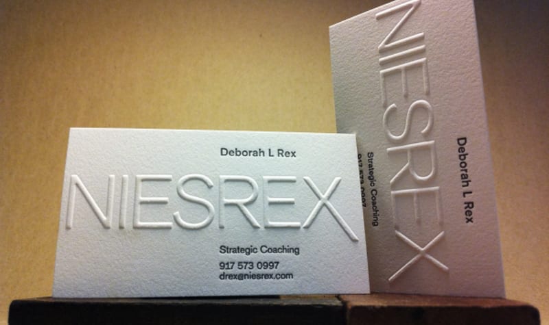
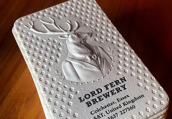
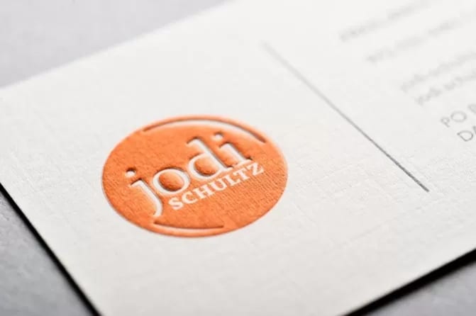
Thinking about embossing or debossing your next run of cards or postcards? WhatsApp us at +852 3001 5678 (English is fine) and we'll help you get the artwork press-ready, with delivery across Hong Kong and Macau.


