
What is debossing?
Debossing uses a metal die to press a chosen area of the card down below the paper surface, creating a raised-and-recessed contrast you can both see and feel. Because the die only works one side, the impression doesn't punch through to the back — your reverse design stays untouched. In English the finish is usually called letterpress or debossing, and this is exactly where a lot of clients get confused: emboss raises the artwork up off the surface, while deboss presses it down into the paper. Same idea, opposite direction — don't mix the two up.
What affects the debossing result?
Choosing the paper
500gsm and above
How deep you can deboss is limited by how thick the paper is. And because the impression must not show on the reverse — that side has to stay flat — a heavy stock gives you the room to press a proper, well-defined depth.
Under 250gsm
We don't really recommend debossing on anything under 250gsm. There simply isn't enough thickness to work with, so the result looks shallow — often it reads as though nothing was debossed at all. For lighter stocks we'd suggest embossing instead, which gives a far more satisfying finish.
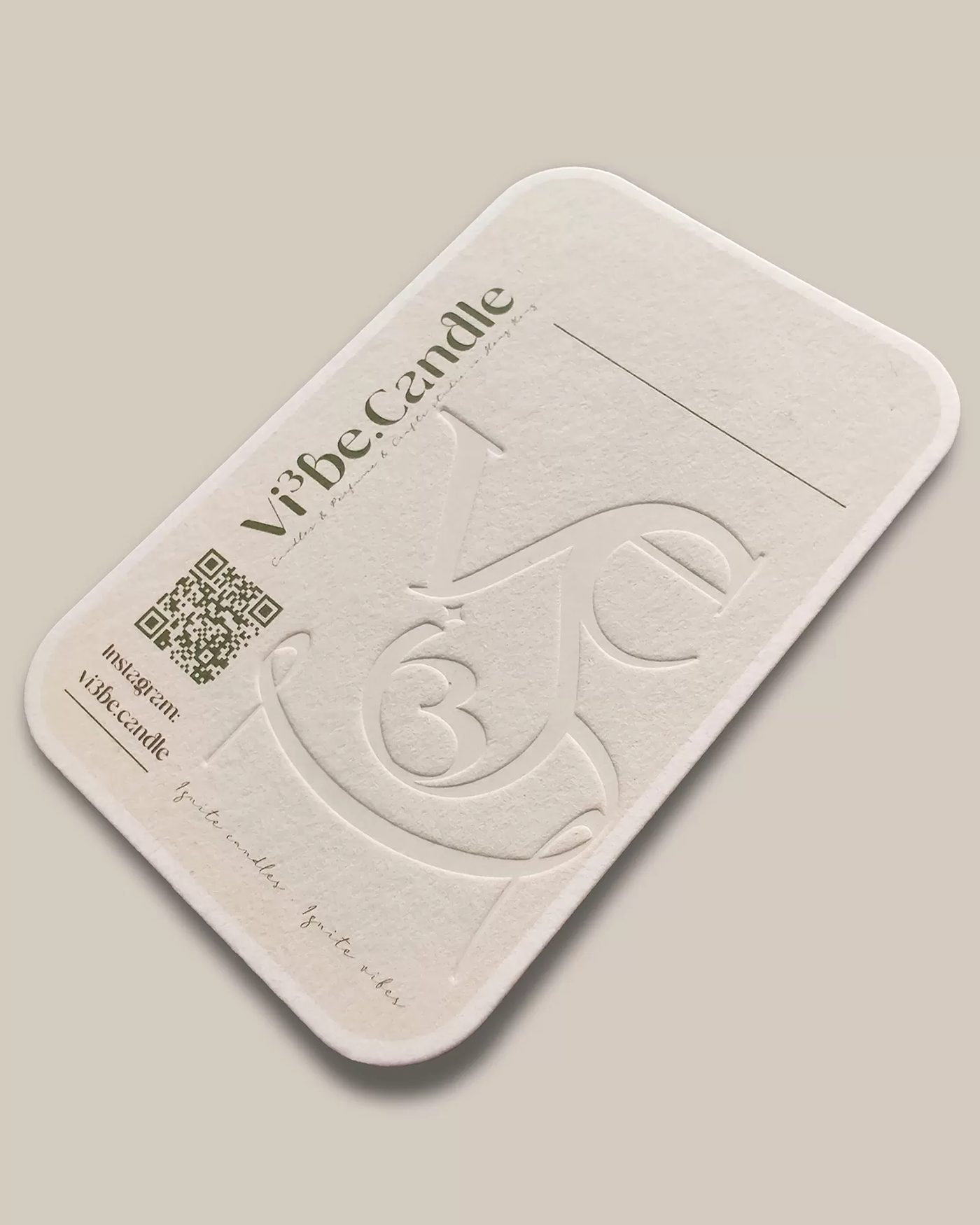
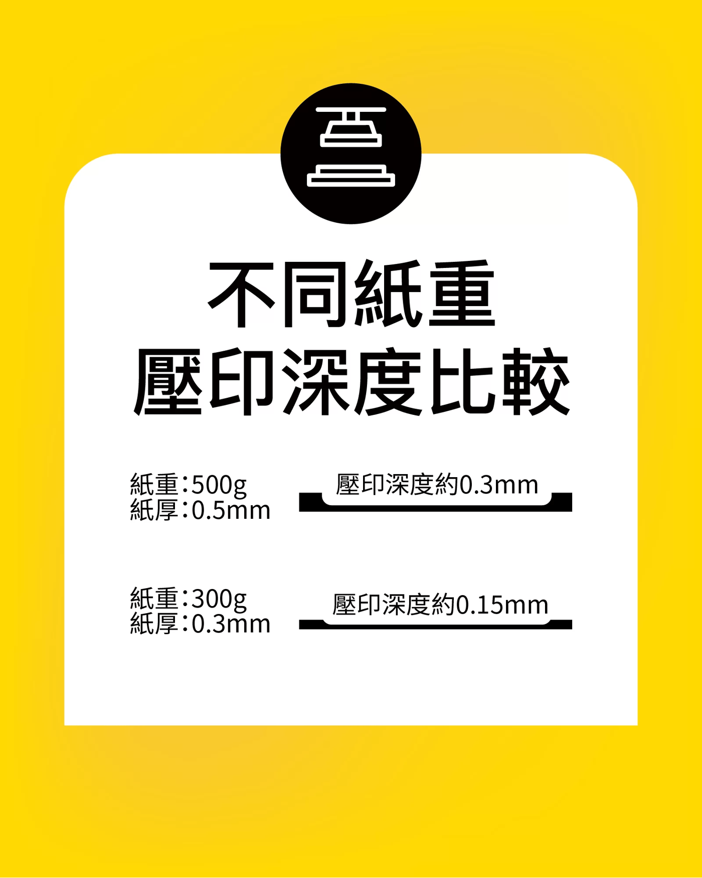
How complex is the artwork?
Simple lines and lettering deboss beautifully, as long as the stock is thick enough. Intricate artwork is a different story — debossing has to be pressed deep to register visually, and we're visual creatures first: even when the texture is there under your fingertips, a weak visual impression undercuts the whole effect.
Spacing between lines
Keep at least 0.4mm between adjacent lines, otherwise the finish won't come out cleanly. A deboss pushes on itself and on everything around it, so an over-busy design can't be pressed deep — and a shallow press means a weak, barely-there result.
Line thickness
The ideal line weight is 0.2mm or thicker; at that weight the debossed result comes out looking its best. As a rule of thumb, the thicker the paper, the heavier the lines and the wider the spacing, the better the deboss.
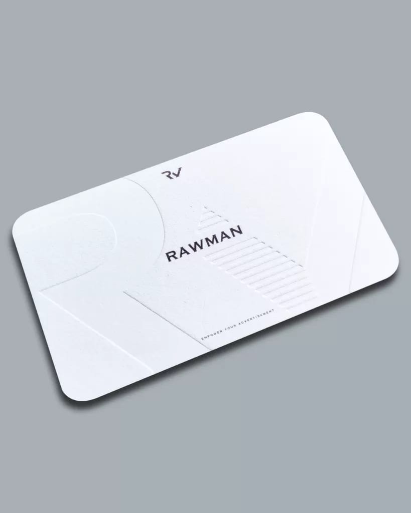
Colourless deboss vs coloured deboss
Colourless deboss (recommended)
Colourless debossing is a designer favourite. It's an inherently artful finish, and paired with the right design it makes understated luxury almost effortless.
It's also the more forgiving of the two — the finished piece tends to land close to what you pictured. Use it for logos, background-texture debossing, headings and the like; whether you want it to feature or just to add a subtle accent, it's a strong choice.
Recommendation: ★★★★☆
Design difficulty: ★☆☆☆☆
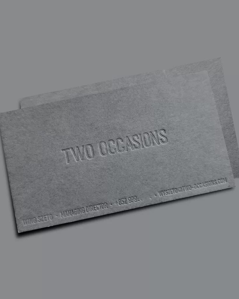
Design direction
Skip colourless debossing for anything that really has to be read — names, company names and other key details — because the type on a card is usually small to begin with. Deboss it with no colour and your reader may have to tilt the card for a few seconds just to catch every line at the right angle. A simple logo, on the other hand, is perfect for colourless debossing: put it on a 500gsm stock and the result is superb.
Coloured deboss
Coloured debossing is a very common technique, but honestly it asks more of the design. Designers who haven't worked with it often assume the impression will read strongly no matter what — but in reality the contrast between the colours makes a huge difference to how the deboss reads.
You have to think about the contrast of the printed colours: get it wrong and the debossing all but disappears to the eye. To make coloured debossing look good, you need to put real thought into the design.
Recommendation: ★★☆☆☆
Design difficulty: ★★★★☆
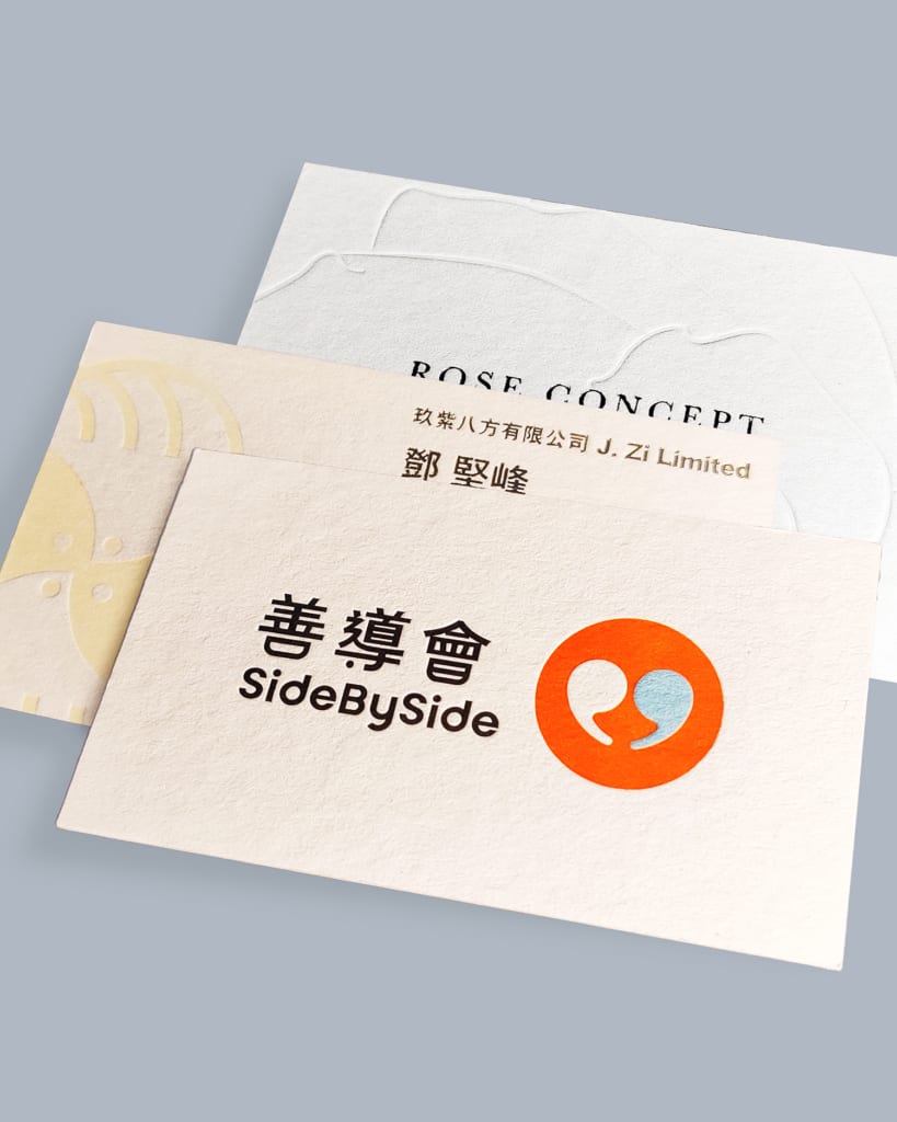
Debossing is a superb finish — the right design makes it shine
With any finish, the single most important thing is picturing the end result before you start designing. The clearer your mental image of the finished piece, the closer the printed result will land to what you had in mind. Debossing, today's star, is exactly the kind of finish that only shows its strengths when it's designed around from the outset.
Every design has its hero moment. Decide up front that the deboss is your print highlight and the whole thing comes together far more easily. Try to bolt finishes on after the design is already finished, and there's a real chance the whole layout starts to look odd.


