
Colour is one of the questions we field most often. Not long ago our account manager Don spent almost an hour walking a customer through why print colours don't always match what's on screen. In print, the questions that look simple are usually the ones that trip people up. If you've been designing for print for years, this probably won't teach you much — but if you're new to design, or you run a small business and order your own printing, this one's for you (and worth sharing).
The colour-conversion trap in print files
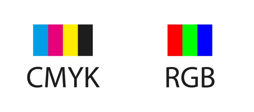
Here's how it happened. A customer who was new to printing was puzzled that his business cards came out in slightly different colours from his design. For someone printing for the first time, that's a completely fair question to ask.
So we pulled up the order and found that the file he'd uploaded was a PSD in RGB. For business cards we generally don't recommend working in Photoshop in the first place — partly the raster-versus-vector issue, which we'll leave aside here. But since the customer didn't use Illustrator and couldn't convert the PSD to an AI file, we had to work with the file as supplied.
The real problem was the RGB colour mode. Before anything goes to press, our pre-press team checks whether the file passes, and any RGB file is converted to CMYK first. We do flag this to customers up front, but it's easy to brush off — people assume the difference won't be that big.
What does changing colour mode do to the finished piece?

(Left: RGB. Right: CMYK.)
We've written before about the difference between CMYK and RGB, and the colour shift a mode conversion introduces is essentially out of our control. The way to avoid it is to prepare your print file properly. A lot of print problems are actually born in pre-press — preparing a good print file is like outlining before you write: a good outline is what makes a good article.
How can something as basic as a colour setting cause a problem this serious? Because every stage of printing is linked — design, printing and finishing each change the final result. If you care about how your printing turns out but aren't deep into the technical side, you're very welcome to reach out to our customer team; we'll do our best to sort out whatever's giving you trouble, so you end up with a result you're happy with.
Back to our customer: it was his first time printing cards, so he didn't know the difference between CMYK and RGB, or that the colour on screen isn't the colour you get on paper. He still wanted the print to match the colours he'd chosen. So next time round, what can you do to keep the printed result from drifting so far?
A few tips before you convert RGB to CMYK
For the problem above, here are a few things you can do in pre-press. Bear in mind the printed result will always differ a little from what's on your screen — but if you skip even the basics, the colour gap only gets more obvious.
- Set your colours before you start designing.
Whatever design software you use, set your working colours in CMYK from the start rather than RGB. - Flatten your images.
Images are RGB by nature, so flattening the file keeps the colour settings consistent across the whole image. - Avoid image effects and transparency.
Plenty of designs lean on layer effects, transparency and similar tricks, and because the effects stack, they shift the colour values. Some of them only show up on screen, though — a subtle texture, for example, can be clear on your monitor but vanish in print because the colour values sit too close together. Transparency can also change colour values enough to produce a big shift.
Converting an RGB file to CMYK
If you didn't think about CMYK at the start and designed in RGB, you'll notice the whole design changes colour once you convert to CMYK. That's mainly because CMYK has a smaller gamut than RGB, so some colours simply can't be reproduced. After converting, there are a couple of tricks to stop the printed colour values from causing trouble.
- Strip out leftover colour values after converting.
Once you convert, you'll notice the colour values look a little odd. Put simply: say you designed in a purple that was R102 G36 B103 in RGB — after converting to CMYK it becomes C75 M99 Y3 K0. At that point you have to ask whether that Y3 really needs to be there. A Y3 value makes almost no difference to the overall colour, so it isn't doing anything meaningful. But if you leave it in, you create a problem: the press ends up laying down an extra yellow layer, which adds colour shift and overprint risk. The finished piece can come out looking a little yellow and muddy.
This is exactly the same principle as avoiding rich (four-colour) black — so to keep your print looking clean, remove any colour values you don't need. - Once you've adjusted the colours, check them against a CMYK swatch book.
Since everyone knows the printed result differs from what you see on screen, if you're particular about colour and want a good result from four-colour (CMYK) printing, we'd suggest doing a colour comparison against a CMYK swatch book before you print. A CMYK swatch book is a colour reference printed in CMYK; different presses and inks will of course print slightly differently, but it's far more true to life than what your screen shows.
By now you should have a decent grasp of converting between CMYK and RGB. Beyond Adobe's software there are plenty of other design tools out there, so before you use one, check whether it can actually design in CMYK — and if it can't, try to avoid it.
And if you have no way to use professional software, just know that the printed colours will differ noticeably from what you see on screen. Questions before you print? WhatsApp our team at +852 3001 5678 (English is fine) and we'll help you get your file press-ready, with delivery across Hong Kong and Macau.


