
If you're not paying for a dedicated press plate, some colour shift is almost unavoidable — gang-run printing and digital printing both drift, and the culprit is usually the jump from RGB to CMYK. Force an RGB file into CMYK and every colour value changes. Your software remaps those values automatically, but because RGB covers a far wider gamut than CMYK, the colour it lands on often isn't the one you wanted.
This guide shares a few practical colour-adjustment and colour-picking tricks for Illustrator and Photoshop. Build them into your file and your printed colours will come out far more stable — run after run.
First, how CMYK and RGB differ
- CMYK mixes like ink on paper: stack cyan, magenta and yellow on top of one another and you head toward black. RGB mixes like light: stack red, green and blue and the result is white.
- CMYK has a smaller gamut than RGB, so there are plenty of colours CMYK simply can't reproduce.
For a fuller comparison of the two, see our guide Understanding CMYK print colour and RGB screen colour to reduce colour shift, which walks through the differences in detail.
Adjusting the CMYK values after an RGB-to-CMYK conversion
When you convert a file from RGB to CMYK straight in Illustrator or Photoshop, the colours often come out looking muddy and flat. Open the colour picker and check each of the CMYK values: if one of the channels sits at only a single-digit percentage, consider dropping it to 0, as shown below:
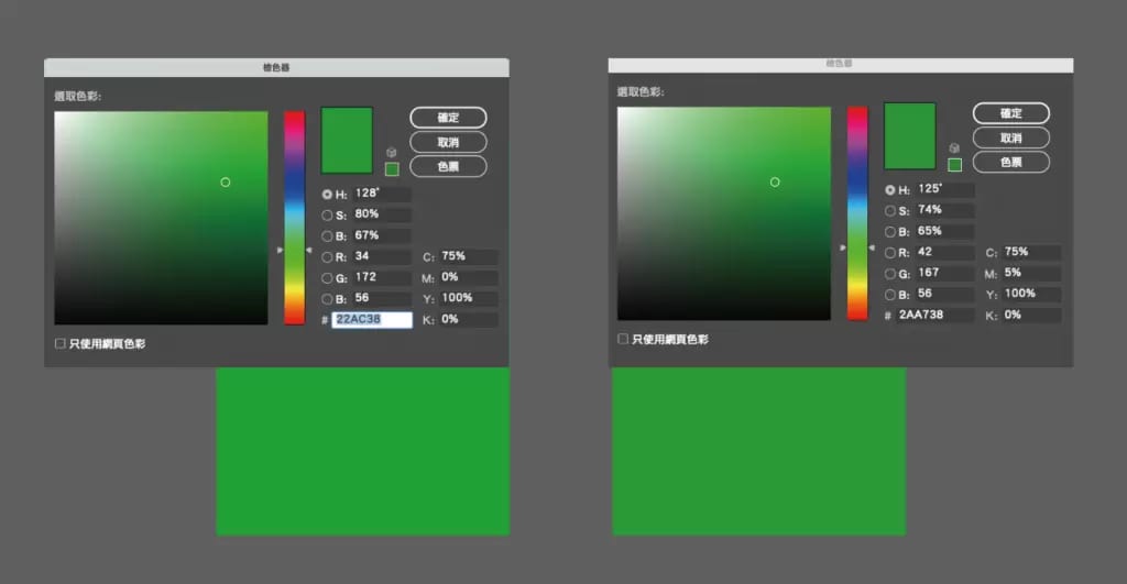
^ The two greens, value for value
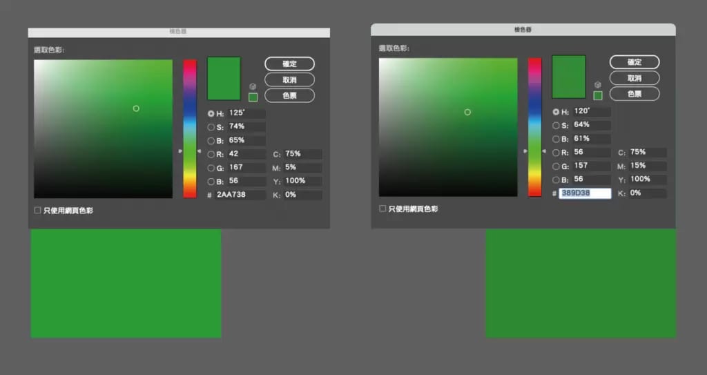
The two greens barely look different — but in print, every extra ink channel adds another chance for the colour to shift. Colour variance typically falls within a range of ±10%. In the example above, an M value of 5% could drift to 15% under that tolerance, and the printed result changes dramatically, as shown below. So when it makes little visible difference, any channel sitting at 8% or lower is best set to 0%.
Rules for setting CMYK values
- Any channel at 8% or below can be zeroed out — this alone slashes the risk of colour shift.
- Keep the total ink coverage within 250%. Go over and the print is prone to set-off, where wet ink smudges onto the back of the sheet stacked above it.
- Avoid colours that use all four channels, such as C20 M20 Y20 K20 — mixes like this shift badly. Aim for three channels or fewer; two or fewer is better still.
- Don't use four-colour (rich) black. It shifts heavily and drags the rest of your design's colours with it. Reach for a "bright black" of K100 plus C20 instead.
- Steer clear of "sensitive" colours — brown, orange, teal, purple and three-colour grey — for large solid-colour areas. Sensitive colours shift easily and are hard to hold steady, whether you're reprinting or printing just once.
Choosing the right colours is what stabilises the print
Whichever print shop you use, if your file's colours follow the rules above, the finished piece shouldn't vary much — and when you reprint the same artwork, the difference between runs shrinks too.
Getting a good print isn't as complicated as it sounds. Once you understand the principles and set your file up to the right standards, you can turn out solid results without ever touching a spot colour. That said, if the budget has room, printing a company logo colour or a large sensitive-colour area as a spot colour will give you an even cleaner result.


