
When we proof card artwork for customers here at Printing Banana, one problem keeps coming up: blurry text. So what are the limits on card fonts, and how small can the type actually go? The good news is that with today's printing technology, even very small text will usually print. The catch is that if the type in your artwork is already soft or low-resolution, it is guaranteed to look wrong on the finished card.
If you are a graphic designer, the key thing to remember is that any size of type can be printed. The real question is whether your text is vector artwork or, if it lives inside an image, whether that image has enough resolution. From there it comes down to matching the type to your design and choosing the right characters for the job. And don't forget who the card is for: if you are handing cards to an older audience, type that is too small simply won't be readable for them.
On both the print and the design side, there are a few details we'd suggest keeping in mind. Think them through and your finished print will be far safer:
Colour printing: font recommendations for cards
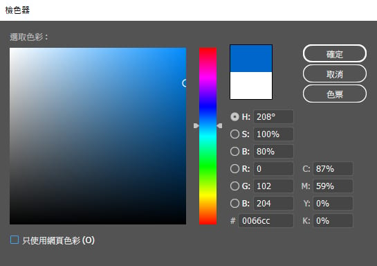
1. Colour printing is four-colour process (CMYK), as we've covered in an earlier article. Because of that, small text should avoid being built from several colour values at once. If the plates misregister even slightly, the text picks up ghosting and loses its crispness. The safest approach is a single channel: solid black (K=100), solid cyan (C=100) or solid magenta (M=100), which on ordinary colour printing does the most to keep type from going fuzzy. Of course a single colour won't always suit the design; if you do need mixed values, try to stay within two channels and keep total ink coverage under 200%.
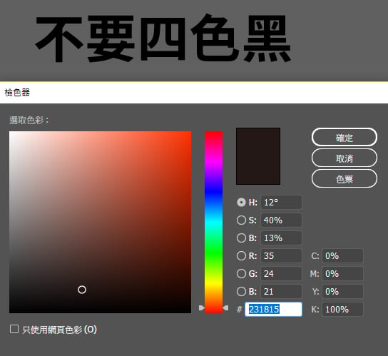
2. Black text must use single black (K=100). Never build it from four-colour black (C=100, M=100, Y=100, K=100), three-colour black, or any mix that goes beyond K=100.
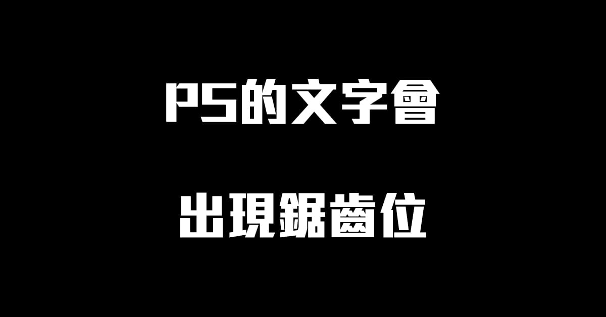
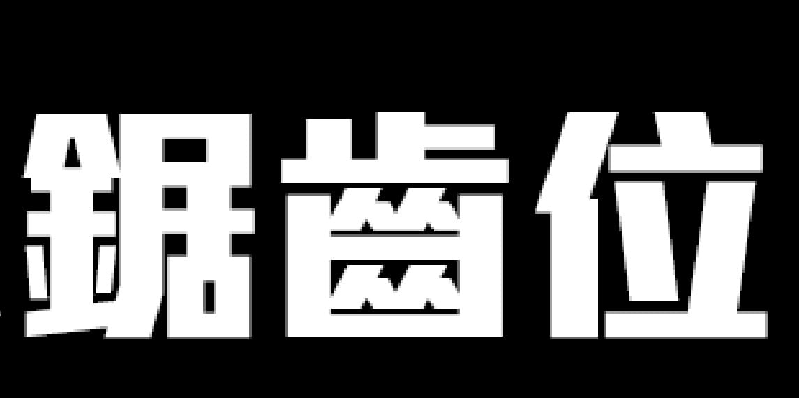
3. When you are setting card artwork, flyers or anything that uses small type, the ideal is to build it in vector software (CorelDRAW or Adobe Illustrator) and never in Photoshop or as a flat printed image. A PSD is a raster format by default, so when it goes straight to print the small text comes out with jagged edges, and you can see the same stepping if you zoom into the file on screen.
The text problems we run into at Printing Banana almost always trace back to one of these three situations.
The first two come down to print quality and the designer's care. You rarely see them in high-end work such as art books or magazines, but they turn up constantly on plain, ordinary matte cards. The third is hard for a printer to catch on its own, though we do check every file and raise it with the customer when something looks off. The trouble is that customers often don't have the design file to hand, so it's always best to get the original artwork from your designer.
Font-size rules for finished (craft) business cards
With spot-colour card printing, each colour is a mixed, dedicated spot ink, so even small text can print sharply. But once you start adding finishing to the type itself, there are a few extra points to weigh up:
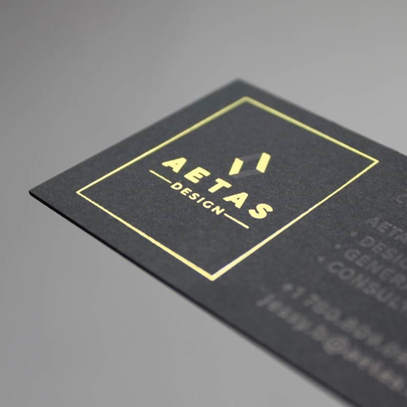
1. Foil-stamped cards: if the type is very small and you need tight detail, we don't recommend foiling it — print it directly instead. Foil-stamped text simply can't hold detail the way offset print can, though it is usually still legible. See the foil example below:
- Text no smaller than 8pt, lines no thinner than 0.6pt (0.2mm), and no less than 0.7mm between two foil areas.
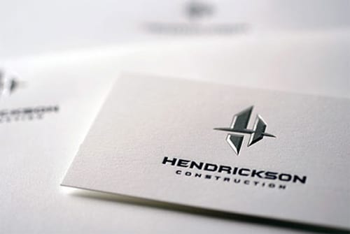
2. Crystal (spot) UV: if you are applying crystal UV over the type, use a single-colour crystal UV and keep multi-colour UV to a minimum to reduce registration error.
- Text no smaller than 8pt, lines no thinner than 0.6pt (0.2mm)
Not sure your type will hold up on the press? Send us the artwork before you order — we proof every file and will flag anything that risks printing soft or ghosted. We print and deliver right across Hong Kong and Macau, so you can order your matte cards or simply WhatsApp us at +852 3001 5678 (English is fine) and we'll take a look.


