
In business, your card is often the very first thing a new contact holds — and in that moment it does the work of introducing your brand. Getting your brand's DNA onto a business card isn't complicated; it comes down to a few key elements. Below we share simple design tips to help you fold your core values and personality into every card you hand out.
4 brand elements every business card needs
Brand colour
Your brand colour is a cornerstone of recognition: used consistently, it lets people place your brand in an instant. That's why your card should lead with your brand colour as its dominant tone — it sharpens recognition and gives the card visual pull. The link between a colour and a brand isn't built overnight; it forms through steady, repeated exposure, and a business card is one of the most effective touchpoints for building it.
Logo
Your logo is the visual heart of your brand — it's what makes you distinctive and easy to recognise. It carries real weight on a card: it reinforces who you are, and beyond simple recognition it can signal what you do, such as the industry you work in.
Typeface
Consistency of typeface matters. When the font on your card matches your website and your other marketing collateral, it strengthens your brand's coherence. Used repeatedly, a typeface builds a strong association with your brand. When you're choosing one, free commercially-licensed fonts are a fine starting point; if your budget allows, you can license a premium typeface or commission your own.
Tagline
Your tagline is a statement of what the brand stands for — it captures your core values and what sets you apart. Weave it thoughtfully into the card design and customers will understand and remember your brand more deeply. One caution: a tagline only works if it stays consistent. If the line on your card differs from the one on your website, it's hard to leave any lasting impression at all.
Cards that show off brand character: real examples
Coca-Cola
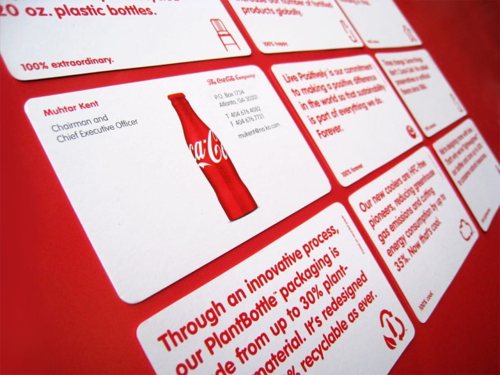
This Coca-Cola card ticks off every element a card should have: the red brand colour, the corporate logo, the typeface, the product and the brand philosophy. What sets it apart from other cards is that it devotes an entire side to communicating the company's outlook — its stance on sustainability and quality. That approach is well worth borrowing. The information side, meanwhile, features a flagship product, underscoring Coca-Cola's appeal once more.
Levi’s

The most distinctive thing about the Levi’s card is the stock: it's printed on kraft paper, echoing the leather patch on a pair of jeans and creating a powerful brand effect. The card still carries the basics — logo, brand colour, brand pattern and typeface — all of which play off the brand's products and marketing. Paper choice has a real impact on a brand, too: a beauty business might reach for an iridescent pearlescent card, while an eco-minded company might opt for recycled stock.
Ready to put your own brand DNA into print? Printing Banana prints business cards with delivery across Hong Kong and Macau — message us on WhatsApp at +852 3001 5678 (English is fine) and we'll help you get every detail right.


